Piko
Piko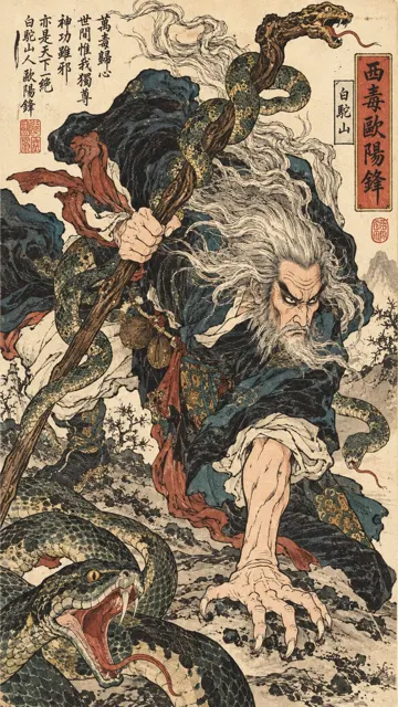 Promptu incele ↗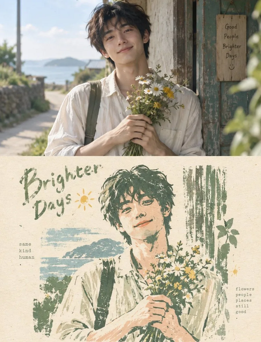
ChatGPT
FotoğrafChatGPT
Vertical split pet photo to woodcut print
Üretici @zhidawang219555
Prompt
Create a vertical double-panel style image. The screen is strictly divided into upper and lower parts, with a height ratio of about 1:1.

**Upper part:**
Please design an original photo with a realistic photographic feel. The main subject is a puppy standing or sitting quietly, or a natural interaction between a person and a puppy, but the focus of the main subject must clearly fall on the person/pet itself. The photo should have a soft, healing, and bright atmosphere. It can be placed in natural environments such as grass, indoor corners, by a door, or by a window, but the environment serves only as a foil; do not treat architecture or space as the main subject.

**Lower part:**
Strictly based on the same subject, outline, posture, and narrative relationship from the original image in the upper part, reconstruct it into a limited-color woodcut print mark floating on the paper. Do not directly copy the entire photo, nor simply apply a filter. Instead, actively subtract complex backgrounds and minor information, retaining only the recognizable outlines, proportions, directions, light and shadow divisions, key structures, and core spatial relationships. Re-summarize the subject in the language of woodcut prints, linocuts, and manual multi-plate printing, making it instantly recognizable while possessing a simple, clumsy, and strongly hand-crafted artistic temperament.

The graphic brushstrokes should carry the characteristic clumsiness and hand-made traces of woodcut prints: lines do not need to be smooth or precise, allowing for slight carving-like hesitation, uneven thickness, fuzzy edges, stiff transitions, local breaks, gaps, misalignments, and irregular white space; the edges of color blocks can show dry brushing, missed printing, lack of ink, and coarse grain textures. The overall effect is not a refined vector illustration, but rather like being carved and printed stroke by stroke with a hand chisel and ink, carrying a simple, direct, slightly naive yet very durable printmaking quality.

The composition focuses on a single visual anchor point, large areas of white space, and incomplete edges. The position and scale are determined by the subject's own visual center of gravity, movement direction, and structural trend. It can be centered, offset, slightly cropped, or extended in a certain direction. Sufficient warm paper white space is reserved around the subject, and the edges gradually disappear through lack of ink, broken textures, paper showing through, and a sense of natural wear, avoiding complete rectangular borders, making the image look like a memory gently embossed on paper.

The color scheme extracts the most recognizable and vital colors from the original photo in the upper part, but converts them into a fresh, soft, healing, and bright limited-color logic. Use a comprehensive color system that is clean and light, such as cream white, ivory white, light pink, misty green, light blue, tender yellow, pale orange, mint green, soft coral, and light ochre, maintaining low to medium saturation, high brightness, and soft contrast. Retain the most touching color memory points of the original image, but avoid dark, dull, dirty, heavy, and overly vintage color schemes. All colors should be overprinted like matte physical ink layers, soft and clear, yet still possessing the grain and warmth of a print.

Text also intervenes as part of the print composition rather than fixed explanatory text. Extract a 1–3 word main title from the subject's identity, action, emotion, state, location, or metaphor in the upper photo, and pair it with a set of extremely short keywords or a micro-description. The main title can be arranged along the subject's outline, white space boundaries, visual axes, or print edges, forming a supporting, interspersed, misplaced, or echoing relationship with the graphics; auxiliary small characters remain tiny and restrained, using typewriter fonts, monospaced serif fonts, or old archival-style layouts, like annotations in travel notes or private collection prints. Do not use a fixed year; let the text grow naturally based on the photo itself.

The overall emphasis is on the simple hand-crafted feel of woodcut prints, fresh and soft limited colors, paper white space, incomplete edges, and restrained layout, presenting a high-end print temperament that is warm, quiet, healing, light, and nostalgic without being gloomy. Maintain a clear and clever visual echo between the original image in the upper part and the woodcut reconstruction in the lower part, avoiding ordinary filters, complete background replication, smooth vector outlines, cartoon illustrations, travel template feels, and cheap vintage vibes.
Metni kopyala, kendi detaylarını ekle ve kullandığın görsel modelinde dene.