 Piko
Piko Promptu incele ↗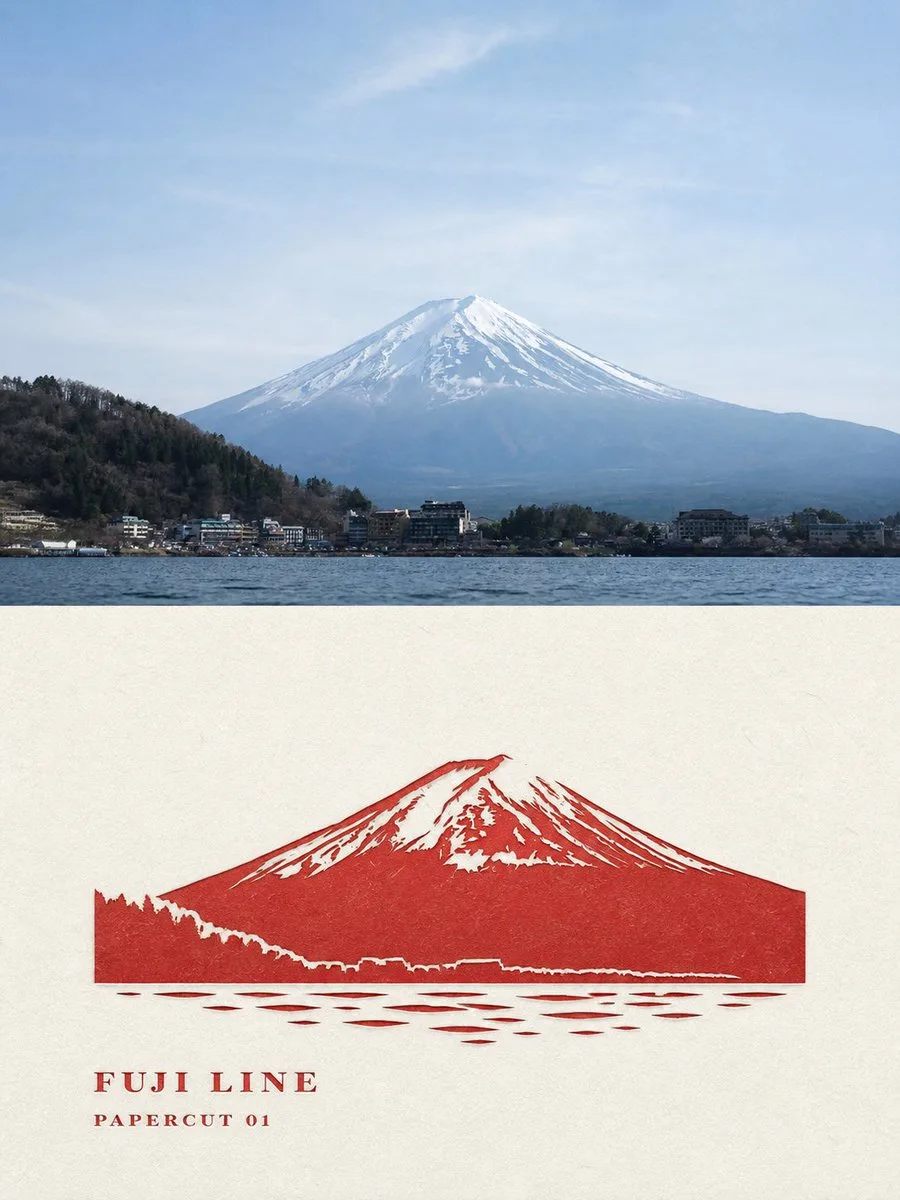
ChatGPT
TasarımChatGPT
Travel photo modern vermilion papercut poster
Üretici @Hamburgerai
Prompt
Please turn every travel photo I upload into an individual high-end design poster. Output each photo separately; it is forbidden to stitch multiple photos into the same frame.

The overall composition uses a 3:4 vertical layout, consisting of a real photo and a transformation of the same scene. The top and bottom areas have a height ratio close to 1:1, using a clear, straight, and restrained horizontal boundary. Do not apply feathering, blurring, gradual blending, or material seepage at the boundary.

## Top Section: Original Photo

Faithfully preserve the identity of the subject, architectural structure, topographical relationships, number of people or animals, postures, observation angles, relative positions, real textures, natural lighting, and original color atmosphere from the original photo.

Apply only slight color grading suitable for art publications, architectural magazines, or travel photography, and add a very thin film grain. The top section must remain a clear, real original photographic work with substantial area, and must not be illustrated, have the subject redrawn, have the sky replaced, have people moved, have architecture changed, or have non-existent landmarks added.

To adapt to the layout, a small amount of sky, ground, or surrounding environment can be naturally extended, but the subject must not be stretched, mirrored, squeezed, copied, or distorted.

## Bottom Section: Vermilion Landmark Papercut

Extract the most recognizable landmark subject from the same photo and reconstruct it into a monochromatic vermilion papercut work with a modern editorial design feel.

Do not copy the full framing of the original photo, nor simply turn the entire photo into a red silhouette. Proactively remove complex backgrounds, repetitive buildings, tiny window panes, dense plants, billboards, cluttered pedestrians, and irrelevant environments, keeping only:

- The most recognizable overall outline of the landmark;
- Architectural levels, roof rhythms, or mountain trends;
- Key negative space openings such as doorways, bridge holes, and window holes;
- One necessary foreground relationship line;
- A minimal amount of subsidiary silhouettes that can explain the location's space.

Adopt a secondary composition of "full-bleed impact + negative space cutting." The subject can be enlarged to 70%–105% of the transformation area height, allowing parts of the outline to naturally go out of frame, but the scale, cropping, and visual center of gravity of the subject must be readjusted, and it cannot maintain the same composition as the photo above.

The subject is cut from a single continuous piece of solid vermilion paper, not a collage of many fragmented red icons. Use the paper-white negative space to cut out doors, windows, eaves, bridge holes, gaps between tree canopies, valleys, and the sky, so that the red and white paper together shape the structure.

The edges of the papercut must be clear, sharp, and complete, with slight real paper fibers, blade undulations, and manual cutting errors. A very small amount of creases or indentations may appear locally, but the overall feel should remain that of flat paper art.

Do not add traditional festive window flowers, bird-and-flower patterns, lace edges, symmetrical decorations, or Lunar New Year papercut elements. It is a modern landmark papercut editorial poster, not a festive decoration.

## Color and Paper

By default, the transformation section uses only:

- A deep and restrained vermilion paper;
- A warm natural rice-white paper;
- A very small amount of indentations in the same color shades.

The vermilion should not be too bright, too orange, or plasticized; it should be close to mineral cinnabar, old ink pads, and matte dyed paper. The paper white accounts for the sky, highlights, air, and spatial distance.

Proactively leave about 20%–35% of continuous paper-white space to one side of or above the subject. The white space must form a clear contrast of weight and density with the vermilion subject; do not use template-style white sidebars.

## Text

Before generation, determine the following text based on the actually visible location, building, or scenery in the photo, and render it accurately word for word in the image:

- A main title of 1–3 English words; use the actual place name when the location is clear, and use "LANDMARK" or a generalized title related to the subject when it cannot be confirmed;
- Material field: "PAPERCUT STUDY 01";
- One observation sentence of 5–12 English words, describing only the outlines, directions, colors, or spatial relationships that truly exist in the photo.

Place the text collectively in the continuous paper-white area; do not scatter it evenly across the four corners. The main title must be clearly readable at chat preview size.

The text should use embossed lead type, ink-starved printed characters, or narrow uppercase fonts in the same color as the vermilion papercut, with edges showing slight paper teeth and ink gaps, as if printed on the paper alongside the papercut. Do not use smooth, floating digital typography.

Author names, signatures, social media accounts, URLs, QR codes, fictional brands, meaningless numbers, fake Chinese, and gibberish are prohibited.

## Overall Vibe

Modern, restrained, sharp, quiet, with cultural recognition and a sense of collectability, like a landmark papercut research poster produced by an independent art publisher.

Mandatory avoidance: photorealistic lower panel, same-crop same-scale redraw, red photo filter, detailed multicolor illustration, decorative folk lace, symmetrical festival papercut, generic souvenir template, scattered icons, glossy plastic, 3D render, soft blurred edges, smooth vector shapes, excessive details, excessive text, missing source-photo comparison, distorted architecture, invented landmark, fake text, watermark.
Metni kopyala, kendi detaylarını ekle ve kullandığın görsel modelinde dene.


