 Piko
Piko Promptu incele ↗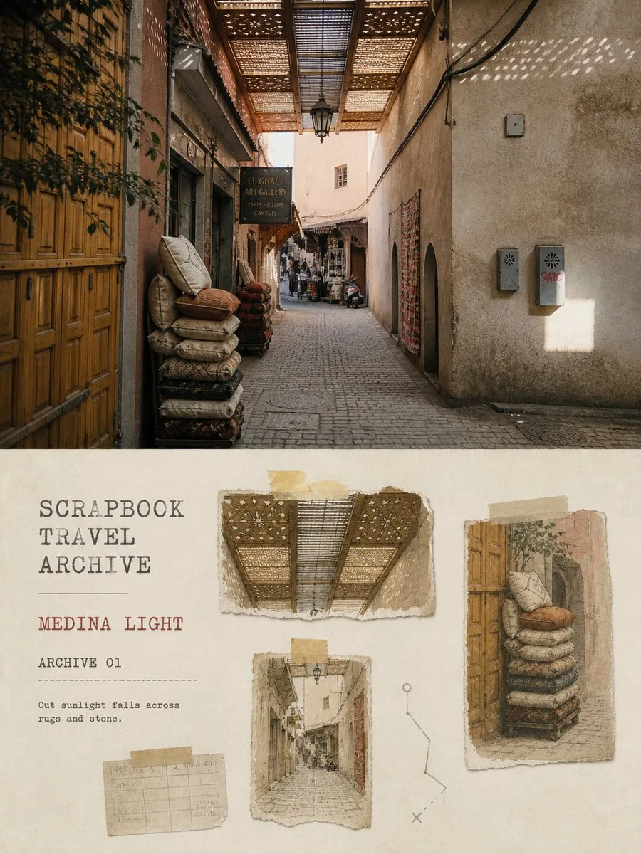
ChatGPT
TasarımChatGPT
Travel photo individual archive poster
Üretici @Hamburgerai
Prompt
Please turn each travel photo I upload into a separate, independent high-end design poster. No multi-image stitching; each photo is output individually.

The overall composition uses a 3:4 vertical layout, with the image consisting of the real original photo and a clipped travel archive of the same scene. The top-to-bottom ratio can be naturally adjusted according to the photo's subject, but a clear and substantial area of the original image must be retained for comparison.

The top part occupies approximately 43%–48% of the frame, faithfully preserving the original photo. Accurately maintain the identity of the subjects, the number and posture of people, architectural structures, street directions, object positions, spatial perspective, real materials, natural light and shadow, and the original color atmosphere. Perform only slight travel magazine color grading and extremely thin film grain processing; the top photo must not be redrawn, stretched, distorted, or have its subject replaced.

The bottom part uses warm off-white old archive paper as a background, extracting 2–4 of the most worth-preserving visual fragments from the same photo, such as:

- The most recognizable subject or landmark
- A section of architectural structure, door/window, arch, or street perspective
- A field object, clothing, utensil, sign, or plant
- A particular light/shadow, color, texture, or partial action

Reorganize these elements into a restrained travel scrapbook archive. Use irregular torn-edge paper scraps, slightly misaligned old paper rectangles, narrow strips of translucent tape, pencil routes, distance markers, archive horizontal lines, and a few printed symbols to establish the layout relationship.

The clipping fragments are not simple copies of multiple small photos, nor are they random stickers. Some fragments can retain a faded photo texture, while some can be transformed into fine pencil, light ink, colored pencil, or low-saturation watercolor observation drawings. All fragments must come from subjects and details that actually exist in the original image and together maintain the direction and story of the original scene.

The main elements should be appropriately scaled down, leaving approximately 45%–60% of continuous white space below. Maintain breathing distance between the paper scraps; do not fill the entire bottom half. Torn edges should be natural and thin, with real paper fibers, but avoid forming heavy 3D paper carvings or exaggerated shadows.

Extract 3–6 colors from the original photo for the color palette, using warm off-white, old paper gray, and pencil colors as the base, while retaining one of the most recognizable colors from the photo as a visual emphasis, such as vermilion, deep blue, olive green, ochre yellow, or fabric colors. The overall feel is low-saturation, slightly faded, with a sense of time like old printed matter and travel archives.

Text intervenes in the image as part of the archive system. Based on the location, subject, light, or travel feeling in the photo, automatically refine:

1. A 2–4 word English main title
2. A serial number, such as "ARCHIVE 01"
3. A short English field observation of about 5–10 words
4. Optional small series logo "SCRAPBOOK TRAVEL ARCHIVE"

The main title uses typewriter fonts, narrow serif fonts, or archive printing fonts with a slight sense of old printing wear. Auxiliary text can be arranged along horizontal lines, paper edges, or pencil routes. All text must be accurately readable, generating no gibberish, fictional addresses, or author information.

The boundary between the top and bottom areas is clear, but avoid heavy dividing bars. The top is the real, complete travel scene, while the bottom is like a page of private observation archive organized from the same scene after the trip.

The overall style has the temperament of an independent travel magazine, old-fashioned field archive, artist's notebook, and modern editorial design. Quiet, restrained, humanistic, with a sense of preserved time, while remaining high-end, clear, and collectible.

Avoid: dense scrapbooks, full-page collages, multiple unrelated photos, generic travel stickers, airplanes, passports, map pins, stamp piles, cartoon icons, cute stickers, children's handicraft feel, random newspapers, exaggerated tape, heavy paper carvings, strong 3D shadows, smooth 3D, plastic textures, realistic copying of the entire photo in the bottom half, changing the subject, fictional objects, fake Chinese, gibberish, author names, social media accounts, signatures, logos, and watermarks.
Metni kopyala, kendi detaylarını ekle ve kullandığın görsel modelinde dene.


