 Piko
Piko Promptu incele ↗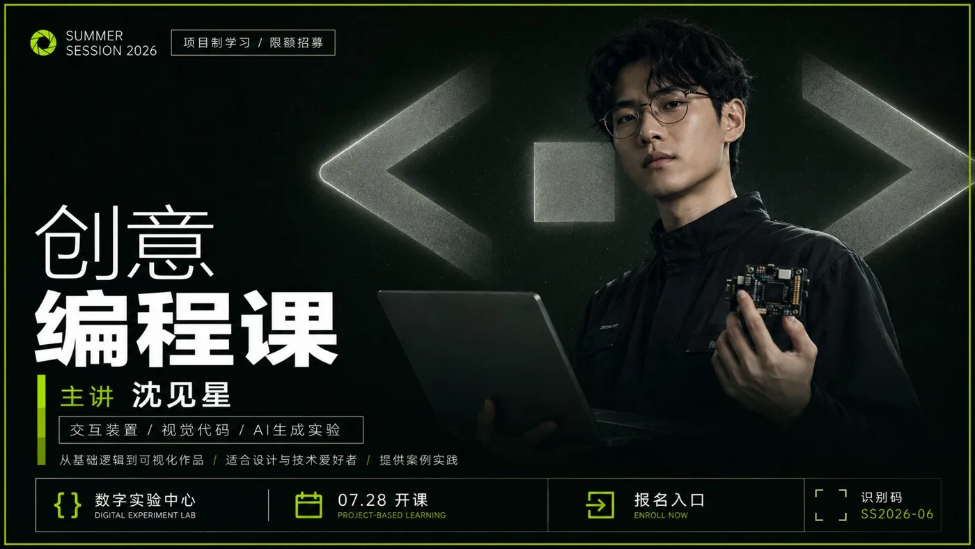
ChatGPT
TasarımChatGPT
Strong presentation style commercial course poster design
Üretici @xiaoxiaodong01
Prompt
Generate a commercial poster with a strong sense of presentation around any subject object: the overall composition starts with a large area of low-brightness theme dark colors as a calm background, with a narrow outer frame formed by high-saturation accent colors derived from the theme on the edges, giving the image an immediate sense of pressurized boundaries and clear recognition; a giant geometric symbol or abstract glyph semantically related to the theme is placed in the background, with a size much larger than the foreground object, using low-saturation neutral light gray and dark gray transitions, partially cropped out of the frame, with soft halos and slight grain on the edges, making it look like both a physical sign in space and a giant billboard swallowed by the dark field. The core subject object is placed in the middle-lower area and pressed forward, maintaining a realistic, calm, and credible photographic or finely rendered texture, its outer silhouette cut out from in front of the giant symbol, with the bottom gradually swallowed by shadows, forming a relationship where the foreground object obscures the background giant symbol and the background giant symbol supports the weight of the title. The text system uses clean, high-contrast white sans-serif, with small brand lockups and fine-bordered short sentences at the top, and two levels of giant titles in the upper-middle to establish a reading focus, with the first line lighter and the second line significantly bolded, letter spacing is compact but with room to breathe, the title must not cover the core face or key recognition points of the foreground; the middle-lower part uses vertical bars in accent colors to lead into names or theme keywords, accompanied by fine white-bordered description bars and several lines of small text descriptions, with location, date, action entry, or identification codes arranged at the bottom, all forming a stable order along an invisible central axis and left-right margins. The color is determined by the specific hue of the theme, but it must maintain the dark field occupying the absolute area, white text highlighted, gray giant symbols bearing the spatial volume, and accent colors appearing only in the outer frame, emblems, short bars, and a few action points; overall brightness is restrained, clean and cool-toned, retaining subtle noise like digital printing, softened edges, and slight vignetting, without adding messy decorations. Failures usually turn into ordinary character promotional pages, background symbols that are too small or too bright, text that looks like it was pasted on as independent layout, or overflowing accent colors; the giant symbol must dominate the field, the subject must obscure, and the white text hierarchy and small amount of accent colors must jointly control the first glance.

Theme: Course Poster
Metni kopyala, kendi detaylarını ekle ve kullandığın görsel modelinde dene.


