Piko
Piko Promptu incele ↗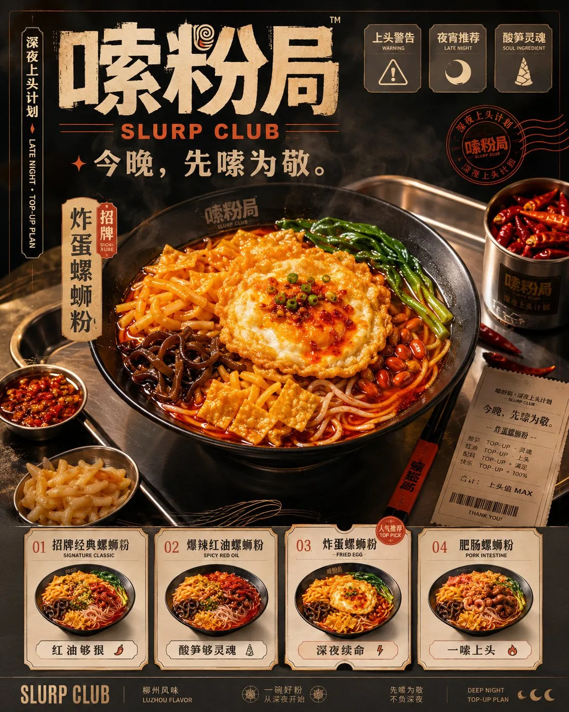
ChatGPT
FotoğrafChatGPT
Slurp club brand visual identity system proposal
Üretici @MrLarus
Prompt
Please create a set of highly finished '4 brand visual proposals' with a unified visual system based on the following brand information. Note: This is not a four-grid puzzle, nor is it a master image combining 4 contents in the same frame, but a set of 4 independent images that need to be 'generated separately in sequence'. Please complete the generation of these 4 images consecutively under the same brand visual system. The 4 images must clearly belong to the same brand, but each image carries different responsibilities and cannot just be 4 repeated variants. [Brand Information] Brand Name: 嗦粉局 (Suo Fen Ju) English Name: SLURP CLUB Brand Concept: Midnight Obsession Project Brand Type: Youthful new-style snail noodle brand / night snack brand Slogan: Tonight, slurp first. One-sentence Positioning: Turning a bowl of smelly, spicy, and obsessive snail noodles into a night snack brand that young people are more willing to buy, photograph, and share. Core Keywords: Snail noodles, night snack, obsessive, red oil, sour bamboo shoots, fried egg, yuba, heavy flavor, smoky atmosphere, youthful trend, midnight life-saver, appetite impact, takeout-friendly, packaging feel, brand proposal feel. Target Audience: Young people aged 18–35, night snack consumers, heavy flavor lovers, people who like to take photos and check-in, browse takeout apps, and pursue stimulating tastes and highly memorable food. [Overall Visual Direction] Do not make it look like traditional local specialty packaging, nor like cheap internet-famous snack posters. The overall look should be like a youthful, design-oriented, textured, and commercially viable night catering brand proposal. Visual Keywords: Warm light night snack, red oil appetite, natural ingredient colors, metal texture, cream-white cards, smoky atmosphere, youthful brand, proposal feel, high-end feel. Color Palette Direction: Do not use excessive black-red hard-clashing colors, do not have black backgrounds with red text for the whole image, and do not cover the whole screen with red. Please use a more layered color system: Main Background Color: Warm charcoal grey, deep smoke grey, deep taupe, black matte texture. Main Accent Color: Chili oil orange-red, red oil red, brick red, instead of piercing bright red. Information Carrier Color: Bone soup cream white, warm cream white, light cream grey, used for menu cards, receipts, SKU cards, label cards, and instruction modules. Auxiliary Ingredient Colors: Sour bamboo shoot yellow, yuba gold, fried egg golden yellow, braised egg brown. Small Area Accents: Scallion green, stainless steel grey, a small amount of warm orange light. Material Language: Stainless steel trays, metal plates, warm light boxes, matte packaging bags, paper menus, receipt paper, seal stickers, plastic film reflection, steam, red oil highlights. Auxiliary Graphics: Red oil ripples, noodle trajectory lines, bowl mouth circles, receipt torn edges, chopstick diagonal lines, chili icon, sour bamboo shoot icon, yuba icon, wood ear icon, peanut icon, fried egg icon, label stickers, receipt numbering system. Label Copy can use: Obsession Warning, Night Snack Recommendation, Extra Spicy Must-Order, Extra Fried Egg, Soul of Sour Bamboo Shoots, Midnight Life-Saver, Slurp Once Obsessed, Slurp First Tonight, Heavy Flavor Lovers. Core Products: 1. Signature Classic Snail Noodles 2. Super Spicy Red Oil Snail Noodles 3. Fried Egg Snail Noodles 4. Pork Intestine Snail Noodles 5. Double Yuba Snail Noodles 6. Deluxe Double-Mix Snail Noodles [Unified Requirements] 1. The four images must belong to the same brand system, keeping brand name, font temperament, color scheme, auxiliary graphics, label system, and product logic unified. 2. All images use vertical 4:5 ratio, suitable for social media display and brand proposal presentation. 3. Each image is generated independently, no four-grids, no merging into one master image. 4. The overall result must have high finish, sufficient information, strong design feel, and strong brand proposal feel; do not be too simple or too empty. 5. The visuals must have appetite impact but not be overly dark, and no red-black overload. 6. Highlight warm light, natural ingredient colors, metal texture, cream-white information cards, and red oil layering. 7. Products must be real and tempting, with clear layers of red oil, sour bamboo shoots, yuba, fried eggs, peanuts, wood ear, green vegetables, and rice noodles. 8. Chinese titles should be clear, English text as auxiliary, and the overall layout should have a commercial proposal feel. [Image 1] IMAGE 1 | DARK RED OIL HERO BOARD Task: Generate the brand visual cover image for the entire proposal. At first glance, make people feel: night snack, hot and spicy, obsessive, snail noodles, youthful trend, appetite impact, and brand texture. Composition: Top displays brand name '嗦粉局', English name 'SLURP CLUB', slogan 'Tonight, slurp first.', and information like 'Midnight Obsession Project'. Center features a bowl of 'Fried Egg Snail Noodles' as the absolute visual center. Use black ceramic bowls, dark tableware, or stainless steel trays. The bowl must clearly show red oil soup base, rice noodles, fried egg, sour bamboo shoots, yuba, wood ear, peanuts, green vegetables, and scallions; a small amount of braised egg or meat slices can be added. Food should have steam, oil glisten, and real ingredient layers. Surroundings can include chili, sour bamboo shoot side dishes, chopsticks, receipts, seasoning bowls, and other details. Background uses warm charcoal grey, deep smoke grey, metallic grey; no pure dead black. Titles and key labels use chili oil orange-red, info cards use bone soup cream white to improve layering and readability. Bottom displays 4 main product small cards: 1. Signature Classic Snail Noodles 2. Super Spicy Red Oil Snail Noodles 3. Fried Egg Snail Noodles 4. Pork Intestine Snail Noodles. Add selling point labels: Hardcore Red Oil / Soulful Sour Bamboo Shoots / Midnight Life-Saver / Slurp Once Obsessed. Requirements: Do not make it like a common catering poster; make it like a high-finish, youthful, textured brand visual cover. The visual should be impactful but not a blurred mess of black and red. [Image 2] IMAGE 2 | MIDNIGHT VISUAL SYSTEM BOARD Task: Generate a brand identification system image, showing the visual system composition of 'Suo Fen Ju'. It is not a common VI manual, but should look like a high-end proposal board of 'Midnight Menu Archive + Brand ID System + Receipt Label System'. Composition: Top displays brand name '嗦粉局', English name 'SLURP CLUB', slogan 'Tonight, slurp first.', can include a small snail noodle main bowl image as a visual anchor. Middle modularly displays the following content: 1) Brand Identity System: Chinese logotype '嗦粉局', English logotype 'SLURP CLUB', seal version, horizontal version, vertical version, simplified identity. 2) Color System: Chili oil orange-red, warm charcoal grey, bone soup cream white, sour bamboo shoot yellow, yuba gold, stainless steel grey, scallion green. Color blocks should have names and hierarchy, do not use all black and red. 3) Typography System: Chinese main title font, Chinese auxiliary font, English auxiliary font, label font. Example words can include: 嗦粉局, Tonight slurp first, Obsession warning, Night snack recommendation. 4) Icon System: Chili, sour bamboo shoot, yuba, wood ear, peanut, braised egg, fried egg, chopsticks, rice noodles, red oil. 5) Label Sticker System: Obsession warning, Extra spicy must-order, Extra fried egg, Night snack recommendation, Soul of sour bamboo shoots, Midnight life-saver, Heavy flavor lovers, The more you slurp the more obsessed you get. These labels can be made into receipt strips, stickers, seals, menu labels. 6) Auxiliary Graphic System: Red oil ripples, noodle trajectory lines, receipt torn edges, bowl mouth circles, chopstick diagonal lines, steam lines. 7) SKU Coding System: 01 Signature Classic, 02 Super Spicy Red Oil, 03 Fried Egg, 04 Pork Intestine, 05 Double Yuba, 06 Deluxe Double-Mix. Bottom displays 6 SKU product cards, each with a small image, number, name, and spiciness or selling point labels. Requirements: The overall look must have design and system feel, using bone soup cream white cards to carry information, avoiding excessive black and red throughout the image. It should look like a high-end brand archive board, not a promotional flyer or an e-sports style control panel. [Image 3] IMAGE 3 | PRODUCT & PACKAGING BOARD Task: Generate product and packaging application images, showing how 'Suo Fen Ju' is implemented as a sellable product system. Make people feel at a glance that this brand can be dine-in, takeout, retail, and sold on shelves. Composition: Top displays 4 key finished products: 1. Signature Classic Snail Noodles 2. Super Spicy Red Oil Snail Noodles 3. Fried Egg Snail Noodles 4. Pork Intestine Snail Noodles. Finished products should be presented using high-end food photography, with red oil, rice noodles, fried egg, sour bamboo shoots, yuba, peanuts, wood ear, and green vegetables clearly visible. The food area should be bright, with steam, oil glisten, and layers. Middle displays the complete packaging system: Bagged home-version snail noodles, Tubed/Cup-packed instant version, Takeout bowls, Tote bags, Takeout bags, Seals, Chopstick sleeves, Menu cards, Brand stickers, Receipts, Ingredient pack breakdown: red oil pack, sour bamboo shoot pack, yuba pack, peanut pack, vinegar pack, soup base pack. Packaging style uses warm charcoal grey, bone soup cream white, chili oil orange-red, sour bamboo shoot yellow, yuba gold; do not make it look like traditional local specialty packaging. It should have modernity, youthfulness, texture, and SKU differentiation. Bottom displays 6 complete SKU product cards: 1. Signature Classic Snail Noodles 2. Super Spicy Red Oil Snail Noodles 3. Fried Egg Snail Noodles 4. Pork Intestine Snail Noodles 5. Double Yuba Snail Noodles 6. Deluxe Double-Mix Snail Noodles. Each product card includes a product image, name, number, and highlight labels. Selling points can be added: Hardcore Red Oil / Soulful Sour Bamboo Shoots / Fried Egg Must-Order / Midnight Life-Saver / Extra Spicy Warning. If space allows, add topping recommendations: Extra sour bamboo shoots / One more fried egg / Extra pork intestine / Double yuba. Requirements: Must have a 'truly sellable' feel. Not just a pile of products, but reflecting the product system, packaging system, takeout system, and retail system. The overall look should be like a high-end food retail brand proposal. [Image 4] IMAGE 4 | CAMPAIGN & SPACE BOARD Task: Generate communication and scene application images, showing the effect of 'Suo Fen Ju' in the real world. Focus on presenting a complete brand landing of 'Late-night Store + Night Snack Stall + Takeout Communication + Social Media Communication'. Composition: Large main scene on the left: Display a textured late-night store, street-side shop, or night snack stall. The storefront clearly says '嗦粉局', can carry the English 'SLURP CLUB', and displays the slogan 'Tonight, slurp first.' The scene should have warm light, smoky atmosphere, pickup window, counter, finished noodle display, ingredient area, takeout pickup area, a few young customers or staff. The overall atmosphere is midnight, warm, appetizing, making people want to go in and slurp a bowl; do not make it overly dark. Top right module: Display a small night snack pop-up stall or brand event stand, including light boxes, menu boards, product displays, packing bags, brand posters, etc. Middle right module: Display two brand promotion posters: One featuring Fried Egg Snail Noodles, One featuring Super Spicy Red Oil Snail Noodles. Poster copy can use: Tonight, slurp first. Slurp once obsessed, don't sleep tonight. Midnight life-saver, come for a hardcore bowl. Extra spicy warning. Bottom left module: Simulate 3–4 mobile vertical social media content cards: New product recommendations, Fried egg must-order, Extra spicy warning, Night snack recommendation. Each social media card maintains a unified brand style, but not all black/red; food images should stand out. Bottom right module: Display brand touchpoints: Takeout bags, receipts, chopstick sleeves, stickers, napkins, packaging seals, takeout packaging, brand small cards. Bottom info area: Display scene labels: Midnight Store / Night Snack Stall / Takeout Recommendation / Street Smoke & Fire / Youth Community. An emotional slogan can be added: It's late, time for a hardcore bowl. Requirements: This image should have more sense of scene, communication, and storytelling than Image 3. Not a common snack shop or a rustic night market stall, but a youthful, design-oriented night snack brand space with warm light texture. [Execution Method] Please strictly follow the process below: 1. Unify the brand visual DNA internally first. 2. Generate Image 1: Dark Red Oil Hero Board. 3. Under the same brand system, continue to generate Image 2: Midnight Visual System Board. 4. Under the same brand system, continue to generate Image 3: Product & Packaging Board. 5. Under the same brand system, continue to generate Image 4: Campaign & Space Board. 6. Do not merge the 4 images into one, do not make a four-grid, do not repeat the content of the 4 images. 7. Each image is an independent vertical 4:5 brand proposal image. [Final Goal] Output a set of 4 independent but highly unified '嗦粉局 SLURP CLUB' brand visual proposal images: Image 1 sets the tone. Image 2 explains the system. Image 3 handles product and packaging implementation. Image 4 handles communication and scene implementation. The entire result should possess: Unified brand visual DNA, clear page division, high-finish aesthetics, appetite impact, commercial proposal feel, packaging system feel, scene landing feel, and portfolio quality directly usable for brand concept presentation.
Metni kopyala, kendi detaylarını ekle ve kullandığın görsel modelinde dene.