Piko
Piko Promptu incele ↗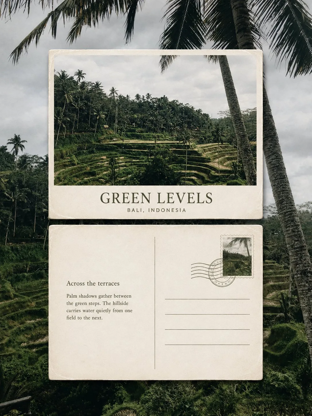
ChatGPT
TasarımChatGPT
Scenery memo postcard travel poster
Üretici @Hamburgerai
Prompt
Please turn each travel photo I upload into an independent "Scenery Memo Postcard" high-end editorial poster, no multi-photo collage, each photo output separately.

The overall composition uses a 3:4 vertical layout. The original photo serves as a clear, realistic, and recognizable full-frame background covering the entire canvas, faithfully preserving the location, subject, architecture, people, terrain, perspective, natural light and shadow, and authentic photography texture from the original photo. Apply only a slight high-end travel photography color grading and moderately reduce the contrast in the area behind the postcards to allow the physical cards to emerge naturally. Do not blur, redraw, replace, or randomly change the background photo.

Place two independent physical horizontal postcards in the center of the image, arranged vertically along the same central axis:

- Top: Postcard front;
- Bottom: Postcard back;
- Both cards must have the same width, same height, and use the same standard horizontal postcard ratio;
- Left and right edges strictly aligned, kept horizontal, no rotation, no tilting;
- Card width accounts for approximately 72%—82% of the overall image;
- Maintain a breathing space of about 5%—10% of the card height between the two cards;
- No overlapping, misalignment, side-by-side, or scattered arrangements.

The front of the top postcard uses a representative horizontal crop of the same original photo, highlighting the most recognizable subject, landmark, human action, or natural landscape in the photo. It must maintain an authentic photography texture and not be converted into an illustration. A short English main title and a real, accurate location name can be added.

The back of the bottom postcard uses warm white or off-white thick paper, preserving slight paper grain, edge wear, creases, and traces of collection. The back features a thin-line divider, four restrained address lines, a stamp in the top right corner, and a slight postmark.

The stamp design must be extracted from the same original photo, using silhouettes of landmarks, buildings, plants, vehicles, mountains, or figures from the photo; no second location or irrelevant patterns. The postmark is only an abstract mark, with no fabricated dates, zip codes, addresses, or fake postal information.

In the blank area of the back, add an original travel observation of no more than two sentences. The text should describe based on the location, light, weather, movement, and environmental imagery truly visible in the photo, being quiet, natural, and restrained, like a private note jotted down during a journey. Do not use famous quotes; do not fabricate stories that do not exist in the photo.

Before generation, please clearly write out and accurately present the following text:

Main Title:
"[Short English title extracted based on the photo]"

Location:
"[Real location, country]"

Back Subtitle:
"[Short travel observation title]"

Back Body:
"[A short English text of no more than two sentences created based on the actual scene]"

The font uses elegant and restrained editorial serif and simple postal sans-serif. Text colors are extracted from the original photo, such as dark gray, dark green, grayish blue, brown, etc., with low saturation, using one representative color from the photo as a minor accent. The text must be clearly legible, with no garbled characters or extra text.

The two cards use warm white thick paper material, with clear paper edges, slight wear, and natural short drop shadows, making them look like real collection postcards quietly placed on top of the original scenery.

The overall presentation merges the temperament of authentic photography, old postcards, travel publications, private correspondence, and collection archives: quiet, poetic, restrained, warm, with traces of time, while maintaining a high-end editorial design sense.

Avoid ordinary "original image on top, redrawn on bottom" diptych poster structures; avoid side-by-side arrangements, tilted cards, scattered collages, a third card, complex decorations, fictional place names, fake postal info, handwritten gibberish, excessive vintage filters, cartoonish feel, plastic 3D feel, e-commerce template feel, brand logos, and watermarks.
Metni kopyala, kendi detaylarını ekle ve kullandığın görsel modelinde dene.