 Piko
Piko Promptu incele ↗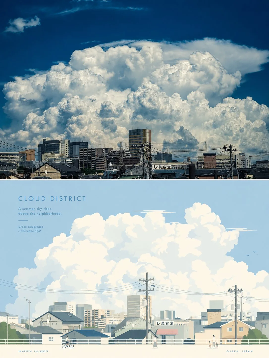
ChatGPT
TasarımChatGPT
Premium minimalist travel poster split composition
Üretici @xiaoxiaodong01
Prompt
Please turn each photo I upload into an independent high-end design poster, no multi-image stitching, output each photo separately. Use an overall 3:4 vertical composition, with the heights of the upper and lower areas strictly 1:1, each occupying 50% of the screen. The upper half preserves the original photo, maintaining the identity, structure, posture, realistic texture, natural light and shadow, and original color atmosphere of the subject, with only slight high-end photographic color grading to give it the quality of art magazines, independent publications, and exhibition photography. To adapt to the frame, the sky, ground, or environmental background can be naturally extended, but the subject must not be stretched, distorted, or changed. The lower half extracts the most recognizable **subject, outline, posture, and narrative relationship** from the photo, reconstructing it into a premium minimalist flat-vector travel poster style situational illustration. Do not mechanically trace the photo; instead, based on the visual personality of the original image, extract the most representative main visual focus and supplement it with 2–4 auxiliary elements that best illustrate the environmental temperament, daily lifestyle, sense of place, or state of life. Whether the original image is a city, building, person, animal, plant, object, vehicle, or natural landscape, the lower half should be like a high-end travel visual poster customized for it, rather than applying a fixed template. The composition should be reorganized according to the temperament of the subject itself, rather than repeating the same layout. Use a clear focal point, distinct foreground and background layers, moderate white space, and a quiet, orderly visual rhythm to establish the image; it can be naturally transformed into streets, squares, shores, courtyards, passages, platforms, plant scenes, indoor corners, open landscapes, or environmental fragments with life clues based on the original image. The subject is always the primary visual center, and other elements are only used to strengthen the uniqueness of 'this is this place / this object / this situation,' avoiding collage-style landmark stacking, postcard-style listing, and excessive narration. If figures are needed in the image, keep only 3–6 small-scale figures and let them naturally blend into the environment without a single protagonist. The overall style adopts **premium minimalist flat vector illustration**: Japanese stationery feel, boutique sticker illustration, modern editorial travel branding temperament, using simple geometric shapes, soft outlines, uniform line weights, flat color blocks, and restrained details, with a fresh, quiet, exquisite, and contemporary image. Avoid realism, heavy shadows, watercolor textures, paper textures, complex brushstrokes, gradients, crowded backgrounds, and excessive details. The color palette is based on soft, transparent, slightly desaturated high-end color systems, which can be extracted from the comprehensive color temperature of the original image for adjustment, but overall remains light and unified. Use **pale pink-blue, mist blue, sky blue, airy cool-toned blue** to create the main atmosphere, then use **ivory white, cream white, light beige, soft gray-green, architectural neutrals** to maintain balance; only allow a small amount of dusty rose or muted blush as tiny accents for flowers, clothing, small logos, awnings, or local decorations, making the image both breathable and layered with exquisite depth. The text logic should also be transformed into a part of this style. Do not directly apply city name templates; instead, extract a short title from the original image's **location, object name, keywords, state, or atmosphere**, place it in the upper left or a position with ample white space, and pair it with a short, restrained, and atmospheric tagline. The typography should maintain an understated, editorial, spacious, premium temperament, not overpowering the image; when necessary, a small amount of small-print information, coordinate-style annotations, or micro-descriptions can be added to make the text naturally integrate into the composition like a visual identifier in a high-end travel brand or boutique postcard, rather than a title bar pasted on later. The overall presentation should be like a **high-end travel poster / boutique lifestyle postcard** specially designed for the subject: fresh, elegant, quiet, modern, and exquisite, with sufficient white space and a relaxed sense of presence. Each lower half must have an independent visual identity and cannot just replace the name while using the same composition, the same foreground, and the same arrangement of objects. Avoid a sense of templates, a sense of copying, general travel poster formulas, and repetitive compositions.
Metni kopyala, kendi detaylarını ekle ve kullandığın görsel modelinde dene.


