 Piko
Piko Promptu incele ↗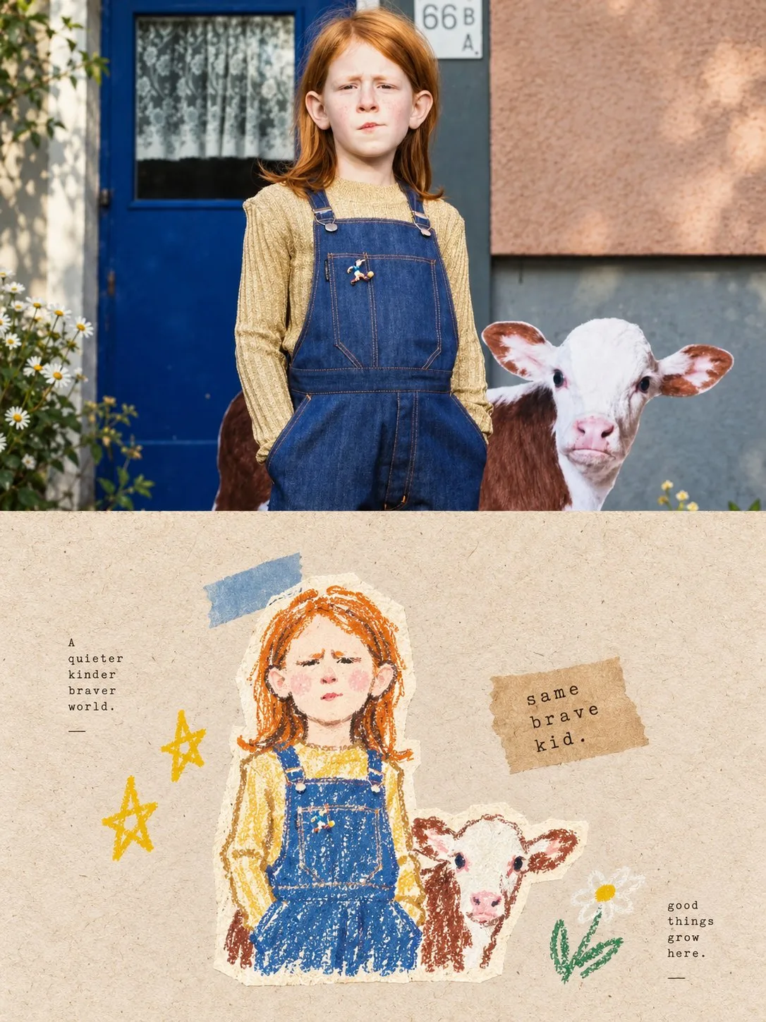
ChatGPT
TasarımChatGPT
Photo to pastel graffiti collage poster style
Üretici @xiaoxiaodong01
Prompt
Please make each photo I upload into an independent high-end design poster, no multi-photo stitching, each photo output separately. Overall adopt a 3:4 vertical composition, the upper and lower two areas are strictly 1:1 in height, each occupying 50% of the screen.

The upper part retains the original photo, keeping the subject identity, structure, posture, realistic texture, natural light and shadow, and original color atmosphere, with only slight high-end color grading to give it the quality of an art magazine, independent publication, or exhibition image. To adapt to the frame, the environment background can be naturally extended, but the subject must not be stretched, distorted, or changed.

The lower part first understands the core theme, subject relationship, structural trend, emotion, and visual metaphor most worth remembering from the original photo, then reconstructs it as a pastel hand-drawn graffiti material collage illustration with retro paper texture. Do not copy the photo object by object, nor fill the screen in a large area; instead, delete irrelevant details and keep only the structures, trends, and visual memory points that best represent the original. Through hand-drawn graffiti, material collage, pastel crayon texture, and a small amount of paper reorganization, perform clever re-drawing and re-expression, so people can recognize the correspondence between it and the photo above at a glance.

The subject shape is presented in a small-scale stamp-style main visual, not pursuing complete reproduction, but completing recognition through a few most critical outlines, postures, directions, and relationships. The subject lines adopt obvious chalk/crayon-style hand-drawn graffiti lines: slight variations in thickness, with dry particles, intermittent powdering, slight shaking, and incomplete closed edges, like a casual line sketch drawn directly on a rough paper surface. There can be slight tilts, repetitions, hesitations, and clumsiness, but it must not become a messy draft. Locally, short lines, cross-hatching, simple grids, and a small amount of smudging can be used to express structure, without realistic volume modeling.

The overall logic of material collage is still maintained. The subject and a small amount of auxiliary elements can be jointly composed of paper scraps, collage shapes, pastel color blocks, and hand-drawn symbols, retaining slight clipped edges, layering relationships, and a handmade feel, but only serving generalization and reconstruction, not trivial decoration. A very small amount of stars, flowers, ripples, geometric symbols, or lifestyle-related small graffiti related to the emotion of the original image can be added around it as a narrative echo, without forming a second visual center.

The composition maintains the relationship between small-scale stamps and large-area whitespace. Positions are freely arranged according to the subject's own direction, proportion, and visual focus, which can be eccentric, edge-aligned, suspended, or partially cropped. Whitespace must be a conscious compositional language, not an empty background. It, together with the subject, collage elements, text, and a few symbols, forms positive and negative shapes, density, gathering and dispersal, and asymmetrical balance, constituting an obvious sense of breathing, space, and pause. Better to delete than to fill, making the subject look like a visual stamp carefully placed in a large area of paper.

The background must form a clear yet gentle contrast with the subject; the hue, brightness, and texture must not all blur together. The background paper can use warm brown kraft paper, recycled paper, light-colored handmade paper, or other paper bases consistent with the temperament of the original image, but it must be distinguished from the subject in line brightness, color block brightness, or hue to let the subject emerge clearly. The background maintains real fiber and grain, clean and natural, without dirty or old stains.

Colors are extracted from the photo above by picking 2–4 of the most vivid, friendly, and representative colors to be re-modulated into a soft and clear pastel color set. It can naturally form light colors such as cream pink, peach orange, light sky blue, mint green, soft yellow, lavender, etc., and brighten with white or cream lines. The overall look should be bright, warm, healing, and have a sense of life, while being sufficiently distinguished from the background to avoid darkness, dirty browns, dull Morandi tones, fluorescent colors, and cheap candy feelings.

Text only acts as minimal editorial intervention, with no language restriction. A small amount of short sentences or text fragments can be freely refined from the subject, emotion, action, memory, or metaphor of the photo, using slender, sparse, light typewriter layout fonts with slightly uneven letter spacing and old-style printing errors, forming a contrast with loose hand-drawn lines. The text quietly scatters in the whitespace, placed close to the subject or arranged along the direction of the screen, jointly forming a natural mixed image-text relationship with the illustration, without using fixed title templates.

The overall presentation is a high-end visual effect composed of paper texture, pastel crayon graffiti, a small amount of material collage, a small-scale stamp subject, large areas of conscious whitespace, and loose mixed image-text layout. The focus is not to copy the photo, but to understand the visual language of the original image and then re-express the original theme in a cleverer, lighter, and more breathable way. Avoid object-by-object redrawing, background and subject blurring together, filling the screen, realistic portrayal, fine outlining, smooth vectors, excessive decoration, children's template feel, 3D feel, and commercial poster feel.
Metni kopyala, kendi detaylarını ekle ve kullandığın görsel modelinde dene.


