 Piko
Piko Promptu incele ↗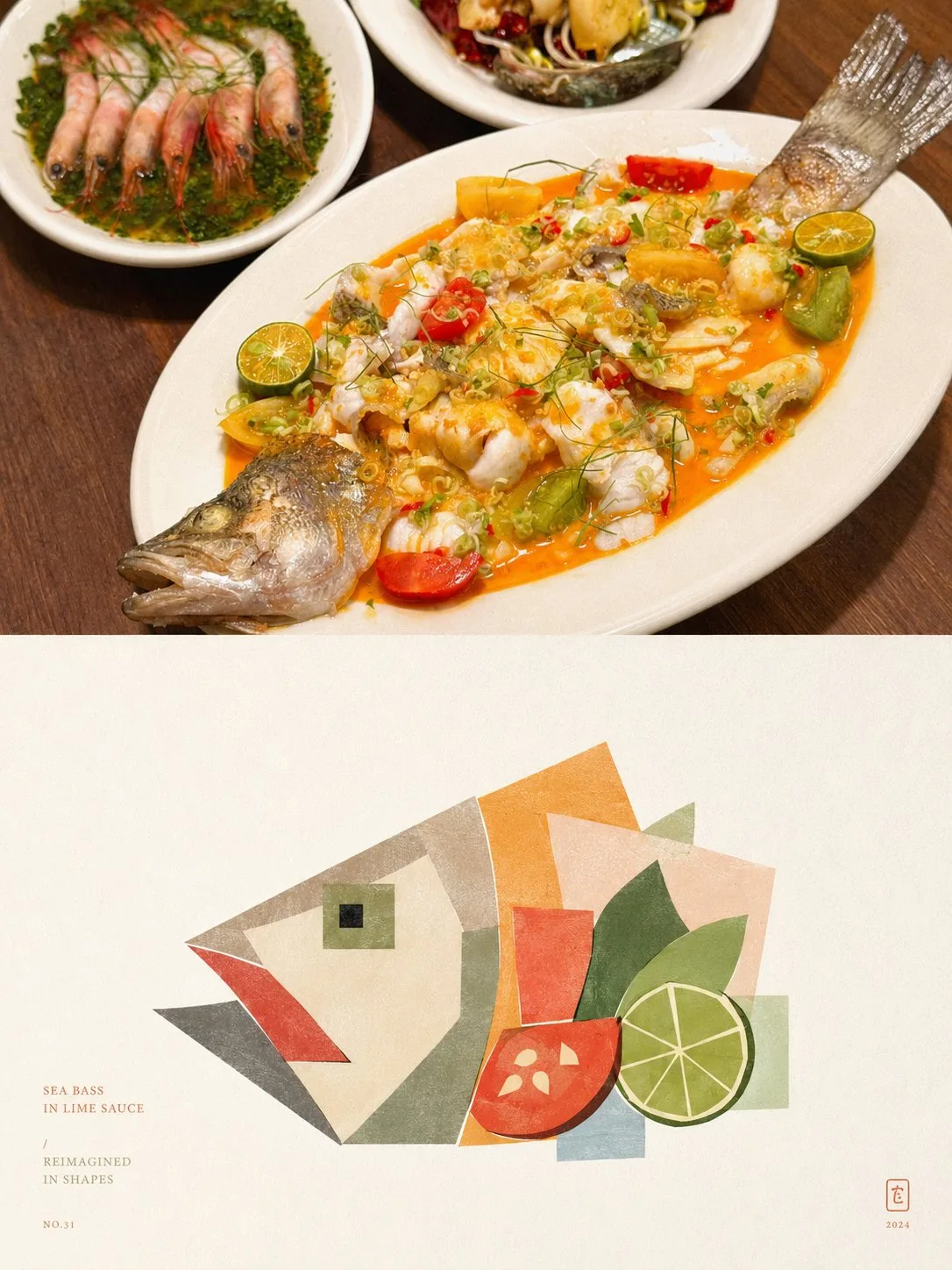
ChatGPT
TasarımChatGPT
Photo geometric deconstruction modular poster style
Üretici @xiaoxiaodong01
Prompt
Please turn each photo I upload into an independent high-end design poster, no multi-photo stitching, each photo output separately. Use a 3:4 vertical composition overall, with the top and bottom areas strictly 1:1 in height, each occupying 50% of the screen.

The top half retains the original photo, maintaining the subject's identity, structure, posture, realistic texture, natural lighting, and original color atmosphere, with only slight high-end color grading to give it the quality of art magazines, independent publications, and exhibition images. To fit the frame, the environmental background can be naturally extended, but the subject must not be stretched, distorted, or changed.

The bottom half extracts the most recognizable subject, outline, structure, posture, and narrative relationship of the photo, and reconstructs them into blocky, modular geometric deconstruction illustrations. Do not fully copy the photo, nor paint realistically; instead, remove irrelevant details and only keep the visual memory points that best represent the original object's identity and temperament. Re-establish the image through geometric generalization, shape overlapping, and collage-style reorganization, so that people can recognize the correspondence between it and the photo above at a glance.

The overall styling emphasizes a sense of blocks, modules, geometric segmentation, and complete large facets. Geometric splitting should not be too fragmented; do not cut into a large number of scattered small pieces, but organize the subject with fewer, larger, and more complete rectangles, squares, rounded corners, ellipses, triangles, and irregular blocks. People can be expressed with square faces, clear jawlines, and blocky facial features; buildings can be transformed into square volumes, facade partitions, window rhythms, and structural turns; animals, plants, objects, and landscapes should also be refined into geometric forms with blocky order and modular relationships. Moderate exaggeration and deformation are allowed, but the overall result must be mature, restrained, and concise, avoiding trivialization, infantilization, and being too scattered.

The overall styling adopts flat color blocks + collage-style composition + modernist geometric language. Color blocks are re-stitched like pieces of paper, forming a vivid but orderly collage feel; complex backgrounds are actively deleted, leaving only a few necessary shapes or auxiliary blocks, without forming a second visual center.

The composition maintains a relationship of small-scale subjects / large areas of white space, freely arranging positions according to the subject's own direction, proportion, visual focus, and structural trend. It can be off-center, edge-aligned, or partially cropped, but always maintain clear primary and secondary roles, rhythmic density, and editorial balance. The overall image emphasizes positive and negative shapes, block weight, breathing white space, and layout order, giving the bottom half both a sense of art and the temperament of high-end publications.

The material presents gentle paper grain and a slight printmaking feel: retain fine paper texture, soft noise, and a slight printing texture on top of the geometric color blocks, making the image closer to paper collage or art print works. Avoid smooth vectors, 3D rendering, photo filters, and over-refinement.

The color scheme extracts 2–4 of the most recognizable, pleasing colors that best embody the subject's temperament from the photo above and reorganizes them into a more high-end color system. The overall palette can be moderately brightened, purified, and desaturated, transformed into lighter, modern, and durable color block relationships such as creamy white, apricot, peach pink, coral orange, misty blue, gray-green, sage green, warm brown, and soft purple. The main colors are vivid but not harsh, the auxiliary colors are gentle and layered, and the overall temperament is clean, warm, fashionable, and approachable, avoiding earthy yellow, dirty gray, dark brown, fluorescent colors, cheap candy feelings, and cluttered color schemes.

A small amount of text intervenes, with no language restrictions. Short titles, small annotations, numbers, or explanatory fragments can be freely refined based on the subject's identity, location, mood, temperament, or symbolic meaning. The text should be small, light, and restrained, naturally falling in white space or layout corners, forming an exquisite graphic-text relationship with the graphics, without stacking commercial titles.

The overall presentation features geometric deconstruction of complete large blocks, restrained collage, soft high-end color schemes, paper grain, large areas of white space, and editorial layout forming a visual effect together. Whether the subject is a person, building, animal, plant, object, or natural landscape, it should maintain a clear identity, modular geometric order, and a unified artistic language. Avoid realistic depiction, over-fragmented cutting, naive collage, complex perspective, overly dense details, cartoonish feel, 3D feel, templated poster feel, and cheap cultural and creative feel.
Metni kopyala, kendi detaylarını ekle ve kullandığın görsel modelinde dene.


