 Piko
Piko Promptu incele ↗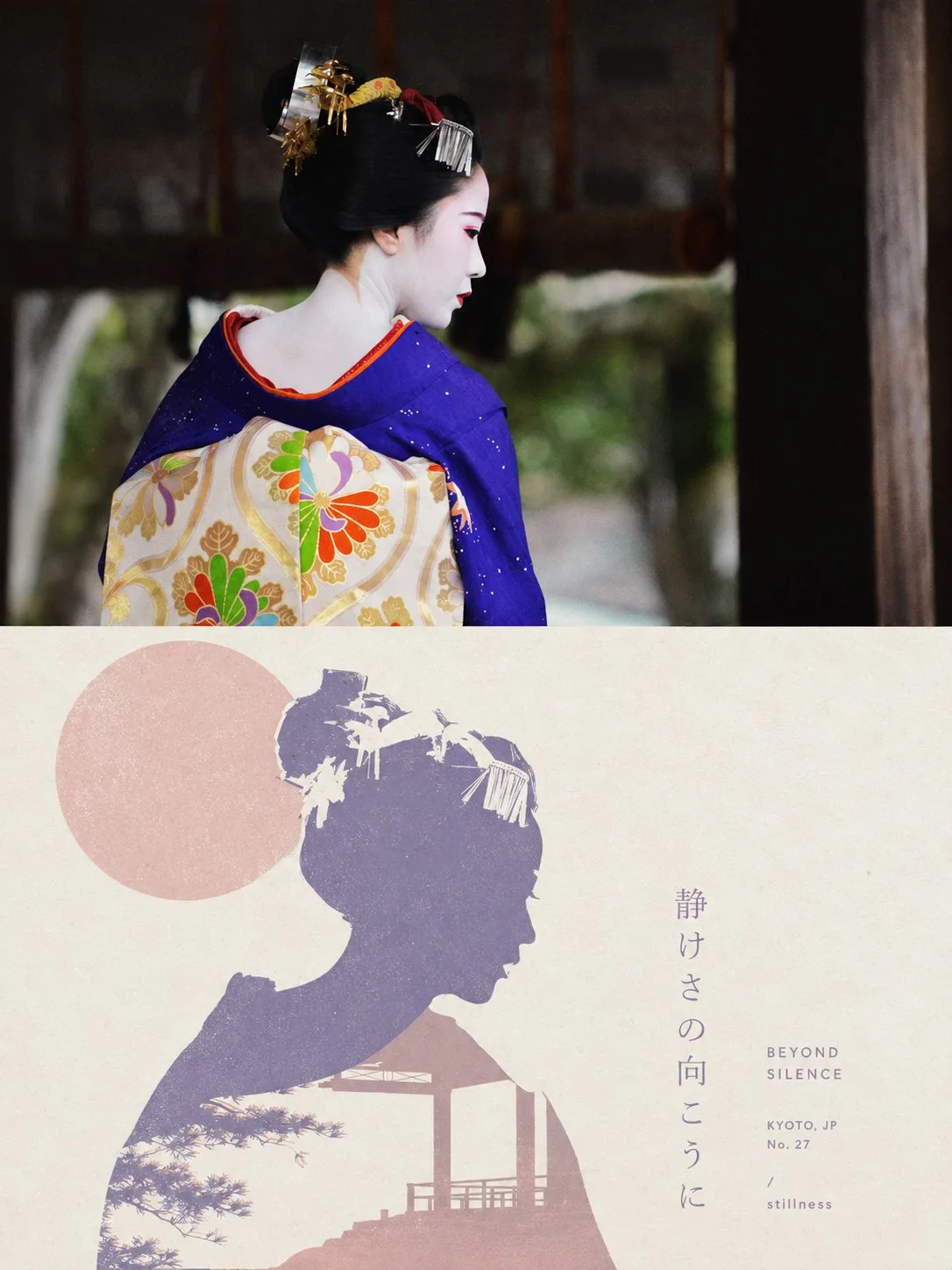
ChatGPT
TasarımChatGPT
Morandi minimalist gestalt screenprint poster design
Üretici @xiaoxiaodong01
Prompt
Please make each photo I upload into an independent high-end design poster, no multi-photo stitching, each photo output individually. The overall composition uses a 3:4 vertical layout, with the upper and lower regions strictly 1:1 in height, each occupying 50% of the screen.

The upper part retains the original photo, maintaining the main structure, realistic texture, natural light and shadow, and original color atmosphere, with only slight high-end photography color grading to give it an art magazine, independent publication, and exhibition photography texture. To fit the frame, the sky, ground, or environmental background can be naturally extended, but the subject must not be stretched, distorted, or changed.

The lower part extracts the most recognizable subject, outline, posture, and narrative relationship from the photo, reconstructing it into a minimalist Gestalt positive and negative space screen print. Retain the most recognizable outer contour of the subject, while extracting an environment, structure, object, or symbolic image most closely related to it from the original photo, allowing the two to merge into a complete graphic through contour interlocking, negative space hollowing, boundary sharing, and figure-ground reversal: seeing the subject first from a distance, and discovering another layer of scene or image hidden within upon closer inspection. Do not simply stack two objects; let the edge of one shape naturally become the boundary of another.

The composition maintains a single visual anchor, clear silhouette, and large areas of white space, with positioning determined by the subject's own posture, orientation, center of gravity, and contour trend, using eccentricity, partial cropping, upper and lower nesting, or edge alignment to create a clever visual transition between positive and negative shapes. Auxiliary elements must be minimal, letting visual interest mainly come from the momentary switch between 'seeing what' and 'seeing what again,' rather than complex decoration.

The color scheme uses a healing, soft, and high-end Morandi pastel system, referring to the low-saturation color logic in dreamlike architectural spaces: misty pink, soft apricot, grey-green, sage, light terracotta, cream yellow, misty blue, grey-purple, etc., coordinating with each other, with a light-colored paper surface as the base, selecting the most spirited color relationships from the original photo for softening and recombination. Control the overall to 2–4 colors, establishing layers through a combination of color temperature, brightness difference, and area ratio. Colors are clean, soft, and airy, avoiding dirty grey, heavy aging, neon colors, and high-contrast commercial color schemes.

Retain slight paper fibers, screen printing particles, ink coverage, and registration deviations, giving the graphics a real printmaking touch, but keeping edges sharp and color blocks flat, without using gradients, 3D volume, realistic shadows, or smooth CG textures.

Text also participates in the positive and negative space composition. Extract a short English title from the photo's identity, location, action, emotion, state, or symbolic meaning, paired with a very small amount of location, number, status words, or micro-annotations. Text can be arranged along the subject's contour, negative space boundary, horizontal baseline, or white space axis, or partially embedded in graphics, cut by contours, or blocked by color blocks, making the text like a part of the print structure rather than a title pasted on later. The overall look remains small, restrained, clever, and with a high-end editorial feel.

The overall presentation combines minimalist geometry, Gestalt optical illusion, soft Morandi colors, screen printing, and poetic narrative visual temperament. Whether the subject is a person, animal, plant, building, object, vehicle, or natural landscape, it should maintain the dual reading experience of 'recognizing the subject at first glance and discovering the hidden image at second glance,' avoiding multiple parallel focal points, direct collage, complex illustrations, cartoonish feel, commercial promotional feel, and template feel.

Text preference: english
Metni kopyala, kendi detaylarını ekle ve kullandığın görsel modelinde dene.


