 Piko
Piko Promptu incele ↗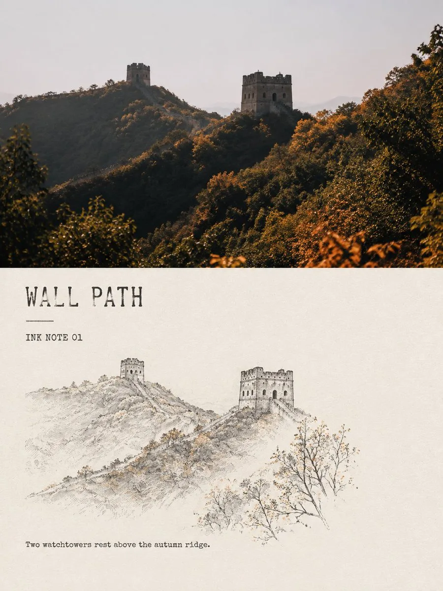
ChatGPT
TasarımChatGPT
Minimalist ink line landscape travel note comparison poster
Üretici @Hamburgerai
Prompt
Please create each of my uploaded travel photos into an independent 'Minimalist Ink Line Landscape Note' comparison poster, without stitching multiple images, outputting each photo separately.

Adopt a 3:4 vertical composition overall, clearly maintaining the visual contrast of 'original photo above, stylized re-drawing below'. The proportions of the upper and lower areas can be naturally adjusted based on the content of the original image, rather than being mechanically divided equally, but the two parts must have clear boundaries and a clear reading relationship, jointly constituting a complete editorial design work.

The upper part preserves the original photo with high fidelity: maintain the location, main subject, architectural structure, character posture, natural light and shadow, spatial layers, and original color atmosphere; do not replace scenes, change key objects, stretch subjects, or fabricate landmarks that do not exist in the original image. Perform only slight and restrained magazine photography color grading; if needed to fit the frame, naturally extend the sky, water surface, ground, or environmental background.

The lower part uses warm rice white or natural paper white as the complete base, refining the photo into a small, minimized minimalist ink line landscape sketch. Do not fully copy the original image, and do not draw the entire frame with line work; actively filter the most recognizable and poetic few pieces of information from the frame, such as: an architectural or topographical structural anchor point, a ridge or shoreline, a plant with a certain posture, a small figure or a travel object, and one or two weather and spatial clues.

Delete irrelevant crowds, cluttered vegetation, repetitive buildings, and trivial backgrounds. The re-drawn subject should occupy only about 38%–62% of the width of the lower area, retaining about 55%–72% of continuous, complete, and perceptible paper white.

Lines should use black or deep grey-black fine steel pen, dry ink, and slight brush 'flying white' texture: allow for thickness variations, pauses, intermittence, paper grain, ink leakage, and unclosed outlines, making it look like a quick but accurate observation sketch made during travel.

Architecture relies on a few structural lines to show proportion; peaks and distant views retain only sparse outlines; water surfaces, fog, sky, and distance are mainly completed through white space; plants do not depict leaves one by one but represent posture through branch direction and very few ink dots. Avoid large areas of grey ink wash, and avoid drawing them as complete traditional landscape paintings or precise architectural drawings.

The color scheme is primarily black ink, allowing for a maximum of two small areas of accent colors extracted from the original photo, such as cinnabar red, autumn leaf ochre, lotus pale pink, moss grey-green, or fishing net warm yellow. The total area of accent colors should not exceed 8% of the lower frame, falling only on one most memorable part, without watercolor full-spread, colored outlines, or high-saturation decoration.

Text should be like headers and captions of small travel publications, few in number but clear and readable. Generate a short English title based on the photo content, paired with a numbering field 'INK NOTE 01' and a very short English observation sentence.

The title can use restrained serif, typewriter, or slightly irregular manual printing fonts; text is placed in the main white space areas, maintaining a breathing distance from the illustration, not pressing against the main subject, not using ornate calligraphy, and not generating Chinese seals, author signatures, brand names, or watermarks. Different images only change the title, number, and observation sentence, keeping the overall layout and font temperament consistent.

The final image should present a clear contrast between real travel photography and a light ink line observation sketch; quiet, restrained, and airy, like a page taken from an independent travel journal, an architectural observation book, or a private sketchbook. The focus is not on showing off techniques, but on letting a location, a type of weather, or a brief movement from the original photo be seen again through subtraction, stopping the pen, and paper white.

Avoid: direct line-art filtering of the entire photo, complete repetition of upper and lower content, filling the lower frame entirely, continuous grey washes, traditional Chinese painting full compositions, complex leaves, precise cross-hatching, comic-style architecture, cartoon characters, watercolor filling, high-saturation color clashing, pseudo-Chinese characters, copying signage text from photos, author names, watermarks, e-commerce template feel, and cheap vintage filters.
Metni kopyala, kendi detaylarını ekle ve kullandığın görsel modelinde dene.


