 Piko
Piko Promptu incele ↗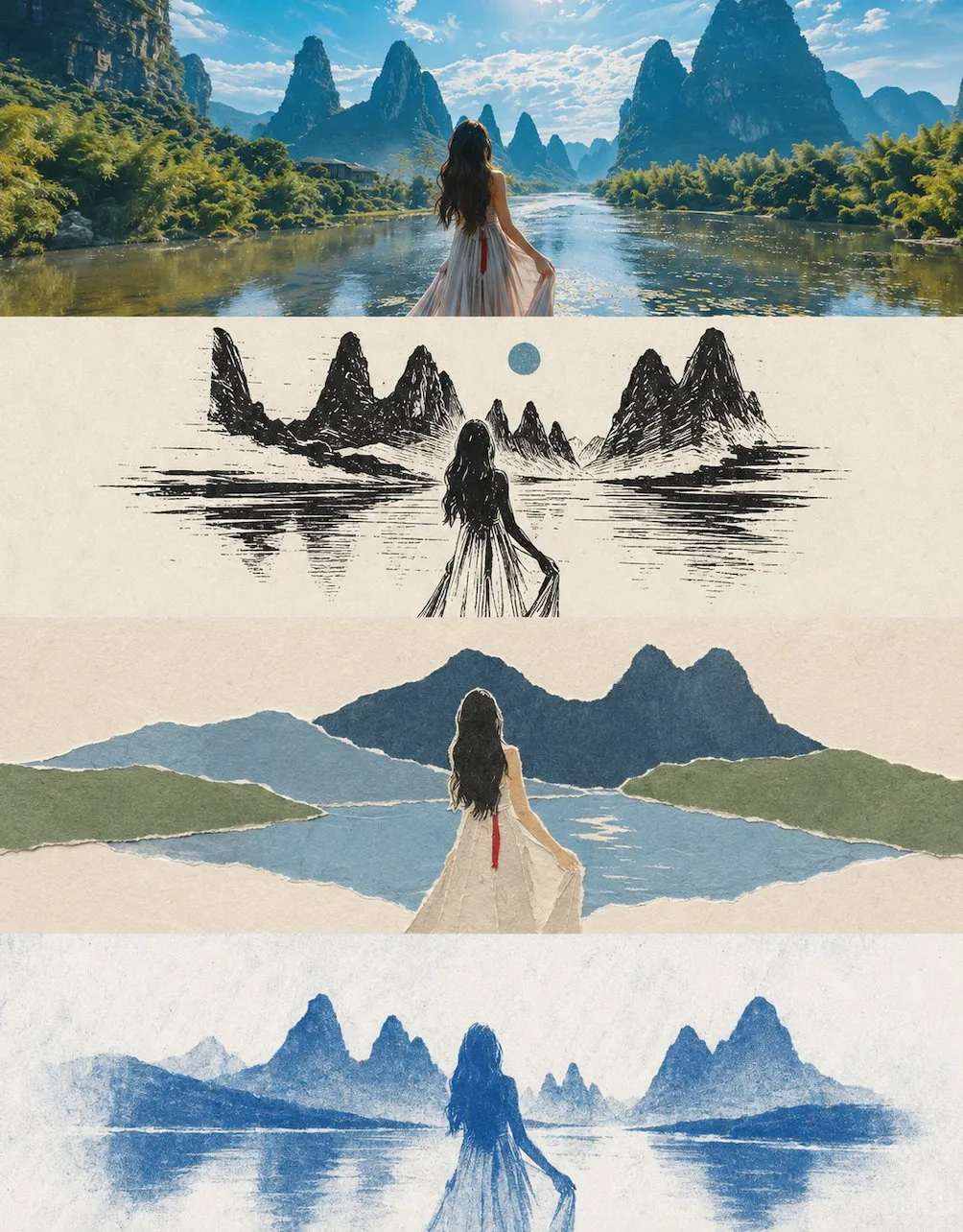
ChatGPT
TasarımChatGPT
Minimalist four layer artistic collage poster
Üretici @zhidawang219555
Prompt
Please turn my uploaded photo into a vertical collage poster with an overall 3:4 vertical composition. The image is strictly divided into four horizontal areas from top to bottom, and the height of each area must be precisely controlled at 25% of the overall image height (the ratio of the four layers is strictly 1:1:1:1, no ratio deviation allowed). The areas are connected seamlessly without dividing lines or gaps. The order is: original image → Style 1 → Style 2 → Style 3. Since each layer has an extremely wide ratio of approximately 3:1, it is suggested that the main subject of each layer be arranged horizontally centered, emphasizing open white space and a sense of breathing on the left and right, avoiding vertical stretching deformation or crowded edges. The four layers maintain continuity and resonance in character positioning, scene structure, and line of sight, presenting an overall sense of the same scene through four translations. The style layers (layers 2 to 4) must follow the principle of minimalism: the number of visual elements in each layer is compressed to the minimum, retaining only 1 most core main symbol, and all other secondary decorations, background details, and foil elements are omitted. The white space ratio is no less than 60%.

The first layer retains the main structure, real character interaction relationships and poses, real texture, natural light and shadow, and the original color atmosphere of the original photo. Only slight high-end photographic color grading is performed to present a magazine photography texture, without changing the character relationships and composition logic. The sky, ground, or environmental background can be naturally expanded without changing character relationships and composition logic to make the whole more spatial and narrative.

The second layer is in woodcut style: high-contrast black and white woodcut knife marks express scene textures and character silhouettes, supplemented by one or two limited color accents. The background is cream or light gray paper, and the knife mark lines are bold and powerful but not messy. Colors are mainly black and cream, paired with one accent color. Avoid overly dense knife marks and avoid too many grayscale levels that make the image look gray.

The third layer is in torn paper collage style: torn edge paper color blocks are used to represent characters and the environment, and the layered edges retain natural tear textures. The background is a cream kraft paper base color. The main elements are composed of several torn edge colored papers stacked together, with no more than three layers. Colors are controlled within 2 to 4 natural color systems. Avoid clutter caused by too many paper pieces and avoid overly fine cut edges.

The fourth layer is in cyanotype style: using cyanotype photography (blueprinting) style, with single Prussian blue and white representing character and environment silhouettes, creating an old craft texture. The background is cream or light bluish-white, and there may be a slight graininess from development. The color is a monochromatic system of Prussian blue and white. Avoid adding other miscellaneous colors and avoid overly heavy graininess that looks dirty.

Each layer needs to uniformly convert the subject and scene into the corresponding style. The overall expression is extremely restrained and simplified, retaining only the most core main symbol and its basic outline relationship, deleting all non-essential background elements, decorative details, and foil items; the key positional relationships, interaction directions, and pose characteristics between characters must be retained but should be abstracted into recognizable outline relationships, achieving "fewer elements, clearer relationships." Colors are all extracted and summarized from the original image, with each layer strictly controlled within 2-4 main colors. The height ratio of the four areas must be strictly maintained at 1:1:1:1 (25% each), and no splicing misalignment or ratio deviation should occur. Overall, avoid punk/cyberpunk styles, forced overlay of realistic photo textures, cartoon styles, 3D rendering feel, commercial poster feel, complex background stacking, too many elements or crowded images, similar styles in adjacent layers, and any text, logos, watermarks, or titles.
Metni kopyala, kendi detaylarını ekle ve kullandığın görsel modelinde dene.


