 Piko
Piko Promptu incele ↗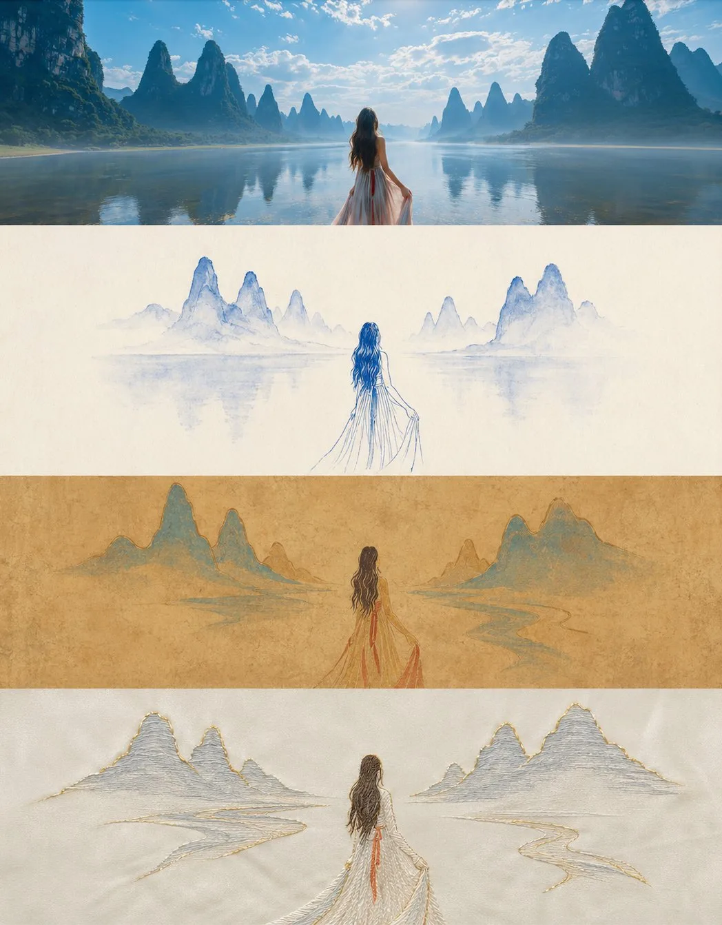
ChatGPT
TasarımChatGPT
Minimalist four layer art style vertical poster
Üretici @zhidawang219555
Prompt
Please turn the photo I uploaded into a vertical collage poster with an overall 3:4 vertical composition. The image is strictly divided into four horizontal areas from top to bottom, and the height of each area must be precisely controlled at 25% of the overall image height (the four-layer ratio is strictly 1:1:1:1, no ratio deviation allowed), with seamless connection between areas, no dividers or gaps. The order is: Original Image -> Style 1 -> Style 2 -> Style 3. Since each layer has an extremely flat and wide aspect ratio of approximately 3:1, it is suggested to arrange the subjects of each layer centered horizontally, emphasizing open white space and a sense of breathability on the left and right, avoiding longitudinal stretching, deformation, or crowded edges. The four layers maintain continuity and resonance in terms of character positioning, scene structure, and eye direction, presenting an overall sense of one image with four translations. The style layers (second to fourth layers) must follow minimalist principles: the number of visual elements in each layer is compressed to the minimum, retaining only one core subject symbol, while other secondary decorations, background details, and foil elements are all omitted, with the white space proportion no less than 60%.

The first layer retains the original photo's main structure, real character interactions and poses, real textures, natural light and shadow, and the original color atmosphere, with only slight professional photography color grading to present a magazine photography texture, without changing the character relationships or composition logic. The sky, ground, or environmental background can be naturally extended without changing character relationships or composition logic to make the overall look more spacious and narrative.

The second layer is in Blue and White Porcelain style: borrowing from blue and white porcelain painting techniques, using cobalt blue lines and smudging on a cream-white base to represent characters and scenes, presenting the sparse and elegant feel of porcelain patterns. Colors are monochromatic, mainly cobalt blue and cream-white. Avoid too many levels of blue intensity that look messy, and avoid piling up patterned decorations.

The third layer is in Dunhuang Mural style: borrowing the mineral heavy-color texture of Dunhuang murals to express a primitive and mottled beauty, lines and color blocks need to be simplified. The background is an earth yellow or ochre base color with a mottled mural texture. Colors are mainly ochre, azurite, cinnabar, and earth yellow. Avoid piling up too many crack textures and avoid complex pattern decorations.

The fourth layer is in Embroidery Brocade style: using embroidery stitch textures to represent characters and scene outlines, presenting silk luster and needlework texture, the patterns must be minimally summarized. The background is a cream-white or light gray satin base color. Colors consist of 2 to 3 soft colors paired with gold thread accents. Avoid overly dense stitches that look complicated, and avoid too many gold threads that look flashy.

Each layer must uniformly convert the subject and scene into the corresponding style, with overall expression being extremely restrained and simplified, keeping only the most core subject symbol and its basic outline relationship, deleting all non-essential background elements, decorative details, and foils; key positional relationships, interaction directions, and postural characteristics between characters must be retained but should be abstracted into recognizable outline relationships, achieving 'fewer elements, clearer relationships'. Colors are all extracted and summarized from the original image, with each layer strictly controlled within 2-4 main colors. The height ratio of the four areas must be strictly maintained at 1:1:1:1 (25% each), with no splicing misalignment or ratio deviation. Avoid cyberpunk/cyberpunk styles, forced superposition of realistic photo textures, cartoon styles, 3D rendering feel, commercial poster feel, complex background stacking, excessive elements or crowded screens, similar styles between adjacent layers, and any text, logos, watermarks, or titles.
Metni kopyala, kendi detaylarını ekle ve kullandığın görsel modelinde dene.


