 Piko
Piko Promptu incele ↗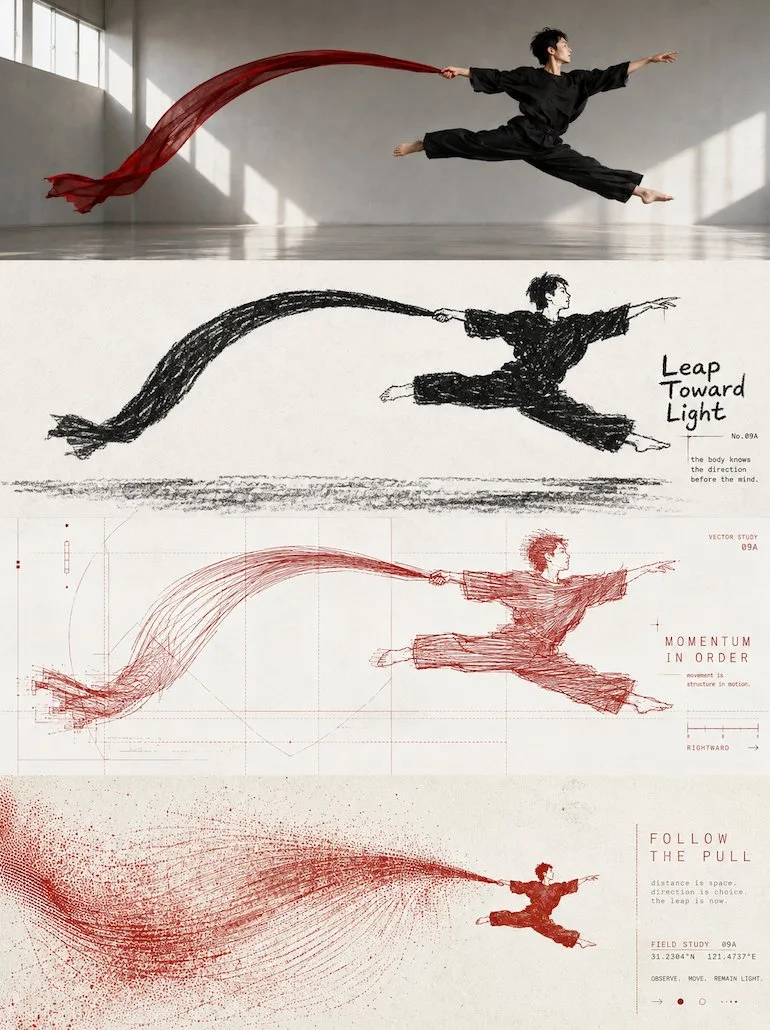
ChatGPT
TasarımChatGPT
Four layer style evolution poster design
Üretici @zhidawang219555
Prompt
Please turn each photo I upload into an independent high-end design poster, no multi-photo stitching, each photo output separately. Overall adopts a 3:4 vertical composition. The screen is strictly divided from top to bottom into four horizontal areas, the height of each area must precisely account for 25% of the overall screen, the ratio of the four layers is strictly 1:1:1:1, no ratio deviation allowed. Seamless transition between areas, no dividers, no white space gaps. The 'no white space gaps' here only means that the seams between layers cannot have gaps; the interior of each layer can still retain negative space, paper, or solid color backgrounds according to the corresponding style. All four layers are based solely on the same uploaded photo, presenting the same subject, the same moment, and the same spatial relationship. Strictly maintain consistency in subject identity, quantity, key structure, proportions, posture, movement direction, line of sight, observation perspective, perspective, occlusion, left-right position, front-back relationship, and core narrative. The four layers are not four unrelated new compositions, but a continuous style translation of the same image. Since each layer is an extremely flat banner of about 3:1, the subject should be organized horizontally, and appropriate breathing space should be reserved on the left and right; natural horizontal extension or slight cropping of the background is allowed, but the subject must not be stretched vertically, key parts must not be cropped, character relationships must not be changed, or scenes unrelated to the original image must not be created. The visual center of gravity, subject proportion, and contour landing points of the four layers should be aligned vertically as much as possible, forming a coherent evolution from real photography to the target style. Each layer must completely fill its own 25% area. Do not add layer numbers, dividers, borders, collage gaps, watermarks, or logos. Unless a layer style description explicitly requires small amounts of editorial text, bill marks, or handwritten notes, do not generate extra text; even if text is needed, it must be small, restrained, not block the subject, and avoid gibberish as much as possible. Layer 1 | Original Photography: Directly retain the real photography state of the uploaded photo as the visual benchmark for the style translation of the subsequent three layers. Maintain the original person or subject identity, quantity, facial features, hairstyle, clothing, structure, proportions, posture, movements, line of sight, interactive relationships, observation perspective, perspective, occlusion, environmental direction, natural light and shadow, and core colors, without performing illustration, texture transformation, geometrization, or 3D reconstruction. To adapt to the extremely flat banner of about 3:1, only natural extension of the left and right sides of the background that conforms to the original scene logic is allowed, or slight cropping that does not damage the subject; the subject's proportions must not be changed, people or buildings must not be stretched, and the head, hands, feet, key objects, or important narrative relationships must not be cropped. The screen remains natural, real, and clear, avoiding excessive skin smoothing, exaggerated color grading, fictional scenery, and decorations unrelated to the original image. Layer 2 | Black and White Thick Crayon Silhouette: In the roughly 3:1 flat horizontal banner area of this layer, translate the real subject of the first layer into a 'black and white thick crayon silhouette' style. Maintain consistency with the first layer's subject identity, quantity, key structure, posture, left-right position, perspective, spatial relationship, and core narrative, and then fully implement the following visual requirements: Extract the most recognizable subject, outline, posture, and narrative relationship from the photo, and reconstruct it as a minimalist thick black dry medium silhouette illustration. Do not mechanically trace photo details, but compress the subject into a rounded, thick, slightly naive generalized form; the head, main outline, or most memorable parts can be appropriately enlarged so that it can still be identified at a glance with minimal information. If the photo contains multiple subjects, retain the most important interactive relationship and treat them as a single visual unit rather than spreading focus evenly. This layer only uses nearly pure white paper base + thick black crayon, charcoal, or dry erase marks, no colors, no grayscale gradients. The black form is not a smooth solid vector block, but is formed by repeated smearing of short, forceful crayons, retaining paper grain, broken strokes, indentations, rough edges, uneven thickness, and local white exposure. The outline is slightly shaky, incomplete, and imprecise, giving the screen a real handmade feel. The most critical identification features of the subject can be strengthened through 'white feature areas suddenly cut out from the black silhouette,' such as the face, around the eyes, window holes, vessel openings, animal faces, key structures of objects, or the most identifiable parts; then use minimal black dots, short lines, or symbols to complete expressions and details. Do not pursue realistic facial features and precise structures, but let a direct, interesting, and strong identification relationship form between black and white. Composition maintains large areas of pure negative space + one main visual relationship. The subject can be centered and suspended, or slightly offset, partially cropped, or close to the bottom of the screen, using only a rough ground friction line, a few short lines, or minimal environmental symbols to suggest space. Grass, rain, smoke, table, shadow, road, wind, or other environmental information should be compressed into minimal crayon marks, keeping the background quiet and empty. Overall does not pursue complex scenes, but lets a posture, action, distance, or relationship bear the main narrative. Text retains a system of small characters where a sense of high-end editorial and children's book coexist. Do not just write the name of the place or object, but extract a short English title from the emotions, actions, relationships, time, or tiny stories in the photo, and then pair it with a number, a matching gold sentence, a chapter number, or a very short, implicit piece of copy. The text can be restrained small printed characters, or a very small amount of clumsy handwriting, crayon characters, or incomplete regular font shapes can be added, making it look as if it originally belonged to this illustration. Text needs to have a clever relationship with the graphics: it can be arranged along the ground line, extended along the direction of the subject's movement, hidden in large areas of negative space, slightly blocked by the outline, stuck in the negative space between two subjects, or use a thin line to connect the number to the subject. Maintain 'one short title + 1–2 groups of tiny auxiliary text' to let the text become part of the composition's rhythm, rather than a common poster title. Overall presents visual characteristics of thick black, clean white, simple shape, and rough texture, maintaining a subtle balance between childishness, gentleness, quietness, humor, and loneliness, like an old black-and-white children's book re-edited by a high-end design studio. Avoid smooth digital strokes, precise line drawings, realistic light and shadow, impasto, 3D effects, color, large-area gray rendering, cartoon sticker feel, and templated commercial illustration. Layer 3 | Geometric Order Linear Experiment: In the roughly 3:1 flat horizontal banner area of this layer, translate the real subject of the first layer into a 'geometric order linear experiment' style. Maintain consistency with the first layer's subject identity, quantity, key structure, posture, left-right position, perspective, spatial relationship, and core narrative, and then fully implement the following visual requirements: Extract the most recognizable subject, outline, posture, and narrative relationship from the photo, and reconstruct it as a linear experimental poster with geometric order. The subject is manifested by high-density repeating lines, misplaced outlines, short loops, and slight jitter trajectories, retaining clear identification edges while maintaining instability and flow internally; the periphery uses lines of the same origin but thinner, sparser, and lighter to spread outward, and establishes a rational structure with horizontal, vertical, diagonal, arc, tangent, or implicit grids, forming visual tension with high density in the center and low density on the periphery, where geometric order and free linearity coexist. Color extraction: from the uploaded original photo, extract the color that is most vital, most recognizable, and best represents the spirit of the subject as the main line color; do not take the average color by area, and do not deliberately age or gray it; it can be appropriately purified, brightened, and corrected to make the color cleaner, more vivid, and more modern. Overall adopts a clean light-colored background, a single main line color, and black-gray micro-typography, forming layers through line density, thickness, and overlapping, avoiding dirty colors, grayness, fixed blue tones, multi-color mixing, and digital gradients. Text intervenes cleverly as part of the composition, extracting a very short English title from the emotion, action, time, state, or metaphor of the photo, and pairing it with a small amount of numbers, matching philosophical gold sentences, state words, scales, or micro-annotations. Text can be arranged along geometric axes, subject outlines, or line field boundaries, arranged horizontally, vertically, rotated, interspersed, or misplaced, forming a sense of high-end editing through tiny font size, thin font weight, wide letter spacing, and precise alignment, so that rational typesetting suppresses the restlessness of free lines. Overall maintains large areas of negative space, a single visual focus, and clear geometric order, presenting a clean, restrained, sharp, experimental, artistic, and vital visual temperament. Avoid random graffiti, directionless yarn balls, dirty old vintage, cyber-tech feel, commercial promotion feel, cartoon feel, and template feel. Layer 4 | Dynamic Magnetic Field Grain Print: In the roughly 3:1 flat horizontal banner area of this layer, translate the real subject of the first layer into a 'dynamic magnetic field grain print' style. Maintain consistency with the first layer's subject identity, quantity, key structure, posture, left-right position, perspective, spatial relationship, and core narrative, and then fully implement the following visual requirements: Extract the most recognizable subject, outline, posture, and narrative relationship from the photo, and reconstruct it as a surreal minimalist print visual. Compress the subject into a clear and restrained visual anchor, usually placed in a large area of negative space on a small scale, retaining only the most critical outline and posture; do not replicate complex details, but let the actions, directions, light and shadow, or spatial relationships in the original image transform into a dynamic field expanding around the subject. The dynamic field naturally chooses a main movement logic according to the subject's own characteristics: prioritized to flow horizontally or diagonally, spread from the core to both sides, or form irregular ripples and echoes; only when the original action itself is clear, retain short-distance falling or rising. Use a large number of thin lines, broken trajectories, coarse dots, and changes in grain density to express movement, denser and stronger near the core, gradually thinning, breaking, and disappearing into negative space towards the edges. Avoid stacking multiple special effects at the same time, let one subject, one movement, and one huge spatial relationship become the core of the screen. Color extraction: from the uploaded original photo, extract the most recognizable and spirited primary color, and form a strict 2–3 color system with warm white, ivory white, or natural paper color and a small amount of black. The primary color can be appropriately purified and strengthened, making it vivid and powerful but not overly digital; form depth through dot density, ink layering, and paper negative space, rather than common gradients. Retain silk screen printing, Risograph, coarse grain, paper fiber, uneven ink coverage, and slight overprint deviation, avoiding computer rendering, 3D, real light effects, and smooth digital illustration feel. Text establishes a restrained experimental art book micro-typography system. Extract a very short English title from the action, distance, state, emotion, or metaphor of the photo, and pair it with 2–4 groups of micro-text, which can be freely combined from short phrases, state words, place or object information, serial numbers, coordinate-style numbers, direction words, archive labels, or observation notes. Text can be arranged along the horizon, dynamic trajectory, subject axis, or negative space edge, or it can be arranged vertically, rotated, with widened letter spacing, embedded in the grain field, or slightly passed through by lines, so that the typesetting itself participates in space and movement, rather than being independently pasted on the screen. Overall pursues tiny subjects, huge negative space, strong scale contrast, a single dynamic field, and coarse printing texture, presenting a quiet, lonely, mysterious, poetic, and slightly surreal experimental editorial visual. Whether the subject is a person, animal, plant, building, utensil, vehicle, or natural landscape, it should maintain a clear identity echo between the original image and the abstract field, avoiding complex scenes, multiple focuses, decorative stacking, common gradients, commercial poster feel, and template feel.
Metni kopyala, kendi detaylarını ekle ve kullandığın görsel modelinde dene.


