 Piko
Piko Promptu incele ↗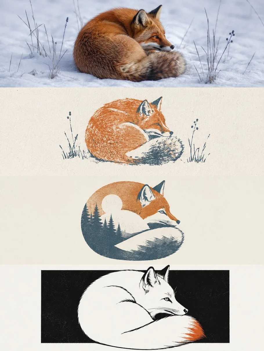
ChatGPT
TasarımChatGPT
Four layer progressive multi style poster design
Üretici @zhidawang219555
Prompt
Please make each photo I upload into a separate independent high-end design poster, no multi-photo stitching, each photo output individually.

The overall composition uses a 3:4 vertical layout. The screen is strictly divided from top to bottom into four equal horizontal areas, the height of each area must accurately occupy 25% of the overall screen, the ratio of the four layers is strictly 1:1:1:1, no ratio deviation allowed. The areas transition seamlessly, without dividing lines or white space gaps. "No white space gaps" here only means the seams between layers cannot have gaps; negative space, paper, or solid color backgrounds can still be retained inside each layer according to the corresponding style.

All four layers are based solely on the same uploaded photo as the only basis, presenting the same subject, the same moment, and the same spatial relationship. Strictly maintain the identity of the subject, quantity, key structures, proportions, posture, direction of action, line of sight, observation perspective, perspective, occlusion, left-right position, front-back relationship, and core narrative consistency. The four layers are not four unrelated new compositions, but a continuous style translation of the same image. Since each layer is an extremely flat banner of approximately 3:1, the subject should be organized horizontally, and an appropriate amount of breathing space on the left and right should be reserved; natural horizontal extension or slight cropping of the background is allowed, but the subject must not be vertically stretched, key parts must not be cropped, character relationships must not be changed, or scenes unrelated to the original image must not be created.

The visual center of gravity, subject proportion, and contour landing points of the four layers should be aligned vertically as much as possible, forming a continuous evolution from real photography to the target style. Each layer must completely fill its own 25% area. Do not add layer numbers, dividing lines, borders, collage gaps, watermarks, or logos. Unless a layer style description explicitly requires small amounts of edited text, receipt markings, or handwritten notes, do not generate extra text; even if text is needed, it must be in small quantities, restrained, not obscuring the subject, and avoid garbled characters as much as possible.

Layer 1 | Original Photography

Directly retain the real photographic state of the uploaded photo as the visual benchmark for the style translation of the subsequent three layers. Maintain the identity, quantity, facial features, hairstyle, clothing, structure, proportions, posture, movement, line of sight, interactive relationship, observation perspective, perspective, occlusion, environmental direction, natural light and shadow, and core colors of the original characters or subjects, without performing illustration, materialization, geometrization, or 3D reconstruction.

To adapt to the extremely flat banner of approximately 3:1, only natural extension of the left and right sides of the background consistent with the original scene logic is allowed, or slight cropping that does not damage the subject; the proportion of the subject must not be changed, characters or buildings must not be stretched, and the head, hands, feet, key objects, or important narrative relationships must not be cropped. The image remains natural, real, and clear, avoiding excessive skin smoothing, exaggerated color grading, fictional scenery, and decorations unrelated to the original image.

Layer 2 | Multi-color Rubber Stamp Field Notes

In the approximately 3:1 flat banner area of this layer, translate the real subject of the first layer into "Multi-color Rubber Stamp Field Notes" style. Maintain consistency with the first layer in terms of subject identity, quantity, key structures, posture, left-right position, perspective, spatial relationship, and core narrative, then fully execute the following visual requirements:

Extract the most recognizable subject, contours, posture, spatial relationships, and narrative features from the photo, and reconstruct them into a refined multi-color rubber stamp image. Do not completely copy the photo; instead, remove irrelevant details and retain only the structures, trends, and visual memory points most representative of the original object. Re-summarize through silhouettes, color blocks, carved lines, and a small amount of layering, so that one can recognize the correspondence with the uploaded original image at a glance.

The composition maintains the relationship between small-scale stamp prints and large areas of white space, with positions arranged freely according to the subject's own direction, proportion, and visual center of gravity, which can be eccentric, edge-aligned, or partially cropped, but maintain clear primary and secondary balance and editorial balance. Extract 2–4 of the most recognizable colors from the uploaded original image and convert them into restrained yet spirited spot color inks, establishing layers through overprinting relationships, without using fixed travel color palettes.

The stamp prints retain real hand-carved and stamped textures, including unevenly thick carved lines, broken ink, paper showing through, grainy ink, edge gaps, pressure changes, and slight overprinting misalignment; the background uses warm light-colored paper with subtle fiber textures, avoiding smooth vectors, filter effects, and a sense of children's handicrafts.

The text is like field notes left by a traveler or observer. Refine a short English title from the location, subject, state, or imagery of the photo, and pair it with a No. index, 2–3 keywords, or very short descriptions. Use small typewriter fonts or archival micro-typography, which can be cleverly aligned with the edges, white space, baselines, or partial contours of the stamp print, making the text part of the recording system rather than a commercial title.

The overall presentation is a visual relationship of original imagery × handmade rubber stamp × travel field notes, which is quiet, restrained, simple, exquisite, and collectible. The original image provides the on-site basis, and the stamp print is responsible for leaving the most recognizable parts in the memory, avoiding a souvenir feel, stamp templates, circular seals, sticker collages, cartoon styles, excessive text, and decorative accumulation.

Layer 3 | Gestalt Negative Space Screen Print

In the approximately 3:1 flat banner area of this layer, translate the real subject of the first layer into "Gestalt Negative Space Screen Print" style. Maintain consistency with the first layer in terms of subject identity, quantity, key structures, posture, left-right position, perspective, spatial relationship, and core narrative, then fully execute the following visual requirements:

Extract the most recognizable subject, contours, posture, and narrative relationship from the photo, and reconstruct them into a minimalist Gestalt negative space screen print. Retain the most recognizable outer contour of the subject, while extracting an environment, structure, object, or symbolic image most closely related to it from the original image, allowing the two to merge into a complete graphic through contour interlocking, negative space hollowing, shared boundaries, and figure-ground reversal: at a distance, the subject is recognized first, and only upon closer inspection is another layer of scene or imagery discovered hidden within. Do not simply stack two objects; let the edges of one shape naturally become the boundary of the other.

The composition maintains a single visual anchor, clear silhouettes, and large areas of white space, with positions determined by the subject's own posture, orientation, center of gravity, and contour trends, which can use eccentricity, partial cropping, top-bottom nesting, or edge alignment, creating a clever visual transition between the positive and negative shapes. Auxiliary elements must be extremely minimal, letting the visual interest mainly come from the instantaneous switch between "what is seen" and "what is seen again," rather than complex decorations.

The color scheme adopts a healing, soft, and high-end Morandi pastel system, referring to the low-saturation color logic in dream-like architectural spaces: mist pink, soft apricot, grey-green, sage, light terracotta, cream yellow, mist blue, grey-purple, etc., coordinating with each other, using light-colored paper as the base, and selecting the most spirited color relationships from the original photo for softening and reorganization. Control the overall to 2–4 colors, establishing layers through combined color temperature, brightness difference, and area ratio. Colors are clean, soft, and have a sense of air, avoiding dirty grey, heavy aging, fluorescent colors, and high-contrast commercial palettes.

Retain slight paper fibers, screen printing grains, ink coverage, and overprinting deviations to give the graphics a real print texture, but keep edges sharp and color blocks flat, without using gradients, 3D volume, realistic shadows, or smooth computer-rendered textures.

The text also participates in the Gestalt composition. Refine a short English title from the identity, location, action, emotion, state, or symbolic meaning of the photo, and pair it with a very small amount of location, index, status words, or micro-notes. The text can be arranged along the subject's contour, negative space boundaries, horizontal baselines, or white space axes, or partially embedded in the graphic, cut by contours, or occluded by color blocks, making the text like a part of the print structure rather than a title pasted on later. Keep it overall tiny, restrained, clever, and with a high-end editorial feel.

Overall presentation of minimalist geometry, Gestalt optical illusion, soft Morandi color, screen printing and poetic narrative combination of visual temperament. Whether the subject is a character, animal, plant, building, object, vehicle or natural landscape, it should maintain the double reading experience of "recognizing the subject at a glance and discovering the hidden imagery at second glance", avoiding multiple side-by-side focal points, direct collage, complex illustration, cartoon feeling, business promotion feeling and template feeling. Text preference: English

Layer 4 | Black and White Out-of-Bounds Illustration and Single Point Color

In the approximately 3:1 flat banner area of this layer, translate the real subject of the first layer into "Black and White Out-of-Bounds Illustration and Single Point Color" style. Maintain consistency with the first layer in terms of subject identity, quantity, key structures, posture, left-right position, perspective, spatial relationship, and core narrative, then fully execute the following visual requirements:

Extract the most recognizable subject, contours, posture, and narrative relationship from the photo, and reconstruct them into a minimalist black and white hand-drawn editorial illustration. Use a horizontal or vertical pure black rectangular color field as the main visual field, so that the subject mostly exists within the rectangle, while selecting the most recognizable head, top outline, branches and leaves, roof, limbs, edge of objects or other key structures to naturally break through the rectangle boundary, forming a clear "out-of-bounds" relationship. The subject is not pasted on the black rectangle, but like popping out, passing through or growing out from the black space, making the rectangle both a background and a part of the composition.

The subject retains only the most necessary outer contours, posture and key structures, expressed with black smooth hand-drawn lines + white negative shapes + a small number of gray color blocks. The lines should be simple, smooth, stable, with natural hand-drawn elasticity and rhythm, allowing for a slight manual feel, but not excessively jittery, repeated strokes, fuzzy noise or deliberate infantileization; the whole is closer to a clean and crisp illustrator line draft, rather than rough and casual graffiti. Internal details remain minimalist, using only a small amount of structural lines, expression lines and local shadows to build identification.

The whole is mainly black, white and gray, but it is allowed to add a core local highlighting color as the finishing touch when necessary. This color can only fall on the most critical, narrative or memory local part, such as a part of the subject, a small object, a key surface, an action focus or an emotional signal. The highlighted color area must be very small, the position is precise, and the role is clear, like the only part lit in the screen, used to enhance the memory point and emotional tension, rather than breaking the overall black and white order. Colors should be extracted from the most representative single highlight color in the original image and appropriately purified.

The composition emphasizes the conflict between the geometric order of the black rectangle and the free contour of the subject. The rectangle undertakes a stable and heavy visual base, and the subject creates vitality with asymmetric positions, partial cropping and crossing boundaries; large areas of white paper negative space surround the black area, making black, white and gray form a strong and restrained area relationship. Auxiliary structures can be transformed into a minimum number of straight lines, slopes, platforms, edges or geometric slices, but shall not form a second subject.

The text establishes a lightweight black and white editorial micro-typography system, extracting a short English title from the action, emotion, state or metaphor of the photo, and matching it with 1-3 groups of tiny notes, numbers, state words or short sentences. The text can be close to the edge of the black rectangle, hidden in the negative space, arranged along the crossing direction, or aligned and staggered with the contour of the subject; use black handwritten characters, thin sans-serif or restrained serif fonts, maintain a small scale, and make the text look like the signature and editorial mark left by the illustrator, rather than a commercial title.

Overall presentation of pure white paper × black geometric color domain × smooth hand-drawn lines × subject crossing boundary × single point color emphasis visual temperament, restrained, smart, light, humorous, modern and artistic publishing sense. Avoid color cartoons, complex scenes, smooth vector strokes, realistic light and shadow, 3D texture, pure black silhouette, rough messy lines and template centralized composition.
Metni kopyala, kendi detaylarını ekle ve kullandığın görsel modelinde dene.


