 Piko
Piko Promptu incele ↗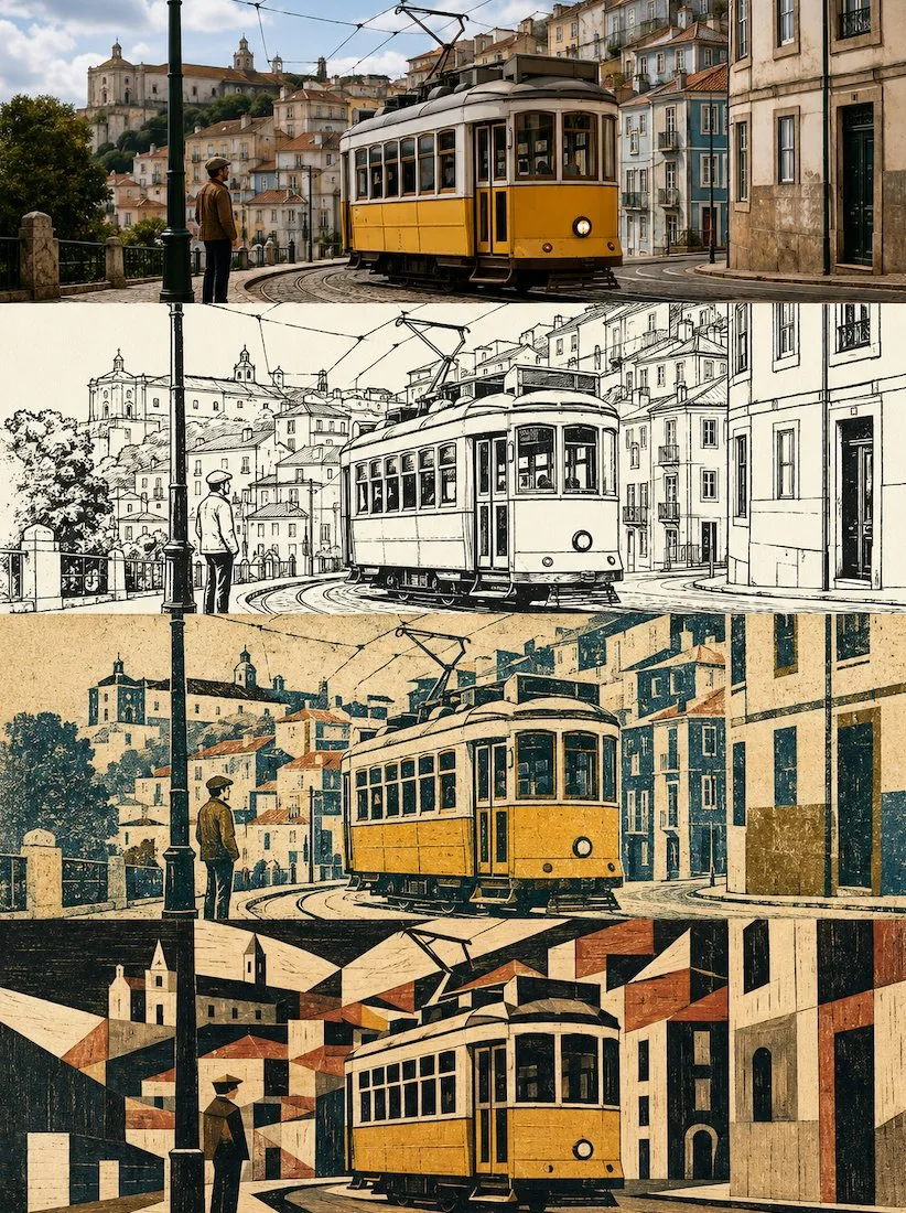
ChatGPT
TasarımChatGPT
Four layer progressive multi dimensional scene poster
Üretici @zhidawang219555
Prompt
Please create a high-end design poster of the same scene from the uploaded photo in the current layer, not a multi-photo collage, output each photo individually. 'Not a multi-photo collage' here means: do not mix different uploaded photos into the same finished product; each uploaded photo must independently generate a complete four-layer style poster.

【Overall Aspect Ratio and Four-Layer Structure】
The overall layout uses a 3:4 vertical composition. The image is strictly divided into four equal horizontal areas from top to bottom, and the height of each area must precisely account for 25% of the overall image height. The ratio of the four layers is strictly 1:1:1:1, and no ratio deviation is allowed. The four layers are seamlessly connected, with no dividing lines, no white gaps, and no borders.

Since each layer is actually an extremely flat banner of approximately 3:1, the subject needs to be horizontally adapted within each layer: maintain the stability of the subject's main position and visual focus, prioritize horizontal expansion, and avoid the subject being vertically stretched, squashed, pushed to the edge, or having key parts cropped. The sky, walls, ground, water surface, paper, or environmental whitespace consistent with the original image can be extended to the left and right, but blurred background duplication must not be used for filling.

【Consistency Across Four Layers】
The four layers must come from the same uploaded photo and the same moment. Strictly maintain the consistency of the subject's identity, number of subjects, the facial features of people or animals, posture, movement direction, gaze, core features of hairstyle and clothing, architectural structure, landmark identity, main object relationships, observation angle, perspective direction, left-right positioning, front-back hierarchy, and narrative relationship.
The style layers are allowed to delete secondary backgrounds, reduce textures, and change materials and detail density according to their respective media, but the subject cannot be replaced with another person, another building, another car, another animal, or another scene.

【Layer 1 | Original Photography】
The first layer faithfully preserves the real photographic texture of the uploaded photo. Retain the subject's identity, quantity, compositional relationship, posture, movement, real materials, natural lighting and shadows, comprehensive color temperature, and scene atmosphere. Only restrained high-end photography-grade color grading, exposure and contrast fine-tuning, and extremely slight delicate grain optimization are allowed.
To adapt to the current approximately 3:1 banner, natural cropping or extending the environmental edges consistent with the original scene can be performed, but the subject must not be stretched, distorted, mirrored, copied, key objects moved, architectural structure changed, or characters redesigned.
The first layer does not add extra text, brand logos, borders, watermarks, or decorative elements.

【Layer 2 | 1970s Animation Style Black and White Ink Drawing | Current Layer Adaptation Rules】
This layer only accounts for 25% of the height of the entire 3:4 four-split poster, which is actually an extremely flat horizontal area of approximately 3:1. The following style instructions are all executed "within the current layer".
Any expressions appearing in the source prompt such as independent poster, entire image, vertical ratio, separate output, etc., must not change the overall four-split structure; the current layer's approximately 3:1 flat horizontal ratio is the highest priority.
Do not generate an original image comparison area, a second photo, top-bottom split screens, or extra multi-grids within the current layer. If there are recomposition requirements in the source prompt, only refinement of background information, materials, whitespace, and secondary elements is allowed; the subject's identity, quantity, key posture, movement direction, observation perspective, main perspective, left-right position, and core spatial relationship must not be changed.
If text is an important component of the source style, it is retained, but it must be reduced to the minimum necessary number that can be clearly read in the current layer; if the source prompt explicitly requires no text, maintain no text.

【Source Style Complete Translation Description】
Create a black and white ink drawing of the [subject]. Emphasize expressive features, using 1970s 2D animation aesthetics, rough high-contrast outlines, sharp and clear line art, minimalist yet hierarchical line widths, and animation clean-up style. The image uses a high-key composition and a pure white background, using only black and white colors, without adding shadows, colors, or grayscale.

【Layer 3 | Coarse Grain Limited Color Travel Relief Print | Current Layer Adaptation Rules】
This layer only accounts for 25% of the height of the entire 3:4 four-split poster, which is actually an extremely flat horizontal area of approximately 3:1. The following style instructions are all executed "within the current layer".
Any expressions appearing in the source prompt such as independent poster, entire image, vertical ratio, separate output, etc., must not change the overall four-split structure; the current layer's approximately 3:1 flat horizontal ratio is the highest priority.
Do not generate an original image comparison area, a second photo, top-bottom split screens, or extra multi-grids within the current layer. If there are recomposition requirements in the source prompt, only refinement of background information, materials, whitespace, and secondary elements is allowed; the subject's identity, quantity, key posture, movement direction, observation perspective, main perspective, left-right position, and core spatial relationship must not be changed.
If text is an important component of the source style, it is retained, but it must be reduced to the minimum necessary number that can be clearly read in the current layer; if the source prompt explicitly requires no text, maintain no text.

【Source Style Complete Translation Description】
Please use the currently uploaded photo as the only reference and make it into a high-end limited color travel relief print poster in the current layer. Use an approximately 3:1 flat horizontal composition for the current layer; the current layer only presents this style translation and does not set an additional original photo comparison area.

Travel Relief Print

The image uses a warm cream or ivory natural printmaking paper background.
The paper should have: visible paper grain, subtle paper fibers, a slightly rough matte surface, warm archival paper, natural pigment absorption.

Select the most recognizable subject from the original uploaded photo, or a scene as a whole that can represent the meaning of the photo, and remake it into an independent "travel print mark" floating on the paper.

Retain what determines the recognizability of the original photo:
- Subject's outer contour
- Posture or direction of movement
- Main light and dark divisions
- Perspective direction
- Key structures
- Material texture rhythm
- Signature colors
- Most important spatial relationships

Actively delete:
- Complex backgrounds
- Repetitive architectural structures
- Large numbers of windows
- Dense crowds
- Irrelevant vehicles
- Tiny signs
- Clutter
- Fine textures
- Secondary objects
- Text that cannot be accurately generated

The current layer is not about reducing the saturation of the entire photo, adding grain, or applying a print filter. It must first understand the most important visual information in the photo, then re-plate, compress, color-set, and print it.

IV. Printmaking Media and Texture
Use the following mixed printmaking language: Travel relief print, limited color palette screen printing, coarse lithography, woodcut texture, linocut texture, stencil printing, compressed photographic texture, handmade printmaking, worn pigment, broken halftones, irregular ink coverage, rough dry brush edges, paper showing through, slight color registration offset, grainy shadows, handmade masking boundaries, natural ink deficiency.
The print should have the texture of coarse grain, handmade overprinting, and old travel prints. Pigments are opaque, matte printing inks, not transparent watercolors.

Allowed:
- Uneven ink coverage
- Local ink deficiency
- Broken halftones
- Rough dry brush edges
- Paper showing through
- Slight color registration offset
- Granular shadows
- Irregular boundaries of manual masking
- Partial wear
- A small amount of original photo texture after compression

Different color layers should look like they were overprinted on the paper separately, rather than smoothly blended through digital gradients. Do not use precise vector strokes. Do not let the subject become a corporate brand logo, clean icon, or common flat illustration.

V. Current Layer Composition
The print subject is placed in the center or slightly upper part of the image. The subject accounts for about 38%–52% of the height of the current layer, naturally adjusted according to the photo content. The print subject cannot fill the entire frame; a large amount of warm ivory paper whitespace must be reserved around it. The edges of the subject cannot form a complete rectangular photo frame. Use the following methods to make the edges disappear naturally: Irregular brush printing, torn-like ink edges, broken halftones, ink-deficient areas, gradually decreasing grain, paper naturally showing through, partial structural interruptions. The overall feel is like "a travel memory being imprinted on paper".
Landscape photos can retain a small amount of terrain, skyline, water surface, or architectural rhythm, but cannot completely reconstruct all backgrounds. Photos of people or vehicles should prioritize highlighting the subject's contour, posture, and direction of movement. Architectural photos should retain the most recognizable volumes, roofs, window-to-wall ratios, or structural rhythms.

VI. Limited Color Palette
Extract 3–5 main colors from the original uploaded photo and compress them into a high-contrast, matte, limited ink color palette. Usually includes: One darkest contour ink color, one warm paper base color, one to two subject colors, one small area highlight or signature color.
Warm-toned photos can use: ochre orange, brick red, burnt yellow, olive green, charcoal gray, warm beige.
Cool-toned photos can use: gray-blue, sea blue-green, dark green, graphite gray, mist gray, and warm ivory.
Night scenes can use: dark dark green, charcoal black, faded blue, dark red, and a small amount of warm yellow light.
Keep one bright color from the original photo that is most recognizable as a visual memory point, but do not use many bright colors simultaneously. All colors must look like layers of physical ink overprinted. Smooth digital gradients, neon glows, high-saturation commercial color matching, and transparent watercolor smudging are prohibited.

VII. Text System
Place a minimal amount of text below the print subject. The main title uses the following exact text: "[English Main Title]". The main title is limited to 1–3 English words, using a restrained typewriter font, monospaced serif, or old archive font, horizontally centered. Below the main title, place the following accurate travel keywords: "[Keyword 1 / Keyword 2 / Keyword 3]". Keywords use 3–5 short English words, separated by slashes, smaller than the main title, with natural letter spacing, like typed descriptions on the back of old travel photos. All text must be verbatim accurate; no modification, addition, deletion, misspelling, or extra characters generated. Except for the above two lines, do not add numbers, years, brands, brand logos, QR codes, URLs, slogans, long paragraphs, or meaningless text. If no text is provided, maintain a no-text design and do not fabricate titles.

VIII. Overall Temperament
The overall should look like a small limited-edition print made from travel photography: direct, simple, nostalgic, warm, quiet, coarse, with a slight sense of adventure and personal travel memory. High-end quality comes from: accurate limited color palette, subject information compression, coarse grain printing texture, incomplete print edges, paper whitespace, restrained text, and visual correspondence with the original photo in terms of subject, color, and narrative. It is not traditional realistic painting, nor is it an ordinary photo filter. It is a mark of travel memory remade from the original photo.

IX. Mandatory Avoidance
Avoid: multi-photo collages, grid layouts, poster display mockups, photo frames, wall scenes, hand-held posters, illustrationizing the original photo area, redrawing photos, changing subject identity, changing facial features, changing posture, changing architectural structure, copying objects, mirroring expansion, stretching photos, blurred photo side filling, applying a print filter to the entire poster, clean vector strokes, smooth digital gradients, smooth flat illustrations, generic brand logo silhouettes, complete rectangular photo crops, detailed background reconstruction, watercolor smudging, transparent watercolor, sticker collage, travel icons, airplane icons, passport graphics, map pins, architectural blueprint lines, random circles, decorative grids, smooth 3D effects, anime, cartoons, neon colors, full-frame filling, hard rectangular photo frames, excessive typography, fictional brands, garbled text, watermarks, cheap souvenir templates.

Most important rule: The print must accurately correspond to the most important subject or scene in the current original photo. The image must remake the most important subject or scene in the original photo into a limited-color, coarse-grained, incomplete-edged travel print mark floating in a large area of ivory paper whitespace. The entire poster must be completed in one generation; do not generate materials separately, do not use code for splicing, and do not output multiple images.

【Layer 4 | Landmark Geometric Engraving Composition Poster | Current Layer Adaptation Rules】
This layer only accounts for 25% of the height of the entire 3:4 four-split poster, which is actually an extremely flat horizontal area of approximately 3:1. The following style instructions are all executed "within the current layer".
Any expressions appearing in the source prompt such as independent poster, entire image, vertical ratio, separate output, etc., must not change the overall four-split structure; the current layer's approximately 3:1 flat horizontal ratio is the highest priority.
Do not generate an original image comparison area, a second photo, top-bottom split screens, or extra multi-grids within the current layer. If there are recomposition requirements in the source prompt, only refinement of background information, materials, whitespace, and secondary elements is allowed; the subject's identity, quantity, key posture, movement direction, observation perspective, main perspective, left-right position, and core spatial relationship must not be changed.
If text is an important component of the source style, it is retained, but it must be reduced to the minimum necessary number that can be clearly read in the current layer; if the source prompt explicitly requires no text, maintain no text.

【Source Style Complete Translation Description】
Please translate each travel photo I upload into an independent high-end landmark art poster. Default to using the current layer's approximately 3:1 flat horizontal composition; do not keep top-bottom split screens, and do not show the original photo area, photo frames, walls, or hand-held display mockups.

First, understand the visual structure that truly determines the recognition of the location, and select a set of the most important subject relationships from buildings, monuments, bridges, towers, stations, ships, peaks, islands, coastlines, or city skylines.

Accurately retain in the original photo:
- Landmark identity and number of subjects
- Observation angle and spatial direction
- Architectural outer contour and hierarchical relationship
- Roof rhythm, tower ratio, bridge spans, arch openings, or main openings
- Ridges, shorelines, water baselines and key negative shapes
- Iconic structures that allow people to recognize the original location at a glance

Actively delete: tourists, vehicles, dense vegetation, advertisements, window panes, tiny text, decorative components, and photographic noise. Do not add buildings, vehicles, cultural symbols, or a second landmark that do not exist in the photo to enhance the "sense of locality".

Remake the subject as a coarse black architectural engraving. Integrate woodcut, drypoint, copperplate etching, and old-fashioned screen printing languages, expressing form through dense but uneven hatching, cross-hatching, broken ink surfaces, score marks, dry brush gaps, local ink leakage, rough edges, and paper showing through.

The subject cannot be a smooth black silhouette, nor can it be like automatic photo outlining. White architectural walls, snow, sky openings, and water highlights can be directly expressed using paper negative shapes, letting the whitespace truly participate in the subject structure.

Place 2 to 3 large modernist geometric blocks behind the subject. All geometric shapes must be extracted from the structure, contour, or negative shapes of the current photo itself, for example:
- Extract circles, semicircles, or low ellipses from the sun, dome, mountain, or visual center;
- Extract vertical arches and curved surfaces from archways, doorways, tower bodies, sails, valleys, or curved roofs;
- Extract tilted or angular blocks from triangular roofs, hillsides, bridge spans, and architectural polylines;
- Extract narrow crescents, black slices, or upright structures from the side of the subject, structural thickness, distant mountains, and spatial shadows.

Different photos must produce different geometric combinations based on their respective subjects. Do not mechanically add the same circle, archway, or sun to all works. Geometric blocks are responsible for organizing space and rhythm and must not become brand logos, badges, or pure decorative patterns.

Geometric color plates need to have a real plate-making texture, including slight overprinting deviations, worn edges, uneven ink color, grain, scratches, nicks, and local paper showing through. Avoid clean vector graphics, digital gradients, and smooth software edges.

The entire image uses warm ivory, old book page beige, or light taupe printmaking paper. The paper has fine fibers, slight indentations, ink stains, and natural wear, but the aging must be restrained; do not have burnt edges, treasure map effects, or full-page stains.

Compress the subject and geometric color plates into a compact visual island, accounting for about 32% to 52% of the image, placed in the lower center, bottom left, or bottom right according to the original photo's center of gravity. Above, at least about 30% to 40% of continuous whitespace is reserved, and sufficient breathing room should also be maintained on the left and right.

Do not fill the canvas with the landscape according to the original photo. The sky, air, distance, and complex background in the photo can be represented directly by the blank paper.

The bottom of the subject uses only a few intermittent black and spot-color horizontal strokes to imply the water surface, road, terrace, horizon, reflection, or shoreline. Strokes should gradually break, wear, and disappear into the paper towards the sides and bottom, not forming a complete background, regular base, or closed landscape.

Overall colors use only:
- Warm paper base color
- Carbon black engraving ink
- One matte spot color extracted and summarized from the original photo

The spot color can be brick red, ochre yellow, dark orange, gray-blue, moss green, olive, or other most representative colors according to the photo, but each work uses only one main spot color. When necessary, a very light version of the same spot color is allowed; do not use colorful collages.

Default to not generating any text. Only when explicitly requested by the user, add a small title of 1 to 3 English words or a number on the edge of the whitespace away from the subject. Prohibit author names, photographer names, signatures, seals, pseudo-calligraphy, accounts, brand logos, and watermarks.

The overall should have the temperament of modernist editorial design, architectural printmaking, coarse screen printing, and collection-level independent publications: restrained, quiet, rough, clearly structured, with a real handmade plate-making feel and large areas of whitespace.

Avoid: Full background coverage, precise tracing of photos, fictional second landmarks, generic landmark templates, fixed arch compositions, random circles, brand logo style compositions, clean vector geometry, smooth digital gradients, flat black silhouettes, photo filters, watercolors, smooth 3D effects, complete landscape reconstruction, crowded collages, multi-color palettes, neon colors, burnt parchment edges, treasure map-style aging, pseudo-calligraphy, author names, signatures, seals, brand logos, watermarks.

【Final Unified Check】
1. The height of the four layers must strictly account for 25% each, and the order must not be changed.
2. No borders, dividing lines, whitespace gaps, or card-style spacing should appear between the four layers.
3. The first layer maintains real photography; layers 2 to 4 strictly execute their respective source styles and do not mix media.
4. Subject identity, quantity, posture, movement direction, perspective, key perspective, left-right positioning, and core spatial relationships must be continuous and consistent.
5. Do not mix different uploaded photos into the same poster.
6. Do not add subjects, landmarks, people, vehicles, or key narrative objects that do not exist in the photo due to stylization.
7. Unless a source style clearly requires text, do not add extra text; all text must be spelled correctly, clearly legible, and no garbled characters, pseudo-text, brand logos, QR codes, or watermarks are allowed.
8. Each layer must be able to independently read its media characteristics, but after combining the four layers, it still looks like the same scene gradually translated from reality into different artistic media.
Metni kopyala, kendi detaylarını ekle ve kullandığın görsel modelinde dene.


