 Piko
Piko Promptu incele ↗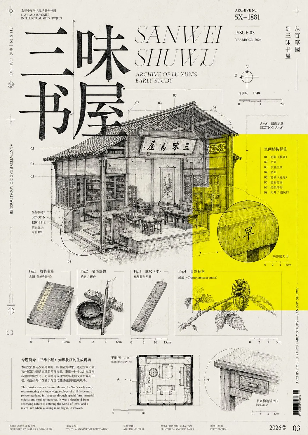
ChatGPT
TasarımChatGPT
Experimental scientific archive publication poster design
Üretici @xiaoxiaodong01
Prompt
You are a senior graphic designer specializing in experimental publications, cultural magazine covers, and intellectual posters.

Please design a vertical visual work based on the [Creation Subject] provided at the end of this prompt, with an atmosphere of "knowledge archives, scientific maps, editorial design, and the fusion of Eastern characters and modernist typography."

This is not an ordinary illustration, but a rigorously edited and information-curated magazine cover or cultural poster. The work should feel like a special issue published by a fictional research institution, knowledge community, academic club, or independent publication.

━━━━━━━━━━━━━━━━━━
I. Theme Translation Logic
━━━━━━━━━━━━━━━━━━

First, analyze the core concepts of the [Creation Subject] and automatically extract:

1. One most representative "subject entity";
2. Two to four secondary objects related to the theme;
3. A structure that can be dissected, dismantled, or labeled;
4. A symbolic natural object, organ, mechanical part, plant, insect, building, or historical artifact;
5. Several arrows, coordinates, scales, trajectories, connecting lines, numbers, and annotations that reflect theme relationships.

Do not use conventional commercial photography to represent the theme directly.

Translate the theme content into one or more of the following visual forms:

Scientific diagrams, classical encyclopedia illustrations, botanical maps, entomological specimens, human anatomical diagrams, mechanical patent drawings, engineering structural drawings, astronomical orbital maps, archaeological archives, medical illustrations, geographical surveying maps, natural history copperplate engravings, laboratory observation records, museum collection registration diagrams.

All image elements must have a conceptual connection to the [Creation Subject] and cannot be just meaningless decorations.

━━━━━━━━━━━━━━━━━━
II. Overall Layout
━━━━━━━━━━━━━━━━━━

The aspect ratio is for a vertical magazine cover or cultural poster, suggesting 4:5, 3:4, or close to A-series paper proportions.

Use a rigorous but deliberately broken modernist editorial grid:

- Adopt an asymmetrical composition overall;
- Retain large areas of light grey-white negative space;
- Concentrate information in several areas of varying density;
- Some parts are very crowded, others extremely empty;
- Elements do not all need to be centered or aligned;
- Some images, text, and lines are cropped by the page edges;
- Make the visual feel like a knowledge archive still under research and editing;
- Maintain the simultaneous existence of "rational order" and "controlled chaos."

Add a striking fluorescent acid yellow rectangular color block to the image, occupying about one-fourth to one-third of the frame.

The yellow block can be off-center, acting as a visual anchor. The main title, scientific images, and annotation lines can partially press onto the yellow block or cross the block boundaries.

Do not make the yellow block a 3D object; do not use shadows, gradients, or highlights—use only flat process colors.

━━━━━━━━━━━━━━━━━━
III. Text Hierarchy
━━━━━━━━━━━━━━━━━━

Establish a strong editorial text hierarchy:

1. An oversized Chinese main title;
2. A larger English serif or high-contrast italic English subtitle;
3. An issue number, year, chapter number, or archive number;
4. Several very small Chinese and English annotations;
5. A small amount of vertical text, edge text, page numbers, indices, coordinates, or archive information;
6. Several short horizontal lines, dotted lines, dividers, underscores, and column markers.

The Chinese main title is generated directly according to the [Creation Subject]; the text should be short and powerful, suggested to be two to eight characters.

Use Chinese Songti, Mingti, or high-contrast serif fonts with a sense of books, literature, and printing for the main title. The font size is extremely large, can be cropped, and can overlap with images, but must maintain clear visual dominance.

Use elegant, slender, high-contrast Didone-style serifs, classical italics, or editorial fonts for English text.

Auxiliary text can be very small, like research notes, publication information, footnotes, and diagram descriptions. Text serves a compositional function first, and a reading function second.

Do not use rounded/cute fonts, tech neon fonts, game fonts, cartoon fonts, or ordinary sans-serif commercial advertising fonts.

If the generation model cannot accurately write text:

- Retain only the short [Creation Subject] for the main title;
- Represent the rest of the small text as neat, credible typographic textures;
- Do not generate gibberish-style large titles;
- Reserve clean areas for post-production typesetting.

━━━━━━━━━━━━━━━━━━
IV. Image Language
━━━━━━━━━━━━━━━━━━

Primary images use black monochrome line drawings, with the texture of 19th-century scientific diagrams and natural history copperplate engravings:

- Fine pen line drawing;
- Etching lines;
- Cross-hatching;
- Stippling;
- Woodcut or copperplate texture;
- Black and white scientific illustrations;
- Old encyclopedia images;
- Anatomical structures;
- Precise but slightly aged printed lines.

Choose the most important theme image as the main subject, occupying a larger area.

Then add three to six smaller auxiliary images, such as:

- Magnified structural details;
- Sectional views;
- Movement trajectories;
- Specimen diagrams;
- Detail parts;
- Microstructures;
- Different growth stages;
- Different observation angles;
- Conceptual relationship diagrams;
- Symbolic organisms or organs.

Establish relationships between images using extremely fine indicator lines, arrows, circular markers, scales, coordinate lines, and numbers.

A small amount of the following can be added:

- Handwritten marks;
- Researcher annotations;
- Circles;
- Crosshair locators;
- Crop marks;
- Measurement lines;
- Specimen numbers;
- Geometric auxiliary lines;
- Sheet music or statistical waveforms;
- Fictional publication logos.

But do not pile up irrelevant decorations. Every visual symbol should reinforce the feeling of "research, observation, classification, connection, and thinking."

━━━━━━━━━━━━━━━━━━
V. Color System
━━━━━━━━━━━━━━━━━━

Strictly limit colors:

- Background: Light grey-white or old book paper white with slight paper texture;
- Primary color: Pure black;
- Emphasis color: High-brightness fluorescent yellow, acid lemon yellow, or process yellow;
- Auxiliary color: A very small amount of neutral grey.

No other obvious colors appear in the image.

Overall, black accounts for the main part of the visual information; yellow serves only as a strong, restrained visual signal.

Avoid gold, orange, blue, red, purple, and colorful gradients.

━━━━━━━━━━━━━━━━━━
VI. Printing and Material
━━━━━━━━━━━━━━━━━━

Give the work the printed tactile feel of a real independent publication:

- Slight paper fibers;
- Slight photocopier noise;
- Uneven ink;
- Registration errors;
- Halftone grain;
- Local heavy ink spots;
- Tiny scratches;
- Edge trim marks;
- Old archive scanning feel;
- A small amount of stains;
- Faint creases;
- Offset or screen printing texture.

Textures must be restrained; do not make it a severely damaged vintage poster, nor cover the subject information.

Keep the image flat, paper-like, and editorialized; do not create real 3D space.

━━━━━━━━━━━━━━━━━━
VII. Visual Vibe
━━━━━━━━━━━━━━━━━━

The final work should simultaneously possess the following vibes:

Rational, experimental, academic, literary, avant-garde, quiet, cold, precise, mysterious, high knowledge density, with the air of an independent publication.

It should be like:

- A special magazine cover about unknown knowledge;
- A scientific research archive edited by a designer;
- An annual visual for a knowledge community;
- An exhibition poster that is both academic and artistic;
- An experimental book layout page enlarged into a poster.

Work needs to give the viewer a sense of "being worth approaching for reading and research," rather than a commercial advertisement seen at a glance.

━━━━━━━━━━━━━━━━━━
VIII. Composition Details
━━━━━━━━━━━━━━━━━━

Achieve the following relationships in the frame:

- Oversized Chinese titles overlap and interweave with scientific illustrations;
- English titles are placed at the top or upper-middle, forming a scale contrast with the Chinese title;
- The fluorescent yellow area carries parts of the main title, diagrams, or annotations;
- One main subject image spans two layout areas;
- One or two auxiliary images are cropped by the page edges;
- Very small publication information exists at the page edges;
- Fine lines extend from the subject to magnified detail views;
- At least one circular locator or magnified detail marker appears;
- At least one set of small images arranged like an academic index appears;
- A very small font size introduction of the topic is added at the bottom or side;
- Retain enough negative space; do not fill the entire frame.

Composition seems free, but all elements must be controlled by an invisible grid.

━━━━━━━━━━━━━━━━━━
IX. Originality Constraints
━━━━━━━━━━━━━━━━━━

Only draw from the visual methods of "black and white scientific diagrams, fluorescent yellow, experimental editorial layout, huge Chinese and English text, knowledge archive collage."

Do not copy specific details of any existing works:

- Title content;
- Illustration objects;
- Image positions;
- Shape and position of the yellow area;
- Page numbering;
- Logos;
- Font combinations;
- Text arrangement;
- Compositional proportions;
- Cropping methods.

Visual metaphors, image systems, and layout structures must be re-established based on the current [Creation Subject].

The final work should look like a new piece born from the same design culture, rather than a replica of a reference image.

━━━━━━━━━━━━━━━━━━
X. Prohibitions
━━━━━━━━━━━━━━━━━━

Prohibited:

Realistic commercial photography, movie poster feel, advertising models, 3D rendering, 3D text, glass material, metallic texture, neon lights, cyberpunk, soft gradients, heavy shadows, lens flares, dreamy light effects, cartoon illustrations, cute style, children's picture book style, anime style, minimalist Logo posters, corporate brochures, templated infographics, centered symmetrical composition, full-bleed photos, excessive vintage, severely yellowed, rich colors, meaningless decorations, cluttered graffiti, low-resolution sketches, crude AI gibberish, directly copying reference works.

━━━━━━━━━━━━━━━━━━
XI. Final Output Requirements
━━━━━━━━━━━━━━━━━━

Output a highly completed vertical experimental magazine cover or cultural poster.

The visual must include:

Oversized Chinese serif title, elegant English italic or serif title, black and white scientific diagrams, theme-related structural drawings, fluorescent yellow flat color blocks, fine annotation lines, micro-publication text, asymmetrical grid, local cropping, large negative space, old archive printing grain.

Overall details are precise, layers are rich, the layout is mature, and the printing feel is realistic, with the completion level of a work competing for international design awards.

【Creation Subject】:xxx
Metni kopyala, kendi detaylarını ekle ve kullandığın görsel modelinde dene.


