Piko
Piko Promptu incele ↗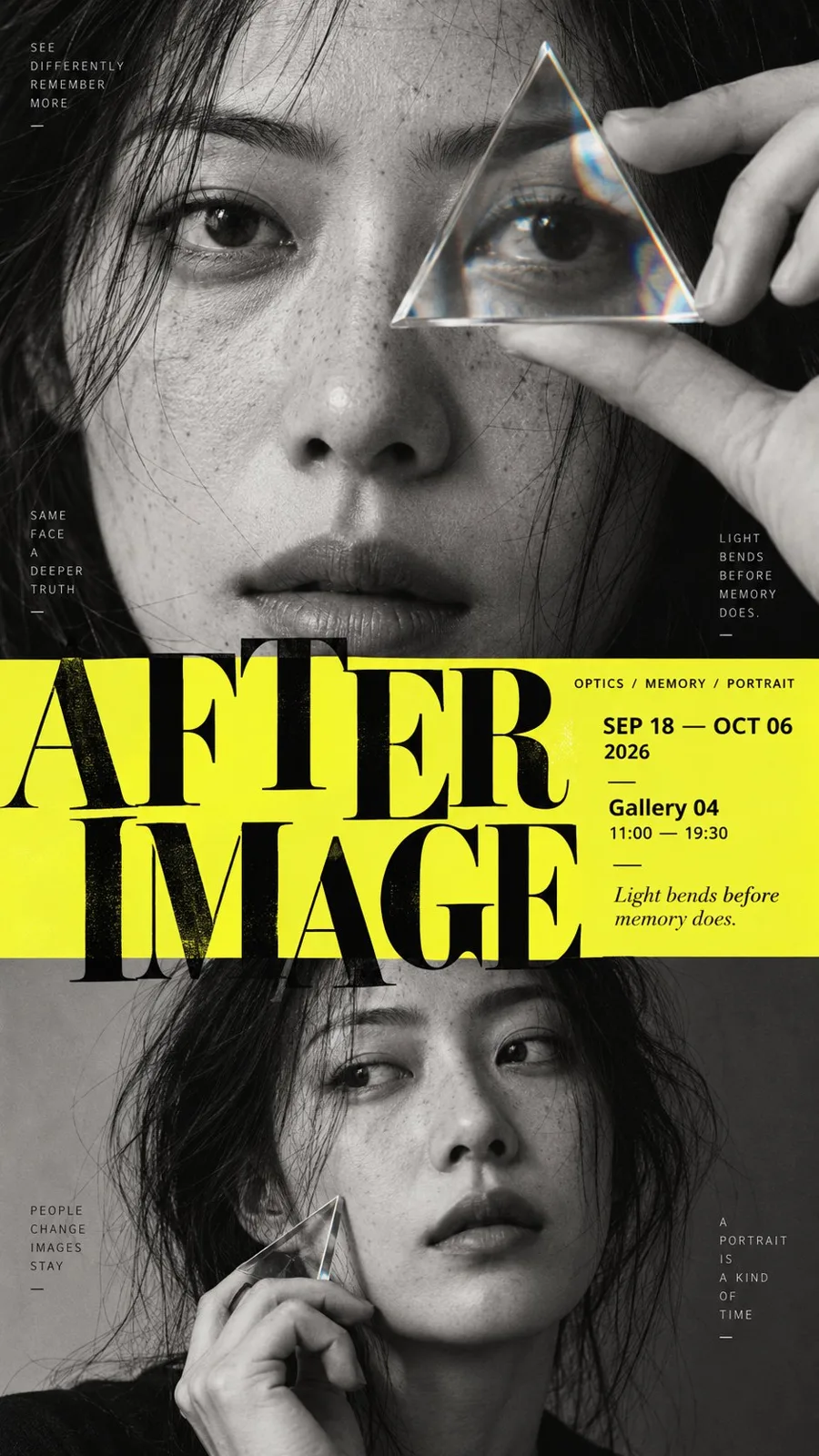
ChatGPT
TasarımChatGPT
Editorial poster layout template
Üretici @MrLarus
Prompt
[POSTER THEME]: {fill in the theme}
[MAIN TITLE]: {fill in the title}
[TOP SECTION]: {portrait / object archive / typography / image}
[MIDDLE SECTION]: {information band / typography / image / transition}
[BOTTOM SECTION]: {landscape / hero object / second portrait / typography}
[COLOR PALETTE]: {fill in the palette}
[VISUAL STYLE]: {editorial / museum / photography exhibition / cultural poster}
[ASPECT RATIO]: 9:16

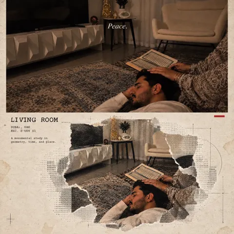
Create a sophisticated vertical editorial poster built around a clear three-part composition: top, middle, and bottom.

Each section must have a distinct visual role, but the final poster should feel like one continuous design rather than three stacked rectangular panels.

Use strong differences in scale, image density, typography, and negative space to establish hierarchy.

The top section should create the first visual anchor through a bold image, oversized typography, or a strong subject.

The middle section should act as the structural hinge of the composition. It can use a title, information field, narrow panoramic image, color band, or typography layer to connect the upper and lower sections.

The bottom section should provide a second visual weight or spatial conclusion through a landscape, object, secondary portrait, or oversized type.

Avoid rigid card-like boundaries. Let selected elements cross between sections through masking, overlap, irregular silhouettes, transparency, atmospheric transitions, foreground/background relationships, or typography extending beyond its original area.

Typography must actively participate in the composition rather than simply sit on top of the image. Allow large letterforms to be cropped by the page, partially hidden behind subjects, overlap imagery, or interact with negative space.

Use a strong editorial hierarchy:
one dominant title,
one clear secondary information layer,
and small meaningful metadata such as dates, venue, category, or curatorial text.

Small text should feel like real exhibition or editorial information, not decorative filler.

Keep some areas intentionally quiet. Do not fill every empty space.

The first read should communicate the main visual structure immediately.
The second read should reveal the interaction between type and imagery.
The third read should reveal the smaller information and details.

Maintain a refined contemporary poster aesthetic with strong typography, deliberate cropping, controlled information density, clean print texture, and professional editorial spacing.Metni kopyala, kendi detaylarını ekle ve kullandığın görsel modelinde dene.