 Piko
Piko Promptu incele ↗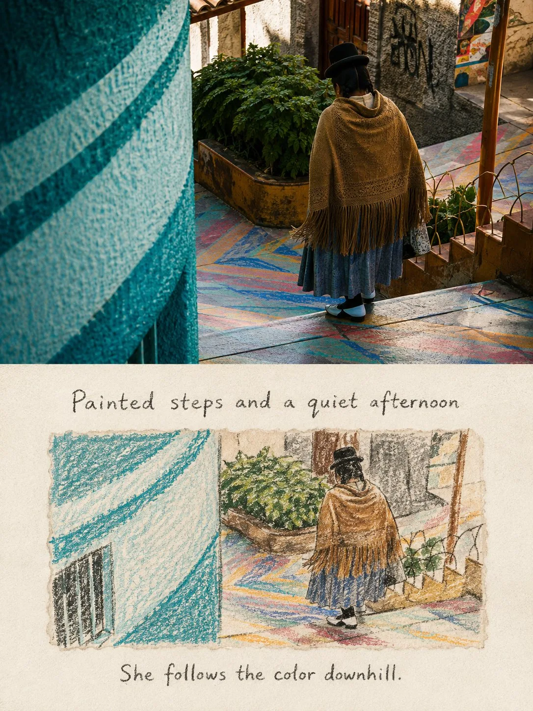
ChatGPT
TasarımChatGPT
Crayon travel notes comparison poster style
Üretici @Hamburgerai
Prompt
Please turn each travel photo I upload into an independent "Crayon Travel Notes" comparison poster, no multi-image stitching, each photo output individually.

Overall adopts a 3:4 vertical composition, the top and bottom two areas are close to 1:1 in height, separated by a clear, straight horizontal boundary. Do not use gradients, feathering, or mutual penetration effects in the middle.

The top half faithfully preserves the original photo, accurately maintaining the people, animals, buildings, vehicles, boats, natural landscapes, action directions, observation angles, spatial relationships, real textures, natural light and shadow, and the original color atmosphere in the photo. Only perform slight travel magazine photography color grading and add very thin film grain. Do not redraw, move, replace, or distort the main subjects in the original photo.

The bottom half is a piece of warm off-white drawing paper with obvious fibers and slight paper teeth, preserving large areas of clean, continuous paper white space.

In the center of the bottom half, embed an independent horizontal drawing paper fragment. The paper fragment occupies about 70%—80% of the width and about 40%—50% of the height of the bottom area, with soft, natural, slightly irregular hand-torn deckle edges and paper fibers, do not use smooth regular digital frames.

The crayon illustration in the horizontal paper fragment must come from the same photo above. Do not just extract an isolated person or object, but instead preserve the most important narrative composition and spatial relationship of the original photo:

- Preserve one most recognizable main subject;
- Preserve the main subject's original posture, direction, and positional relationship;
- Preserve one to three clues that can explain the location or environment;
- Let the main subject, roads, buildings, mountains, water, sky, or other key elements in the illustration clearly correspond with the photo above;
- Delete messy backgrounds, distant details, photographic noise, tiny text, and irrelevant decorations.

The bottom is not a mechanical tracing of the entire photo, but rather a compression of the complete scene into a short, naive, memory-evoking horizontal crayon drawing. Appropriately change cropping, detail density, and the number of colors, but do not change the subject's identity, quantity, action direction, and key scene relationships.

Complete the illustration using round-tip thick crayons, oil pastels, and a very, very small amount of pencil. Use intermittent, slightly hesitant dark grey or black thick crayon outlines as the main structure, expressing uneven hand pressure, pen stops, re-tracing, over-the-line coloring, paper grain showing through, slight smudging, colors not completely filled, and irregular stroke breaks.

Shapes are simple, rounded, and slightly clumsy, with the intimacy of a private travel sketchbook and old picture books. You can choose not to depict realistic facial features or pursue accurate perspective, but the main subject must remain instantly recognizable through its outline, posture, and iconic items. The image should be naive but not childish, relaxed but not sloppy.

Extract two to four soft colors from the photo above, paired with black or dark grey outlines. Retain the most memorable characteristic colors of the photo, such as the blue of buildings, the orange of vehicles, the grey-blue of lake water, the green of grass, or the pink of flowers. Reduce the number of colors and saturation, do not use fixed navy blue, rainbow palettes, or colors unrelated to the original photo.

Add a natural English handwritten caption above and below the horizontal drawing core respectively:

- The top text describes the location, weather, subject, or scene relationship truly visible in the photo;
- The bottom text records a slight emotion or observation brought by this moment;
- The two sentences should be short, natural, and human-like, like sentences jotted down during a trip;
- Do not use numbers, years, archive fields, advertising slogans, or standardized poster titles.

The text uses loose, slightly shaky graphite pencil or crayon handwriting, preserving paper teeth, broken strokes, and natural writing errors. The font size must be clearly readable in chat previews; the text should look like it is truly written on the paper surface, rather than post-added smooth digital typography.

The overall presentation is a gentle contrast between real travel photography and a private crayon sketchbook. The top records the scene that actually happened at the time, while the bottom leaves behind shapes and colors after memory deletion and a light annotation.

Avoid isolated character icons, sticker-style subjects, complete realistic background redrawing, children's cartoons, emojis, rainbow color schemes, smooth vector lines, automatic photo outlining, digital filters, full-bleed illustrations, regular frames, dense decorations, gibberish, fake Chinese, author names, signatures, brand logos, QR codes, and watermarks.
Metni kopyala, kendi detaylarını ekle ve kullandığın görsel modelinde dene.


