 Piko
Piko Promptu incele ↗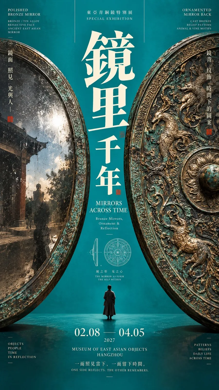
ChatGPT
TasarımChatGPT
Central axis clamped cultural exhibition poster design
Üretici @MrLarus
Prompt
[Theme]: ____
[Chinese Main Title]: ____
[English Title]: ____
[Left Main Subject]: ____
[Right Main Subject]: ____
[Central Axis Content]: Title / Character / Plant / Negative Space / Others ____
[Clamping Method]: Circular Arc Negative Shape / Spatial Perspective / Flexible Material / Dual Object Weighting / Others ____
[Background Main Color]: ____
[Subject Material and Style]: ____
[Date / Venue]: ____
[Image Ratio]: 9:16

Generate a "central axis clamped" poster with strong visual impact and a high-end cultural exhibition temperament.

First, establish a clear and stable vertical central axis, then let the [Left Main Subject] and [Right Main Subject] jointly create visual weight from both sides of the frame, pushing the main title, characters, plants, or negative space areas towards the center.

The left and right subjects must be large enough, close to the edges of the frame, and allow for natural cropping, jointly bearing the primary visual weight. The two sides can differ in silhouette, size, color, material, and detail, but the overall visual weight must be balanced, avoiding simple duplication and mechanical mirroring.

Choose different clamping methods based on the theme:

Circular or arched subjects can use silhouettes to jointly clamp a central negative shape;
Architectural or screen spatial subjects can form depth in the central axis through perspective;
Flexible materials like fabrics or plants can form flexible clamping through natural bending;
Objects, characters, or cultural relics can strengthen the central title through left and right weighting.

The central axis must become the most important reading area of the frame. The Chinese main title uses a bold large font size, which can adopt vertical layout, mixed horizontal and vertical layout, scale changes, partial occlusion, or slight intersection with the subjects, letting Typography truly participate in the composition rather than being simply placed at the top.

Allow the central axis to include a low-weight visual node, such as a tiny character, flower branch, pattern rubbing, structural line drawing, or research diagram, giving the center both a focus and layering, but do not form a third subject of the same level.

Information density can be rich, but concentrated in 2–3 areas: the central axis core information, left and right sidebars, and bottom exhibition info. Form a clear font size contrast through oversized titles and tiny text; do not scatter small text evenly across the entire frame.

Use one clear large-area main color to establish recognition, such as cinnabar red, cobalt blue, lemon yellow, grass green, cyan blue, dark brown, or persimmon orange. Control the overall palette to 3–5 main colors, creating contrast through subject materials, Typography, and a very small amount of accent colors.

Core principle: It's not simple "bilateral symmetry," but using visual weight on both sides to jointly shape the center. The left and right are responsible for applying pressure, while the central axis is responsible for focusing; the structure is stable, but details allow for differences.

Overall requirements: Strong central axis, strong subjects, strong color gamut, clear sense of design, rich information but not chaotic, clear edges, distinct text, realistic materials, with the completion level of a mature cultural exhibition poster and Editorial Design.
Metni kopyala, kendi detaylarını ekle ve kullandığın görsel modelinde dene.


