 Piko
Piko Explore prompt ↗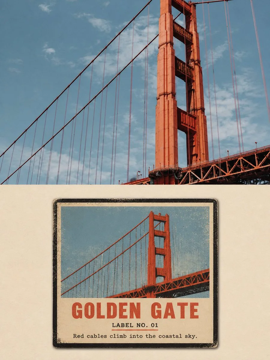
ChatGPT
DesignChatGPT
Vintage matchbox travel label poster
Creator @Hamburgerai
Prompt
Please turn each travel photo I upload into an individual high-end design poster. One photo corresponds to one finished product. No multi-photo collages, and do not create product display mockups.

Adopt a 3:4 vertical composition overall. The image consists of a real photography area at the top and a vintage label re-rendering area at the bottom, with a clear, straight horizontal boundary between the two areas.

The upper photography area accounts for about 45%–50% of the entire image. Faithfully preserve the subject, architecture, vehicles, terrain, direction, spatial relationships, observation angles, natural light and shadow, real textures, and color atmosphere of the original photo. Perform only slight high-end travel photography color grading and extremely thin film grain processing. The top must remain a clearly identifiable real photo; do not redraw, deform, mirror, replace subjects, or modify architecture.

The bottom accounts for about 50%–55%, re-rendering the same scene as a "VINTAGE MATCHBOX TRAVEL LABEL".

In a warm off-white or old-paper-colored empty field, place a flat rectangular old paper travel label. The label occupies about 48%–68% of the width of the lower area, with about 32%–52% continuous paper white space remaining around it.

Only show the front of the label; do not show matchbox thickness, drawers, sides, matches, packaging structures, handheld scenes, or product displays.

Extract the most recognizable subject outlines, orientations, postures, key architectural structures, and iconic color blocks from the original photo, compressing the complex environment into a central stamp, badge, or large color block composition.

The subject must be immediately traceable to the original photo, but photo tracing or automatic vectorization cannot be used. Reorganize the composition based on the subject's characteristics, for example:

- Landmark buildings compressed into thick-outline badges;
- Bridges transformed into strong directional structures of towers and cables;
- Roads transformed into exaggerated perspective wedges;
- Vehicles transformed into side-profile stamps composed of spoilers, bodies, and wheels;
- Mountains and terrain transformed into a few hard-edged silhouettes.

Use heavy near-black borders, thick black outlines, hard-edged flat painting, and 2–4 opaque spot colors. Colors must be extracted from the original photo, then summarized and moderately purified, while adding warm paper color and near-black outline color.

Express old color printing characteristics:

- coarse halftone;
- waxy ink grain;
- missing ink;
- rough printed edges;
- slight color misregistration;
- worn corners;
- aged paper fibers;
- uneven spot-color coverage.

Legible paper white space must still be reserved inside the label; do not fill the surroundings with decorations, dots, or borders.

Text is added as part of the label printing:

- A location or scene title of 1–3 English words;
- A number in the style of "LABEL NO. 01";
- An observation sentence of 5–10 English words.

Use bold, slightly irregular vintage uppercase fonts for the main title, and small old lead type or typewriter fonts for auxiliary text. Allow for slight ink missing, wear, and color registration offset, but the main title must be clearly readable in chat previews.

Do not copy trademarks, window stickers, organization names, author signatures, or irrelevant text from the original photo. Do not imitate real match brands, specific old packaging, or existing product labels.

The overall look is like a travel print preserved from an old suitcase, roadside shop, or local souvenir album: direct, coarse, sun-aged, and collectible, but not childish, cheap, or a nostalgic template.

Avoid: 3D matchboxes, sides of packaging boxes, matches, product advertisement mockups, real brand imitations, modern minimalist logos, smooth vectors, digital gradients, photographic filters, automatic photo tracing, too many colors, complex panoramas, children's cartoons, generic travel icons, redrawing of the entire poster, missing original photos, shrinking photos into small decorations, changing materials for the same framing, blurred boundaries, author names, logos, watermarks, gibberish, fictional brands, and redundant text.
Copy the text, add your own details, and try it in your image model.


