 Piko
Piko Explore prompt ↗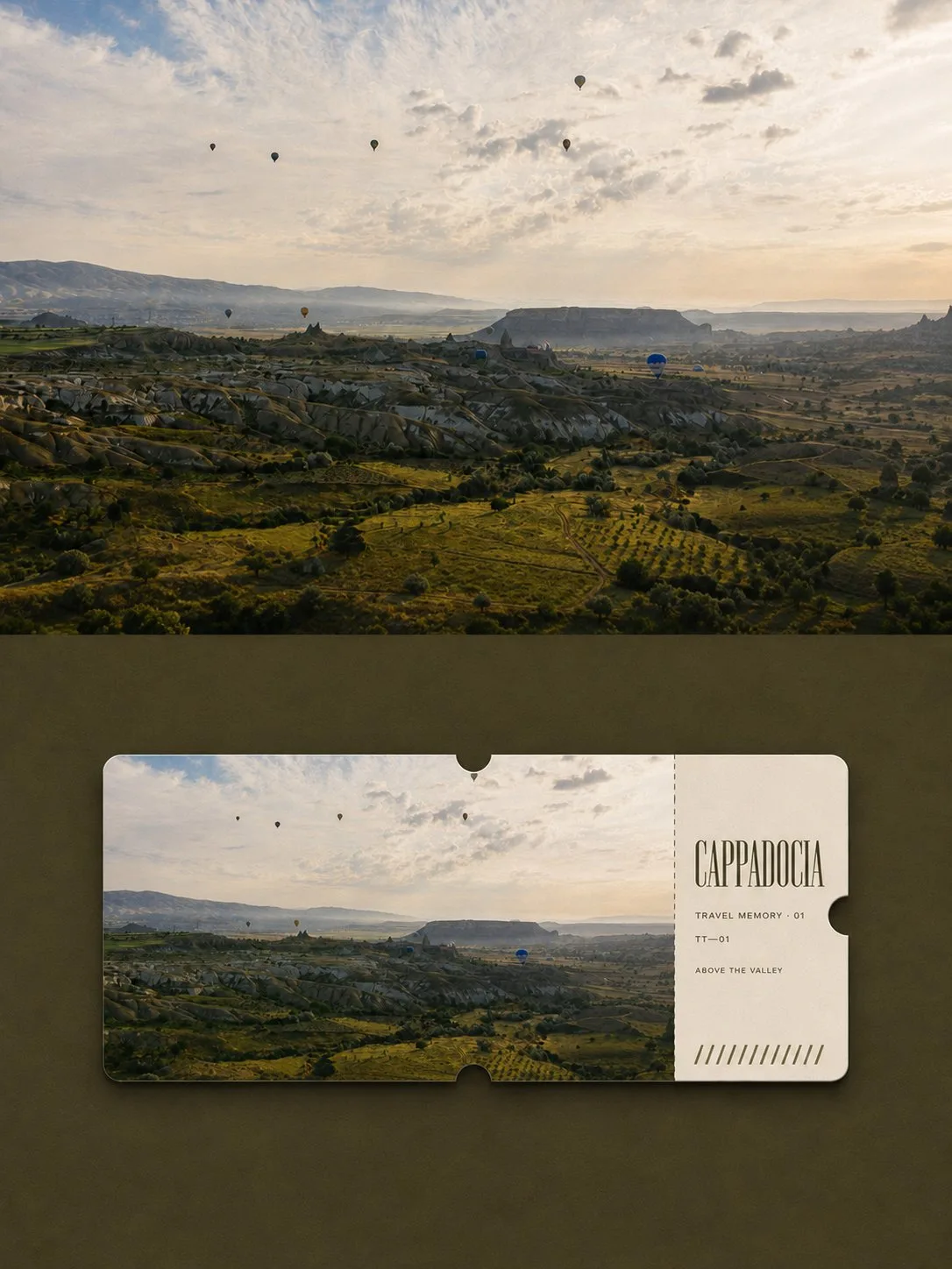
ChatGPT
DesignChatGPT
Travel souvenir ticket poster design
Creator @Hamburgerai
Prompt
Please turn each travel photo I upload into an independent high-end design poster, without multi-image stitching, outputting each photo separately.

The overall composition uses a 3:4 vertical layout, with the screen divided into two clear contrast areas, upper and lower, with a ratio of approximately 1:1. Use a straight, clear, and restrained horizontal boundary between the top and bottom, without gradients, feathering, paper tearing, or overlapping.

The upper part fully unfolds the original travel photo. Faithfully maintain the location, identity and quantity of subjects, horizon, terrain direction, buildings, people, vehicles or boats, observation angles, relative positions, real textures, natural light and shadow, and original colors. Only perform slight travel magazine and art publication color grading, and add an extremely thin film grain. The upper part must clearly be a real full-color photography work, and must not be illustrated or monochromatized, nor should ticket cards, text, borders, or travel icons appear. To adapt to the frame, the sky, ground, or environment can be naturally extended, but the subject must not be stretched, mirrored, copied, moved, or changed.

The lower part uses a medium-dark color extracted from the dark parts of the original photo as a matte paper background, and retains a large area of solid color empty space. Place a single horizontal full-color travel souvenir ticket card in the center, with the card width accounting for about 80%–88% of the lower area, keeping it horizontal, front-facing, and not rotated.

The ticket card uses soft rounded corners, slight thick paper edges, and extremely shallow contact shadows. The top center, bottom center, and right center of the ticket card each have a semi-circular ticket notch that truly cuts into the outer contour. Approximately 74%–79% of the left side of the ticket card is a high-fidelity full-color wide-angle photograph of exactly the same scene as above; approximately 21%–26% of the right side is a warm ivory information stub, separated by a clear vertical fine dotted perforation line.

Extract 1–3 English words from reliable location information as the main title, and only add a very small amount of series numbers and short sentences of 2–4 English words. Use elegant, narrow serif fonts for the main title, and small neutral sans-serif fonts for auxiliary text. A small amount of unscannable registration stripes can be added to the bottom of the ticket stub, but real barcodes or QR codes must not be generated. Do not invent dates when they cannot be confirmed.

The overall style should be like a collection ticket comparison page produced by an international travel magazine or design agency: the top allows people to see the real scene, and the bottom allows people to see how the same scene is collected as a ticket. Quiet, restrained, modern, and has a sense of collection.

Forced avoidance: missing top photo, two different scenes for top and bottom, illustrated photos, monochromatic top photo, multiple ticket cards, boarding pass templates, aviation or railway branding, passport elements, map pins, travel icons, QR codes, scannable barcodes, fictional locations and dates, logos, author names, photographer names, account handles, signatures, watermarks, plastic 3D, metal foil, desktop or handheld mockups.
Copy the text, add your own details, and try it in your image model.


