 Piko
Piko Explore prompt ↗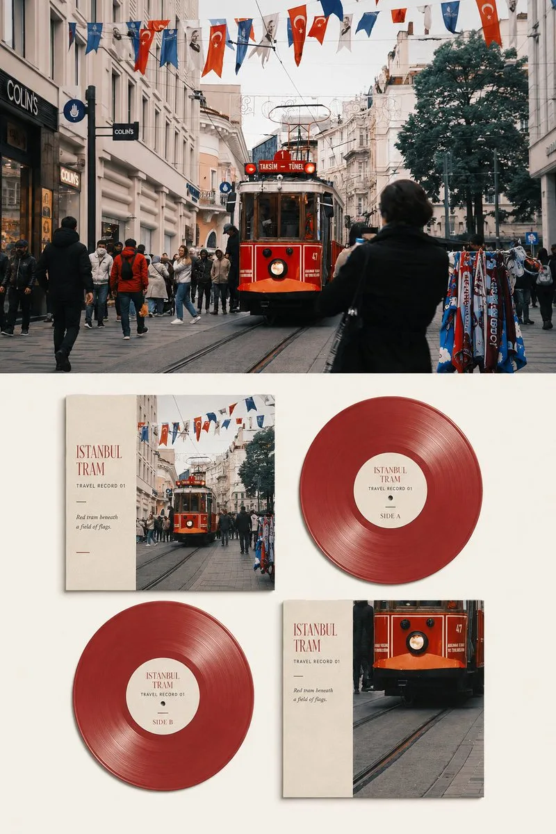
ChatGPT
DesignChatGPT
Travel photo to vinyl record visual archive poster
Creator @Hamburgerai
Prompt
Please turn each travel photo I upload into an individual premium travel record visual archive poster, no multi-image stitching, output each photo separately.

Overall 3:4 vertical composition, forming a clearly visible contrast between the original image and the visual translation of the record. The upper part accounts for about 45%–50% of the frame, the lower part about 50%–55%, the two parts use a clear, horizontal, and restrained boundary, no fogging, no feathering, no mutual penetration. Only output the front of the poster, do not generate desktop, wall, handheld displays or other mockup environments.

The upper part faithfully retains the original photo. Accurately maintain the identity and number of subjects, the posture of people or vehicles, the structure of buildings and terrain, the observation angle, spatial relationships, real textures, natural light and shadow, and the original color atmosphere. Only perform slight premium photography color grading and extremely thin film grain processing, giving the photo the quality of travel magazines, independent music publications, and photography exhibitions.

To adapt to the frame, the sky, ground, water surface, or surrounding environment can be naturally extended, but the subject must not be stretched, distorted, mirrored, moved, replaced, or redrawn. The upper part must still be a clearly identifiable real photography work, not becoming an illustration, record cover, or blurred background.

The lower part translates the same travel photo into a sophisticated record collection visual system on a warm white or light ivory uncoated paper surface.

Fixedly adopt a 2×2 staggered display composed of four items:

Top left: front cover;
Top right: Side A colored vinyl record;
Bottom left: Side B colored vinyl record;
Bottom right: back cover.

The four items should have clear size relationships and a stable editorial grid, but should not be arranged like a stiff product catalog. The sizes of the front and back covers are close, and the size, color, transparency, and groove structure of the two records remain consistent, showing Side A and Side B of the same record respectively. Do not add a third record, nor merge the front and back covers into the same item.

The front cover must directly use the most recognizable real local crop from the original photo. Retain the core buildings, figures, vehicles, terrain, plants, sky, water surface, or other main subjects in the photo, so that it can be matched with the original image above at a glance.

The back cover uses another effective crop of the same original photo, or re-selects a visual focus for the same scene. It can echo the front cover in terms of distance, whole and part, or subject and environment, but must not redraw the photo, replace the location, stitch in similar landscapes, or invent content that does not exist in the original image.

Secondary information is allowed to be removed through cropping, scale changes, and whitespace, but the identity, number, direction of subjects, building structures, terrain relationships, and iconic colors in the cover must be faithful to the original image. The cover cannot use generic record illustrations or abstract patterns unrelated to the photo to replace real travel imagery.

The front and back covers adopt a design combining photos and editorial whitespace. The photo can be cropped and placed on one side of the cover, keeping about 25%–40% of the light-colored paper surface on the other side for titles, numbers, and short sentences. The covers should have realistic paper thickness, cut edges, uncoated paper fibers, slight wear, tiny printing deviations, and natural short shadows.

The two records use the same representative color extracted from the original photo as the base color, which can present a slight translucent, smoky, frosted, or soft pearlescent effect. Express realistic and fine record grooves, center holes, center labels, and edge thickness, but avoid plastic CGI and excessive highlights.

The center labels of Side A and Side B must use the same typography system, title, and numbering, only writing the side designation as 'SIDE A' and 'SIDE B' respectively. The two records must obviously belong to the same set of records, and there should be no inconsistency in color, size, or design language.

The overall color scheme is entirely extracted from the original photo. Select one color from the photo that is most representative and best reflects the temperament of the location as the main color of the record, and then complete the cover design with shades of the same color, analogous colors, and one small area of emphasis color. Summarize, purify, and soften complex colors into a limited color palette, maintaining the warm and cold relationship of the original scene, without applying fixed vinyl record color templates.

Add a small amount of clearly readable English text on the cover and record center label. Based on the real and confirmable location, subject, weather, action, or atmosphere in the photo, extract a main title of 1–3 English words, and add the following text structure:

Main Title: determined word by word based on the photo content;
Serial Number: 'TRAVEL RECORD 01', numbered sequentially for multiple photos;
Side Designation: 'SIDE A' and 'SIDE B';
Observation Sentence: one line of 5–12 English words, describing the light, color, action, or spatial relationship actually visible in the photo.

Text must be determined word by word before generation. When the location cannot be confirmed, use the scene or emotional theme, do not fabricate cities, building names, dates, coordinates, artists, or release information.

The font uses a delicate narrow serif paired with restrained small sans-serif. The main title should be clearly readable in a normal chat preview, the number and observation sentence can be smaller, but cannot be shrunk into decorative gray lines. The text should look like it is truly printed on the cover paper and record center label, allowing for slight ink bleeding, paper ink absorption, and printing registration deviations.

The four items in the lower part account for about 62%–78% of the area, with a continuous and complete warm white paper surface reserved on the periphery. There should be sufficient distance between the four items, and they must not obscure key photos, record center labels, or text. Whitespace needs to participate in the composition, giving the entire set of records a sense of being carefully displayed and collected.

The overall style refers to premium record covers, independent music publications, travel photography archives, and collectible editorial design. Let the colors, rhythms, and scenes in the photo be translated into a set of travel records that can be viewed repeatedly, rather than simply pasting the photo onto a record template.

Avoid: missing the original photo at the top, original image shrunk into a decorative thumbnail, using different locations for top and bottom, cover redrawn as illustration, fictional landscapes, changing buildings, a third record, inconsistency between Side A and Side B, records obscuring covers, black fixed record templates, perspective desktops, e-commerce product mockups, handheld displays, glossy plastic 3D, fictional artists, fictional record labels, brand logos, URLs, QR codes, unreadable tracklists, garbled text, author names, account handles, and watermarks.
Copy the text, add your own details, and try it in your image model.


