 Piko
Piko Explore prompt ↗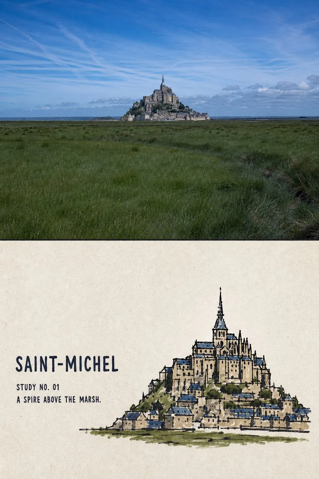
ChatGPT
DesignChatGPT
Travel photo to folk ink landmark comparison poster
Creator @Hamburgerai
Prompt
Please turn each travel photo I upload into an individual "Folk Ink and Color Landmark Portrait" comparison poster. Output each photo separately; do not combine multiple photos into a single frame.

## Overall Layout

Use a 3:4 vertical composition.

The frame is divided vertically into two areas with an approximate 1:1 height ratio:

- Upper part: High-fidelity original photo;
- Lower part: A folk ink and color landmark portrait distilled from the same photo.

Use a straight, clear, and restrained horizontal boundary between the upper and lower areas. No gradients, feathering, tearing, or allowing ink lines and color blocks to invade the photo area.

## Upper Part: Real Photo

Faithfully preserve the following from the original photo:

- Landmark or building identity;
- Building height-to-width ratio;
- Facade or front-side observation angle;
- Relationship between roofs, domes, towers, and portals;
- Steps, colonnades, sculptures, and entrance directions;
- Necessary surrounding roads, trees, water surfaces, or walls;
- Real materials, natural light and shadow, and the original color atmosphere.

Perform only slight color grading in the style of travel magazines, independent publications, and art exhibitions, and add a very thin layer of film grain.

The upper part must remain a real photograph. Do not illustrate, move buildings, change perspective, add decorations, replace the sky, stretch, mirror, or duplicate the subject.

## Lower Part: Landmark Portrait

Do not redraw the photo completely, and do not add an ink line filter to the photo.

First, identify the 2–4 most identifying structural elements of the building, such as:

- Roof or dome outlines;
- Height relationship of towers;
- Main portals and arches;
- Direction of steps and bases;
- Rhythm of colonnades;
- Position of statues;
- Bridgeheads, walls, or a small section of waterfront.

Proactively remove tourists, vehicles, advertisements, signs, dense vegetation, repetitive window panes, brick seams, carvings, complex cornices, sky textures, and photographic noise.

The lower part should only retain the minimum information that makes the building instantly recognizable.

The building portrait usually occupies only 36%–55% of the conversion area, placed in the center, lower-middle, or biased towards one side following the center of gravity of the original photo. Retain 45%–60% continuous warm white paper around it.

Remove the background first, then shrink the subject. Do not shrink the entire landscape and stuff it into the lower area, nor fill the entire background.

## Ink Lines

On warm, off-white matte drawing paper with subtle paper fibers, redraw the building using heavy, slightly shaky black brushes, oil-based markers, or thick ink pens.

The ink lines should have realistic wrist pressure and paper resistance:

- Uneven thickness;
- Slight hesitation and back-folding;
- Local re-tracing;
- Occasional broken lines;
- Small ink blobs;
- Rough paper edges;
- A few unclosed outlines.

First, use a small amount of firm outer outlines to capture the roof, tower body, portal, steps, and base, then use very few short lines, dot-like ink marks, or small black blocks to suggest the internal structure.

The lines can be slightly clumsy but must accurately capture the character of the building. Do not draw it as a fine pen architectural drawing, automatic photo tracing, vector outlines of uniform thickness, or a children's coloring draft.

## Coloring

Use only 2–3 iconic colors extracted from the original photo, plus paper white and black ink to form the entire palette.

Prioritize extracting:

- The representative color of the building's walls or roof;
- One environmental color from the sky, plants, water, or ground;
- If necessary, add a darker visual anchor color.

Reduce the saturation of the colors slightly to form a full, slightly aged, matte gouache flat wash.

Color blocks may appear with:

- Obvious brush marks;
- Uneven coverage;
- Crossing over ink lines;
- Local misalignment;
- White gaps (missed spots);
- Edge chips;
- Paper texture showing through.

Colors do not need to fit perfectly inside the lines. It should look as if the painter directly brushed several blocks of old color onto the paper, rather than closed filling in digital software.

Color is only used for main walls, roofs, ground, or two or three irregular backplates; do not fill the entire background.

## Whitespace and Composition

The building portrait and text occupy two separate areas of white paper with space between them.

- When the building is to the left, place the text on the right or top right;
- When the building is to the right, place the text on the left or top left;
- Maintain a clear breathing distance between the building and the text.

Except for the building and text, retain at least one complete, continuous area of white paper without images or words, allowing the blank space to represent the sky, distance, light, and the sense of quietness in travel.

Do not use template layouts where all four corners are filled with information.

## Text

By default, add a set of restrained but legible English travel captions.

The text content must be determined verbatim based on the facts of the photo before generation, including:

1. A location or scene title of 1–3 English words;
2. A short field, such as "STUDY NO. 01" or "LANDMARK NOTE";
3. An observation sentence of 5–10 English words describing the roofs, portals, steps, colors, shorelines, or weather truly visible in the photo.

The main title uses slightly hesitant thick-stroke English uppercase, oil-based marker characters, or old manual lead type.

The title must be clearly legible at normal chat preview sizes, usually occupying 20%–32% of the width of the lower area. Allow slight misalignment, ink breakage, paper teeth, and manual spacing, but it must not be so scribbled as to be unrecognizable.

The numbering and observation sentences are about 45%–65% of the height of the title characters, using small old lead type, handwritten side notes, or humanist sans-serif, also remaining clearly legible.

The text uses black ink or a dark color extracted from the building color blocks, appearing as if written, drawn, or printed directly on the paper, and must not become a floating smooth digital typography layer.

If the location cannot be reliably confirmed, use the real scene theme as the title; do not guess cities, building names, dates, or coordinates.

Prohibit Chinese inscriptions, fake Chinese, pseudo-calligraphy, author names, signatures, social media accounts, logos, QR codes, URLs, fictional locations, and gibberish.

## Mandatory Avoidance

Avoid: fixed Chinese temple template, red-wall blue-background formula, invented stone lions, invented flags, fake seals, Chinese calligraphy, copied reference architecture, detailed pen-and-ink architecture drawing, transparent watercolor wash, screenprint halftone, full-page rubber stamp texture, woodcut hatching, automatic photo outlines, vector illustration, clean closed color fills, childish coloring-book style, cartoon landmark icon, complete background rendering, excessive architectural details, edge-to-edge painting, tiny unreadable typography, floating digital text, author signature, logo, watermark.

Most Important Rules:

The upper part must clearly retain the real original photo.

The lower part uses heavy and slightly shaky black ink lines to capture the most identifying roof, tower, portal, steps, or statue of the same building; then uses two or three slightly overlapping, brush-marked old colors to anchor the main relationships.

Proactively delete details, shrink the building, add legible travel captions, and retain large areas of continuous white paper, making the result look like a folk architectural portrait carefully drawn during a journey, rather than an architectural fine drawing, a photo filter, or a generic cartoon landmark.
Copy the text, add your own details, and try it in your image model.


