Piko
Piko Explore prompt ↗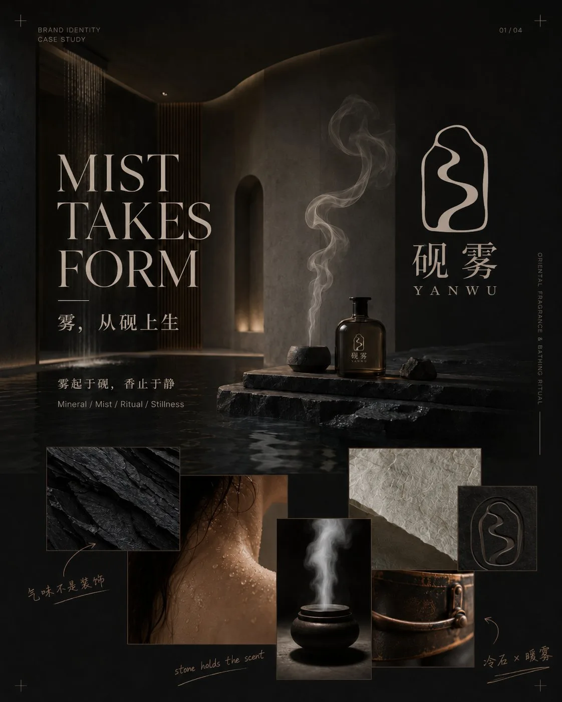
ChatGPT
PhotographyChatGPT
Senior brand designer four image vi proposal
Creator @MrLarus
Prompt
You are a senior brand designer, logo designer, visual art director, and editorial layout designer.

Please design and generate a set of [Four-Image Brand Visual Identity Proposal] directly for the same brand according to the brand information I fill in. Do not output image prompts first, and do not just provide plans or page outlines; generate 4 independent images directly.

[Brand Information]

Chinese Brand Name: [Fill in]
English Brand Name: [Fill in]
Brand Industry: [Fill in]
Main Products or Services: [Fill in]
Brand Positioning and Target Audience: [Fill in]
Brand Core Concept: [Fill in]
Brand Personality Keywords: [Fill in 3–5]
Brand Slogan: [Fill in, or re-refine based on concept]

Logo Inspiration Source: [Fill in]
Logo Type: [Abstract Symbol / Chinese Character Integration / Letter Graphic / Geometric Symbol / Emblem, etc.]
Meaning the Logo is expected to express: [Fill in]
Elements to avoid: [Fill in]

Overall Visual Style: [Fill in]
Main Color Tone: [Fill in]
Secondary and Accent Colors: [Fill in]
Main Materials: [Fill in 3–5 types]
Photography or Spatial Atmosphere: [Fill in]
Main Products, Packaging, and Application Scenarios: [Fill in]

Image Aspect Ratio: [Default 4:5 vertical]
Text Language: [Mainly Chinese / Mainly English / Combination of Chinese and English]
Supplementary Requirements: [Fill in]

If some information is not filled in, please automatically supplement a reasonable plan based on the brand industry, positioning, and concept. Do not stop because non-critical fields are empty.

━━━━━━━━━━━━━━━━━━
【Design Task】
━━━━━━━━━━━━━━━━━━

First, unify the design and lock the brand system, including:

- An original, clear, independently usable logo pattern
- Chinese and English brand wordmarks
- Main, secondary, and accent colors
- Typography, materials, and photographic language
- Secondary graphics and patterns extended from the logo
- Product, packaging, material, and spatial application methods

The logo cannot be text-only. It must include a design-heavy independent Symbol related to the brand concept, with clear outlines, negative space, or geometric structures, recognizable even when scaled down, and suitable for embossing, gold stamping, embroidery, engraving, and spatial signage.

Avoid directly using common industry icons, such as incense burners, tea leaves, female profiles, houses, common leaves, lotuses, auspicious clouds, Taiji, or traditional seals. They need to be abstracted, simplified, and reconstructed to form original brand symbols.

Once the logo is determined, the core outline, internal structure, wordmark, and combination method in the four images must remain consistent and cannot be redesigned for each image.

━━━━━━━━━━━━━━━━━━
【Content of the Four Images】
━━━━━━━━━━━━━━━━━━

Image 1 | Brand Worldview and Concept Cover

Use a large brand key visual to establish the brand mood and worldview, while clearly displaying the complete logo, Chinese name, English name, conceptual main title, brand manifesto, 3–5 mood or material images, and a small amount of handwritten conceptual notes.

Adopt a structure of "Main Title + Large Key Visual + Complete Logo + Irregular Mood Collage." The logo must be clearly visible but should not overpower the main title and brand atmosphere.

Image 2 | Logo Concept and Symbol Generation Logic

With the oversized Logo Symbol as the visual center, display the complete logo, Chinese and English wordmarks, horizontal and vertical combinations, simplified versions, conceptual source sketches, negative space, and structural relationships.

Add a small amount of hand-drawn outlines, arrows, circles, and designer's handwritten notes to let the audience understand why the logo was designed this way. The page should have a sense of research but should not be made into a complex engineering drawing or a traditional VI table.

Image 3 | Brand Visual Language and Design System

Display brand main colors, secondary colors, fonts, materials, photographic language, logo partial crops, and secondary patterns.

Colors need to establish a connection with real materials, such as stone, paper, metal, glass, plants, or fabrics. Secondary graphics must be extracted from the logo outline, internal curves, negative space, or strokes, and no irrelevant decorations should be added.

The layout uses a combination of regular grids and free collage, adding large typography, vertical text, thin lines, and a small amount of handwritten markings.

Image 4 | Brand Application and Experience Scenarios

Show how the brand enters real products, packaging, paper goods, fabrics, and spaces. Select 5–7 reasonable touchpoints based on the industry, such as the main product, gift box, tote bag, card, label, uniform, towel, metal signage, storefront, reception desk, or spatial wayfinding.

Adopt a structure of "One large product or spatial key visual + 4–6 application details." The complete logo, independent Symbol, and secondary patterns need to be used in layers; do not have every product repeatedly print the full brand name.

━━━━━━━━━━━━━━━━━━
【Overall Visual Requirements】
━━━━━━━━━━━━━━━━━━

The entire set of images adopts a design language that combines high-end brand proposals, Editorial magazine design, art direction boards, and modern visual identity cases.

Each image must have:

- A striking large main title
- A short subtitle
- A core description
- 2–4 keywords or information tags
- 2–4 meaningful handwritten notes
- A clear visual center
- Approximately 25%–35% white space

The main title should participate in the composition; it can be enlarged, cropped, displaced, arranged vertically, or interspersed with images and logos, rather than being a plain header.

Handwritten markings can use short sentences, arrows, circles, underlines, or simple sketches to explain the logo, fonts, colors, materials, and processes. Handwritten content must be short, clear, and meaningful, avoiding meaningless garbled text and full-screen graffiti.

The four images use a unified brand name, logo, font, color scheme, material, photographic atmosphere, margins, and guide lines, but the layout cannot be identical:

- Image 1: Large key visual and mood collage
- Image 2: Oversized logo and structural research
- Image 3: Color, font, and material system
- Image 4: Product space and application implementation

Avoid common PPTs, simple Moodboards, traditional VI tables, material website mockup collections, neatly repeated grids, large blocks of body text, information crowding, low-quality 3D materials, cheap gold, color drift, and changes in logo structure.

━━━━━━━━━━━━━━━━━━
【Output Requirements】
━━━━━━━━━━━━━━━━━━

Please directly generate 4 independent 4:5 vertical images. Do not merge the four contents into one collage, and do not output image generation prompts first.

Generate in the following order:

1. Brand Worldview and Concept Cover
2. Logo Concept and Symbol Generation Logic
3. Brand Visual Language and Design System
4. Brand Application and Experience Scenarios

If currently only one image can be generated at a time, please start directly from Image 1 and continue generating Image 2, Image 3, and Image 4 according to the same locked logo and visual system, without re-planning or changing the design direction.
Copy the text, add your own details, and try it in your image model.