 Piko
Piko Explore prompt ↗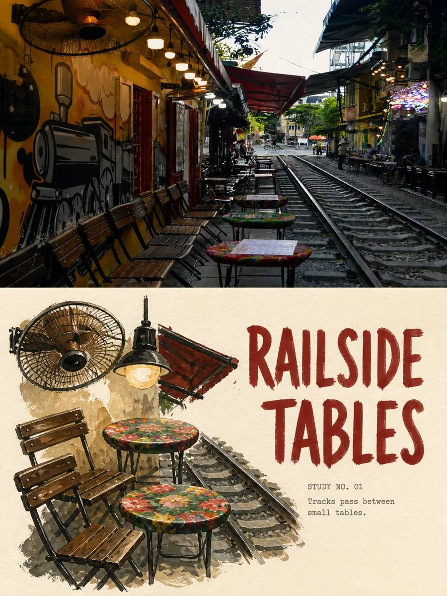
ChatGPT
DesignChatGPT
Rich gouache travel still life comparison poster
Creator @Hamburgerai
Prompt
Please make each of my uploaded travel photos into an independent "Rich Gouache Travel Still Life" comparison poster. Each photo is output individually, and multiple photos must not be stitched into the same work. The overall layout uses a 3:4 portrait composition. The frame is divided into two top and bottom areas with a height ratio close to 1:1, using clear, straight, and restrained horizontal boundaries; no gradients, feathering, or allowing paint to invade the photo area. The top half faithfully preserves the original photo. Accurately maintain the subject identity, quantity, posture, architectural structure, street direction, object relationships, real materials, natural light and shadow, and original color atmosphere, with only slight travel magazine and art publication color grading and extremely thin film grain. The top half must still be clearly a real photograph and must not be illustrated, stretched, mirrored, copied, or have the subject changed. The bottom half should not completely redraw the original scene, nor should the entire photo be simply gouached. First understand the photo, then select 4–8 urban objects that best represent the location and travel memories, such as motorcycles, bicycles, plastic low stools, coffee tables, lanterns, flower baskets, tableware, awnings, window panes, road markings, or signboard outlines. Reorganize the selected objects into an asymmetrical group of travel still lifes. Allow for changes in the scale, distance, occlusion, and spatial organization of the objects, making them like urban specimens picked up from the journey and rearranged on paper. The still life group occupies about 45%–68% of the bottom area, and must be surrounded by a continuous, complete piece of warm off-white paper with no fragmented decorations invading. Do not arrange all objects evenly along the bottom edge, and do not fill the background. Use truly opaque rich gouache, combined with a small amount of acrylic and dry brush textures. Colors are completely extracted from the original photo and compressed into 4–7 primary colors. Use direct, matte, highly opaque paint blocks; outlines are done in the deepest dark brown, blue-black, or charcoal gray from the photo, completed with loose, uneven, slightly hesitant hand-drawn lines. Retain visible brush bristles, dry brush gaps, thickness variations in paint, rough edges, a few search lines, and the base paper showing through. Highlights use uncovered paper white or direct white gouache strokes. Three sets of accurate text are added by default: 1. Refine a main title of 1–3 English words based on the photo content. 2. Add numbering in the form of "STUDY NO. 01". 3. Add a short observation sentence of 5–10 English words. The main title must be clearly readable at chat preview size. Use thick, slightly narrow or slightly rounded, slightly slanted hand-drawn gouache uppercase letters, featuring matte opaque pigment, visible brush bristles, dry brush gaps, rough edges, and uneven manual kerning. The title should look like it is brushed directly onto the paper with a paintbrush, rather than a smooth digital font overlaid later. The numbering and observation sentences use clearly readable small-sized humanist sans-serif, old lead type, or relaxed handwriting, allowing for slight ink deficiency, paper tooth, and manual misalignment. Text color is extracted from the original photo and the gouache still life, echoing the subject. Text is placed in continuous white space and can slightly bite into the edges of the still life, but must not block key subjects. Only render text explicitly written in the prompt. Do not generate fictional place names, dates, brands, signs, author names, signatures, logos, QR codes, watermarks, garbled code, or extra long text. Avoid: transparent watercolor wash, full-scene tracing, same-crop redraw, photorealistic painting, smooth digital gradients, airbrush, clean vector outlines, oil impasto, plastic 3D, cartoon, anime, childish coloring-book style, copied shop signs, fake labels, tiny unreadable typography, thin polished magazine fonts, floating digital text, excessive decoration, filled negative space, missing source-photo comparison. Most important rule: The top half must preserve the real original photo; the bottom half must actively extract urban objects and recompose them, turning the same travel location into a group of travel still lifes with a rich gouache texture, hand-drawn titles, and large areas of white paper.
Copy the text, add your own details, and try it in your image model.


