 Piko
Piko Explore prompt ↗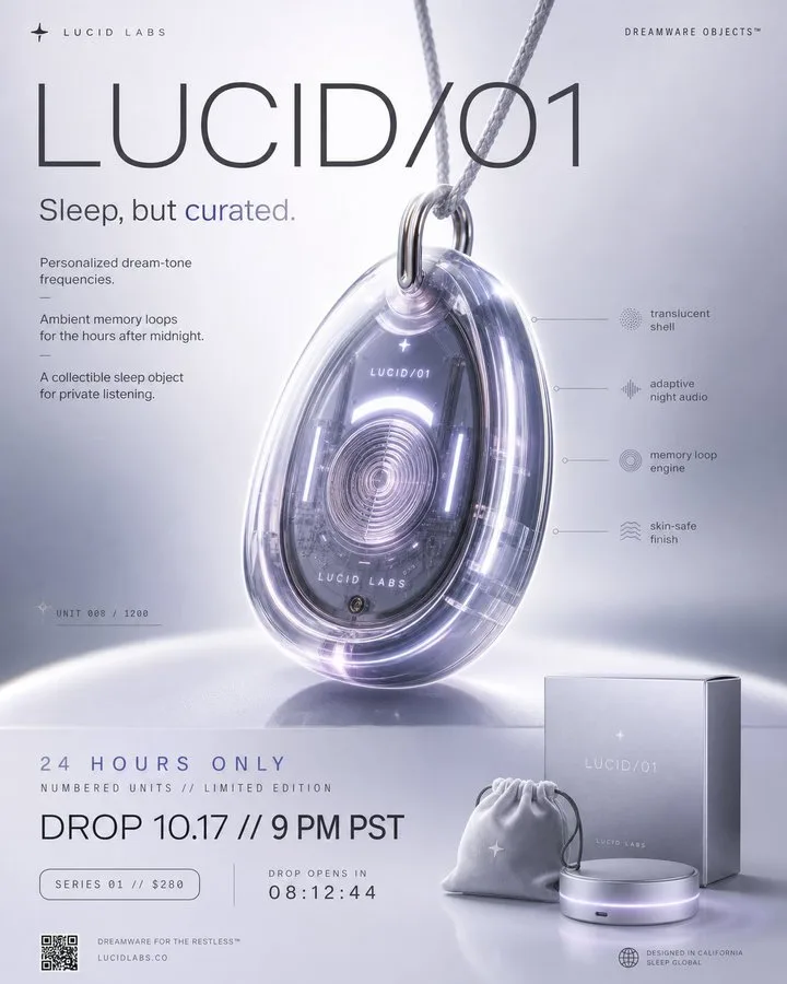
ChatGPT
DesignChatGPT
Premium scarce launch poster
Creator @LudovicCreator
Prompt
Create a premium, highly believable Fake Product Drop Poster for an imaginary product called [PRODUCT NAME].

The goal is to make the product feel instantly desirable, culturally relevant, and visually irresistible, as if it were a real limited-edition release from a brand people obsess over. The poster should feel like a launch teaser, hype campaign, or collectible promo visual with strong viral potential.

Product details:
- Product name: [PRODUCT NAME]
- Product category: [FASHION / TECH / BEAUTY / FOOD / DRINK / OBJECT / ACCESSORY / TOY / PERFUME / HYBRID / ABSURD LUXURY]
- Core concept: [WHAT THE PRODUCT IS]
- Drop type: [LIMITED EDITION / SEASONAL DROP / COLLAB / SECRET RELEASE / CULT ITEM / EXCLUSIVE CAPSULE]
- Audience: [AUDIENCE]
- Main appeal: [WHY PEOPLE WOULD WANT IT]
- Brand energy: [COOL / CHAOTIC / LUXURY / INTERNET-CORE / PLAYFUL / FUTURISTIC / ARTSY / HYPER-PREMIUM]
- Cultural vibe: [GEN Z HYPE / QUIET LUXURY / Y2K / CYBER / RETRO / ART TOY / HIGH FASHION / STREETWEAR / SOFT SURREAL]
- Scarcity logic: [LIMITED UNITS / INVITE ONLY / 24-HOUR DROP / MEMBERS ONLY / EXCLUSIVE COLORWAY]

Poster structure:
Build the visual like a premium product launch poster.

Include sections such as:
- hero product image
- product name
- launch or drop date
- short teaser line or campaign slogan
- product specs or feature callouts
- edition or scarcity marker
- optional collaboration logo or sub-brand
- optional “coming soon” or countdown cue
- optional fake price or product code
- optional packaging or accessory hints

For the copy, include:
- one strong hero headline
- 1 to 4 supporting teaser lines
- concise, culturally fluent launch language
- a balance between hype and premium restraint
- wording that feels like a real teaser campaign, not a generic ad

Include:
- a strong product name lockup
- premium hierarchy
- clear drop information
- polished product styling
- realistic campaign logic
- trend-aware visual cues
- visual desire and scarcity energy
- strong shareable poster composition

Visual direction:
- Make the poster feel like a real brand drop people would repost, wait for, and talk about
- Emphasize desirability, scarcity, coolness, and product fantasy
- Balance polished commercial design with cultural fluency
- Make it suitable for social launches, poster culture, product concepts, brand worldbuilding, or fake campaign design
- The result should look like a genuine launch poster from a sought-after brand

Art direction:
- Style: [LUXURY PRODUCT CAMPAIGN / STREETWEAR DROP POSTER / APPLE-LIKE MINIMAL / HYPEBEAST VISUAL / BEAUTY TEASER / ART TOY CAMPAIGN / FUTURIST COMMERCIAL]
- Color palette: [PALETTE]
- Typography feel: [BOLD SANS / LUXURY SERIF / CLEAN MINIMAL / INDUSTRIAL TECH / HYPE EDITORIAL]
- Material feel: [POSTER PRINT / DIGITAL CAMPAIGN VISUAL / BILLBOARD MOCKUP / PRODUCT TEASER SHEET / DROP ANNOUNCEMENT]
- Lighting or image mood: [FLASHY / GLOWY / LUXURIOUS / DRAMATIC / CLEAN STUDIO / RAW CAMPAIGN]
- Background: [SOLID COLOR / GRADIENT / TEXTURAL / SHADOW SPACE / PRODUCT STAGE / STUDIO SET]

Composition:
- Show the poster as one cohesive launch object
- Make the hero product, name, and drop info instantly readable
- Use strong poster hierarchy and real campaign logic
- Make the product feel iconic, ownable, and culturally charged
- Make the final output feel like a premium fake product campaign with viral potential

Output quality:
- ultra-detailed
- visually structured
- commercially believable
- trend-aware and culturally fluent
- polished product styling
- strong launch hierarchy
- premium poster composition
- instantly shareable visual concept

Optional content blocks:
- countdown timer
- edition number
- collaboration mark
- packaging preview
- feature icons
- “sold out soon” cue
- launch city marker
- QR code
- fake serial number
- campaign disclaimer

Avoid:
- generic poster composition
- weak product concept
- fake-looking scarcity cues
- cluttered layout
- random typography choices
- amateur launch aesthetics
- too much copy fighting the hero object
- overly corporate tone unless intentionally chosen
Copy the text, add your own details, and try it in your image model.


