 Piko
Piko Explore prompt ↗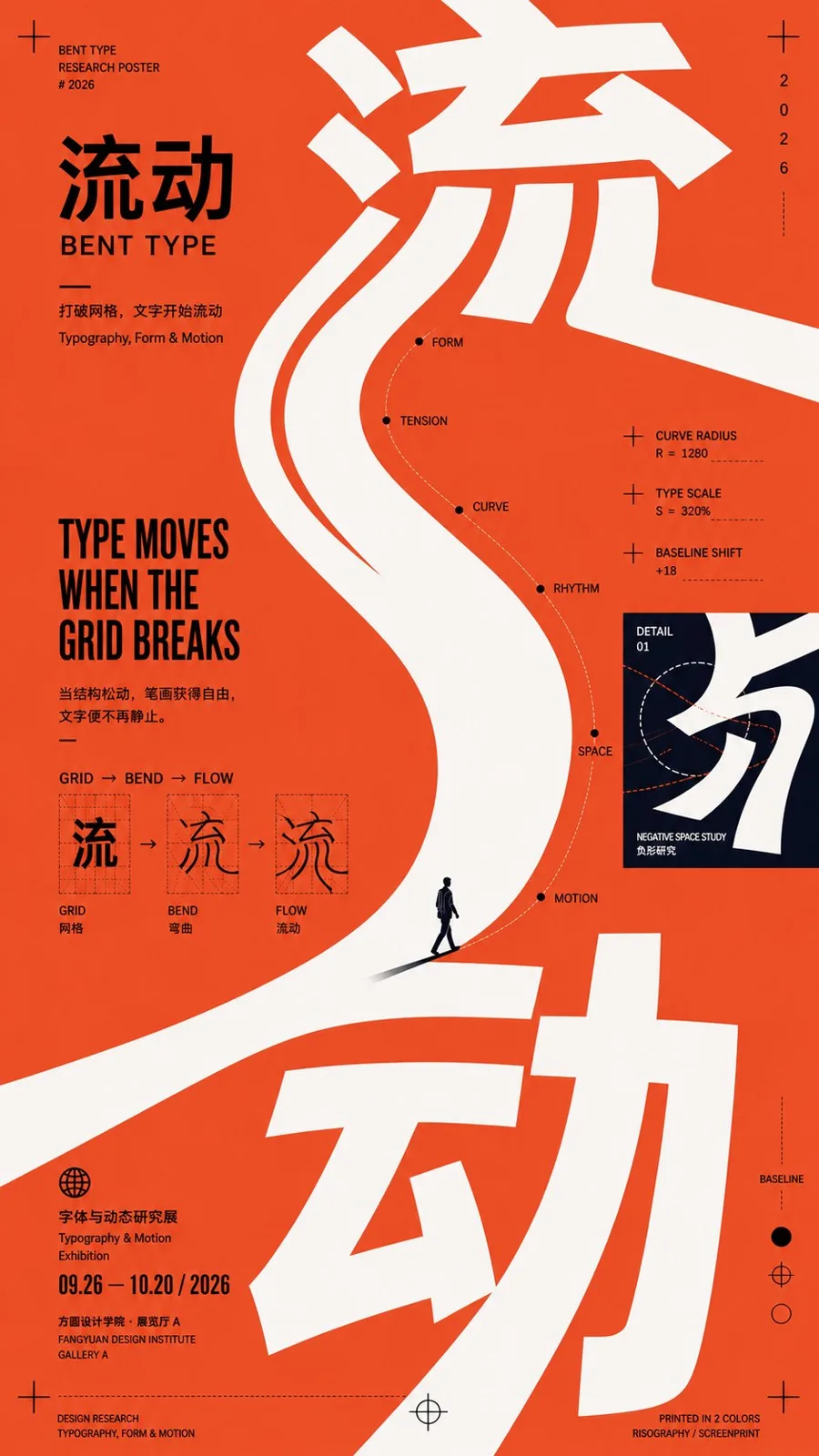
ChatGPT
DesignChatGPT
Postmodern curve composition poster design prompt
Creator @MrLarus
Prompt
【Theme】: ____
【Chinese Title】: ____
【English Title】: ____
【Main Visual】: ____
【Curve Composition Method】: Large Curved Typography / Surface Folding / Spiral Collage / Curve Connection / Others
【Auxiliary Materials】: ____
【Main Color】: ____
【Auxiliary Color】: ____
【Accent Color】: ____
【Aspect Ratio】: 9:16

Generate a curve composition poster with a strong sense of design, overall using a visual language of Contemporary Editorial Poster × Postmodern Graphic Design × Cultural Exhibition Poster.

First determine one most important main curve, then organize the main body, Typography, images, information, and white space around it. The curve is not a decoration, but the visual skeleton and reading path of the entire poster.

Choose a main curve method based on the content:

Large Curved Typography: Let the large Typography itself undergo stretching, bending, cutting, and going out of the frame, so the letterforms directly become the main curve visual.

Surface Folding: Let paper, fabric, architectural surfaces, or other bendable entities form a huge curved surface, and place text, images, and information directly on the curved surface, bending naturally with perspective.

Spiral Collage: Use an open spiral path to connect photos, receipts, text, people, and small visual nodes, gradually guiding from the periphery to the core.

Curve Connection: Use a continuous S-shaped or arched main line to pass through multiple visual nodes of different scales, allowing originally scattered images, people, and text to form a complete narrative.

The entire poster only keeps one strongest curve direction; other lines and elements must only follow or balance the main curve and not create new visual competition.

The main title must participate in the composition, and can be misplaced, cross-zone, cut, partially obscured, or change scale along the curve, rather than just being neatly placed at the top.

The image allows 2–3 visual languages such as photography, illustration, handwriting, color blocks, paper, and receipts to collide, but all materials must be organized around the same curve path to avoid random sticker-style collage.

Control obvious visual hierarchy: see the main curve and main visual first; see the main title second; read images and information along the curve path third; and finally see the date, location, and tiny auxiliary text.

Retain large areas of effective white space, allow for asymmetry, cropping, scale imbalance, partial out-of-frame, and slight color offset, giving the layout a loose but orderly postmodern editorial design feel.

Control colors within 3–5 types, establishing recognition with one large area main color, one strong contrast color, and a small amount of accent colors.

Overall requirements: clear curves, eye-catching visuals, rich but not cluttered information, a sense of manual typesetting, and the temperament of design schools and art publications.
Copy the text, add your own details, and try it in your image model.


