 Piko
Piko Explore prompt ↗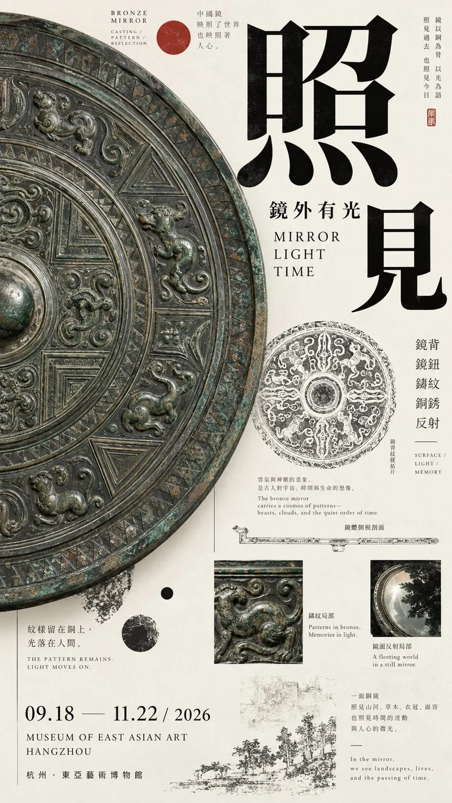
ChatGPT
DesignChatGPT
Oriental culture exhibition poster design guide
Creator @MrLarus
Prompt
[Theme]:
[Chinese Title]:
[English Title]:
[Core Subject]:
[Left-Right Relationship]: Giant object dominating / Image narrow band × Wide text field / Subject × Archive / Image crossing boundaries / Dense × White space / Other
[Left Content]:
[Right Content]:
[Crossover Elements]: Object silhouette / Branches and leaves / Large characters / Line drawings / Patterns / Other
[Main Color Tone]:
[Accent Color]:
[Date / Venue]:
[Aspect Ratio]: 9:16

Generate a high-aesthetic, high-information-density Oriental culture exhibition poster using a "Left-Right Composition / Asymmetrical Dual-Zone Composition."

Do not split the left and right 50/50 equally. Use ratios like 35/65, 40/60, 45/55 flexibly based on the volume of the subject, text density, and white space relationships. The focus is not equal area on both sides, but achieving visual balance among image weight, typography, and information density.

Flexibly choose different methods based on the theme:

Giant Object Dominating: Enlarge a scale object, cultural relic, or art object on one side, allowing bold cropping to occupy the primary visual weight; establish reading hierarchy on the other side through titles, English text, small print, structural line drawings, and exhibition info.

Image Narrow Band × Wide Text Field: Use a slender ancient painting, photography, or pattern slice on one side, while keeping a larger area of paper and typography on the other. Branches, birds, clouds, or subject silhouettes in the image can actively cross out of the core area into the text zone.

Subject × Archive: Maintain a single strong subject on one side, while combining object line drawings, material macros, rubbings, pattern studies, dimensions, era, and a small amount of explanatory text on the other to create an art catalog feel.

Dense × White Space: Form a high-density visual on one side through images, archive fragments, and research content, while maintaining a large area of controlled white space on the other, using only a few large characters and key exhibition info. White space must not just be "no content"; it must be precisely designed through kerning, fine lines, position, and proportion.

Left and right boundaries should not be too mechanical. Allow object edges, large characters, flower branches, patterns, or research lines to cross the boundary by about 3%–10% to reconnect the two sides, while avoiding random collage.

Typography must be redesigned based on the subject of each image. Use oversized single characters, two-character offsets, full horizontal titles, medium-scale titles, multi-column text, or partial color inversion. Adhere to the scale contrast of "large characters are very large, small characters are very small," reducing meaningless medium-sized fonts. Do not fixate on four-character vertical arrangements, and do not repeat templates like "two-character horizontal + two-character vertical."

Information density should refer to mature museum posters, Japanese Editorial Design, and Art Catalogues. Include English subtitles, eras, materials, techniques, venues, dates, curatorial phrases, and 1–3 research nodes directly related to the theme, such as object line drawings, glaze macros, ancient painting materials, pattern rubbings, stone texture studies, or partial enlargements.

These auxiliary pieces of information must serve the theme; do not pile up random small text just to "look professional."

Control colors within 3–5 main colors. Prioritize restrained colors such as bone white, ink black, celadon green, mineral blue/green, deep gray, and ochre, then add a clear but very small area of cinnabar red or another accent color. Paper surface should remain clean without using dirty yellow antique filters.

First glance should see the large subject and the left-right weight relationship; second glance sees the title and main color blocks; third glance discovers how objects, ancient paintings, or branches break through the left-right boundaries; finally, read the materials, structures, eras, and exhibition archives.

Core principle: One side is responsible for anchoring the vision, the other for carrying the reading; white space is weight, and information density is also weight; left and right are not equal, but the whole must be balanced.

Overall requirements: 9:16, high-definition, clear, clean paper surface, realistic subject texture, sharp typography, fine lines and small text as clear as possible, rich information but not messy, with the completion level of mature museum posters and art publications.

Avoid: Mechanical 50/50 split, simple left-image-right-text, placing a similar subject on both sides, subjects being too small, information areas looking like manuals, fixed title templates, PPT info boxes, complex UI, random English, heavy aging, mottled noise, image numbering, copyright logos, four-pointed stars, sparkles, and low-completion AI poster vibes.
Copy the text, add your own details, and try it in your image model.


