 Piko
Piko Explore prompt ↗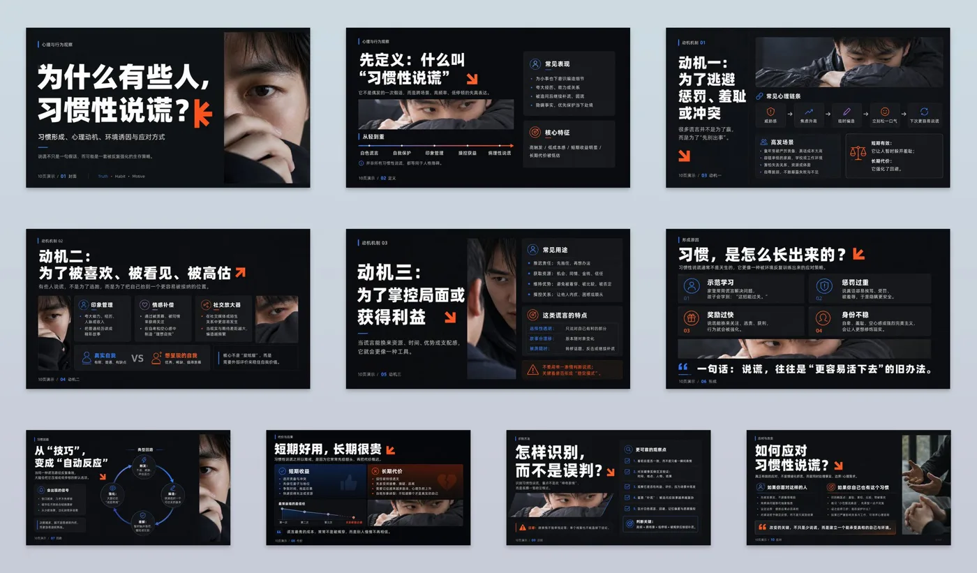
ChatGPT
DesignChatGPT
Modern international typographic style ppt system
Creator @xiaoxiaodong01
Prompt
Establish a modern PPT system collaborating dark field high contrast, bold titles, and rectangular photographic slices: take International Typographic Style theory as the main axis, using modular grids, unified margins, and baseline rhythm to stabilize information; use the functional asymmetry of New Typography to create spanning columns, misalignments, and scale transitions; use Gestalt laws of proximity and common region to cluster titles, descriptions, data, and images into clear modules; use Itten's light-dark and area contrast to let small-area high-purity symbols form instantaneous focus against large-area low-chroma backgrounds. Borrow Josef Müller-Brockmann's mathematical grids and objective hierarchy to coordinate the entire series, absorb Jan Tschichold's dynamic white space and unequal blocks to guide the line of sight, use Paul Rand's conceptualized geometric symbols to provide light recognition, and then use Alexey Brodovitch's bold cropping and text-image dialogue to change page density, with each dividing labor without replicating individual works. The color scheme adopts four types of replaceable roles: deep low-brightness low-chroma background accounts for 65%—80%, high-brightness information color accounts for 15%—25%, thematic photos retain medium-high brightness and medium chroma accounting for 15%—35%, and high-purity cool and warm localized accent colors total no more than 8%; emphasis is only placed adjacent to title endpoints, key numbers, and directional nodes, enhancing brightness through simultaneous contrast, any theme or brand colors must be mapped once according to roles, maintaining area, brightness order, chroma difference, cool-warm tension, and projection readability unchanged. The composition uses a 4—8 column elastic modular grid, with titles read first, focal images second, and descriptions and data last; covers allow oversized titles to span columns, content pages rotate between left-right splitting, up-down staggered levels, and large blocks of white space, rectangular images serve as unequal visual mass to dynamically balance with text areas, allowing only one symbol to cross column lines for controlled breaking of the grid. The background uses a uniform matte plane as the base, with extremely fine low-contrast squares overlaid on the cover, while content pages remain pure; photography adopts natural diffused light, realistic tones, close-up cropping, and hard-edged rectangular masks without decorative filters; radial petals, sharp-angled intersections, and folded-angle linear shapes are produced as stroke-less vector flat fills, with sharp edges, partial edge-pressing or semi-bleeding, undertaking the rhythm of chapters, directions, and pauses. Titles and body text use a rounded geometric sans-serif family with consistent skeletons: titles are extra bold, tight letter spacing, tight line spacing and broken into short lines, body text is regular weight, small font size, loose line spacing; Chinese and Western characters are corrected according to visual face, counter density, and baseline, not strictly aligned by nominal font size, title symbols only fit endpoints or negative spaces, not eroding readability. The overall feeling is bright, direct, young, agile, clear, and credible. Topic: Why do some people habitually lie? Rich in knowledge points. Each layout varies to avoid repetition. A total of 10 pages.
Copy the text, add your own details, and try it in your image model.


