 Piko
Piko Explore prompt ↗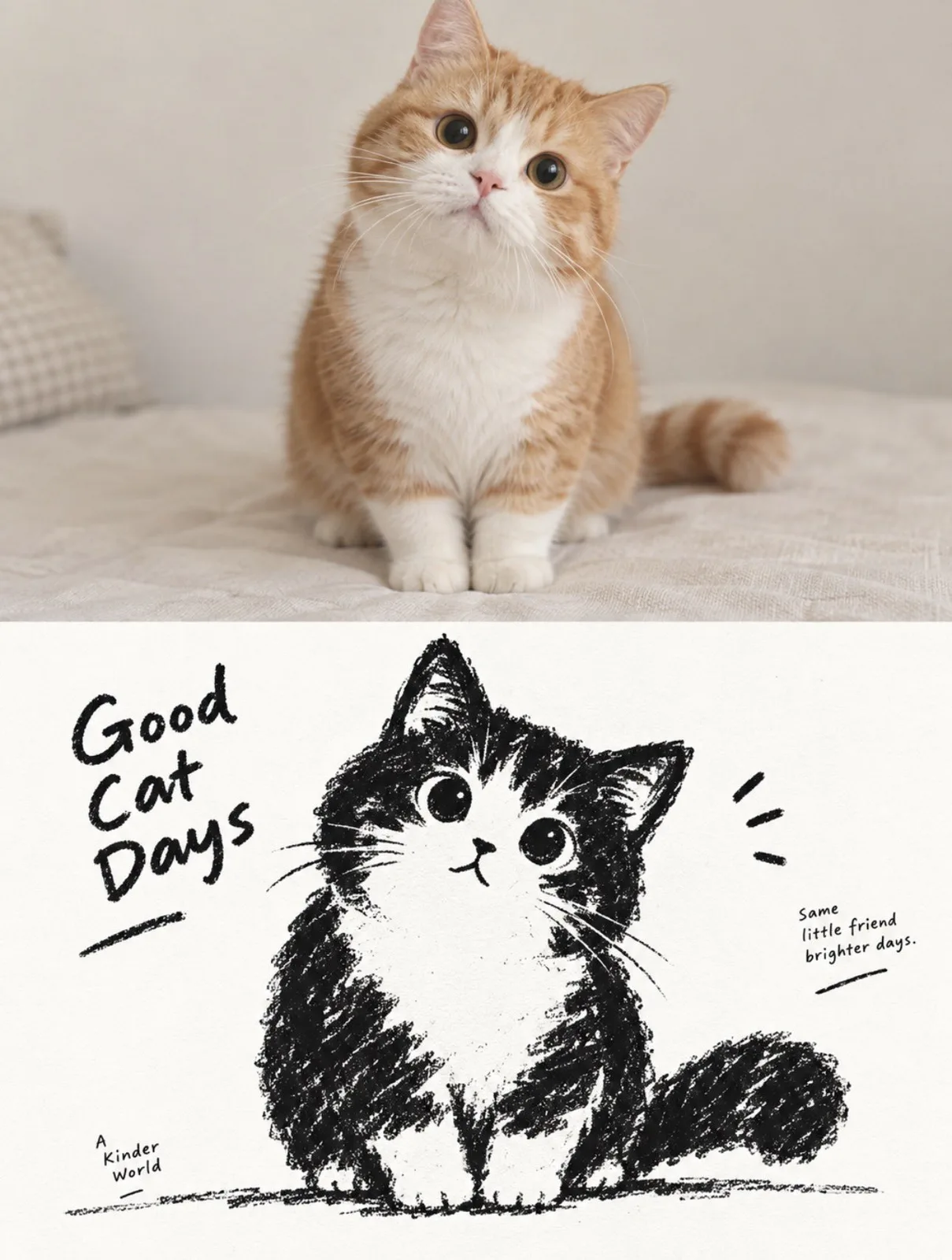
ChatGPT
DesignChatGPT
Minimalist black and white childrens book split poster
Creator @zhidawang219555
Prompt
Create a vertical "top-bottom split" style poster, the canvas is strictly divided into upper and lower areas, overall maintaining sufficient white space, quietness, and a sense of high-end children's book editing.

Upper part:
Display the original photo uploaded by the user. The subject is limited to people, pets, animals, or the interaction relationship between people and pets, retaining the true photographic state of the subject, including shape, fur color or skin tone, hairstyle, clothing, posture, movement, expression, and overall temperament. The upper part is not redrawn in illustration style; it should be like a clean, real, and clear reference photo. The background can be moderately simplified and cropped, but do not let buildings and the environment become the main character; the focus is always the human or animal subject.

Lower part:
Extract the same subject from the photo in the upper part and reconstruct it as a minimalist thick black dry medium silhouette illustration. Do not mechanically trace photo details; instead, compress the subject into a rounded, thick, slightly naive generalized form. The head, face, ears, hand movements, tail, body outline, or the most memorable parts can be moderately enlarged, making the original object recognizable at a glance even under minimal information. If the photo contains multiple subjects, retain the most important interaction relationship and treat them as a single visual unit rather than an average dispersion of focus.

The image uses only a near-pure white paper base + thick black crayon, charcoal, or dry rub marks, no color, and no grayscale gradients. The black form is not a smooth solid vector block but is formed by repeated application of short, powerful crayon strokes, retaining paper grain, broken strokes, indentations, rough edges, uneven thickness, and local white gaps. The outline is slightly shaky, incomplete, and imprecise, keeping the image with a true handmade feel.

The most critical identification features of the subject can be strengthened through "white characteristic areas suddenly cut out of the black silhouette," such as human facial contours, around the eyes, hairline, mouth shape, pet face, nose and mouth area, chest patterns, the core structure of objects, or the most recognizable parts; then use minimal black dots, short lines, or symbols to complete expressions and details. Do not pursue realistic facial features and precise structures, but let a direct, interesting, and strong recognition relationship form between black and white.

The composition maintains large areas of pure white space + one main visual relationship. The subject can be suspended in the center, or slightly offset, partially cropped, or near the bottom of the screen, using only a rough ground friction line, a few short lines, or minimal environment symbols to suggest space. Grass, wind, tabletop, ground, smoke, roads, shadows, or other environmental information should be compressed into minimal crayon marks, keeping the background quiet and empty. The overall goal is not to pursue complex scenes, but to let a posture, movement, distance, or relationship bear the main narrative.

The text retains a small text system where a high-end sense of editing and a children's book feel coexist. Don't just write location or object names, but extract a short English title from the emotion, movement, relationship, time, or small story in the photo, and then match it with a number, a suitable golden quote, a chapter number, or a very short, subtle small copy. The text can be restrained small printed text, or a very small amount of clumsy handwriting, crayon characters, or not completely regular font shapes can be added, making it look as if it originally belonged to this illustration.

The text needs to have a clever relationship with the graphics: it can be arranged along the ground line, extend along the direction of the subject's movement, hide in large areas of white space, produce slight occlusion with the outline, be stuck in the negative space between two subjects, or use a thin line to connect the number with the subject. Maintaining "one short title + 1–2 groups of minimal auxiliary text" is enough, letting the text become part of the compositional rhythm rather than a common poster title.

The overall presentation features the visual characteristics of "upper part real original image + lower part black needs to be thick, white needs to be clean, shape needs to be simple, texture needs to be rough," maintaining a subtle balance between childishness, softness, quietness, humor, and loneliness, like an old black-and-white children's book re-edited by a high-end design studio. Avoid smooth digital outlines, precise line art, realistic light and shadow, thick painting, three-dimensional effects, color, large areas of gray rendering, cartoon sticker feel, and templated commercial illustrations.
Copy the text, add your own details, and try it in your image model.


