 Piko
Piko Explore prompt ↗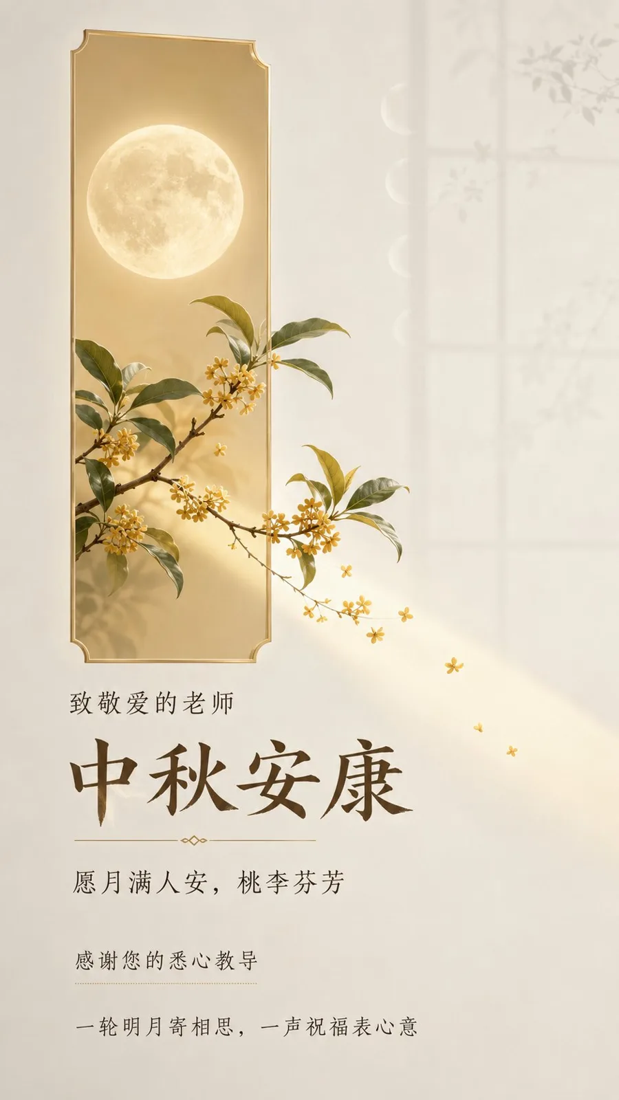
ChatGPT
DesignChatGPT
Mid autumn teacher blessing moon osmanthus poster
Creator @xiaoxiaodong01
Prompt
Design a vertical Mid-Autumn Festival blessing poster for teachers, intended for WeChat chat windows and mobile forwarding, targeting respected teachers, with a short viewing time but needing to be fully understood, with an information density between text-light and standard. The core visual language is "real objects passing through a geometric emotional window": with a realistic full moon, osmanthus branches, and a small amount of osmanthus flowers as the main subjects, representing the single visual event of "moonlight and blessings passing through the window to reach the teacher's side." Set a narrow, long, low-saturation light champagne gold geometric color block in the frame as a visual anchor and spatial container; the color block is like a quiet emotional window illuminated by moonlight, maintaining clear controlled borders and a slight translucency. The full moon is located inside the window, and the osmanthus branches naturally protrude from one end of the window; branches, leaves, flowers, and a small patch of moonlight cross the boundary and extend into the large external white space, creating a sense of real spatial penetration; the main subject must not be completely trapped by the color block, nor should it become a decorative icon. The background is a "moonlit classroom atmosphere" related to the theme: warm ivory white to extremely light mist gray negative space, like the air illuminated by moonlight by a classroom window at night; in the distance, only extremely faint, almost transparent window frame outlines and soothing lunar phase arcs are retained, allowing the main subject to emerge from a quiet distance and preserving a truly clean breathing area for the text. Add only a small amount of fine-line lunar phases and osmanthus branch shadows that have a causal relationship with Mid-Autumn and teacher-student emotions; the surface is complete, clean, and matte, with only subtle controlled changes in brightness, avoiding irrelevant scenery, crowded decorations, or dramatic dark scenes. The text must accurately present the following Chinese characters, without any pseudo-text, garbled code, extra English, or unauthorized content, maintaining natural and clear Simplified Chinese fonts: 1. "中秋安康"—Main title, the first reading entry point, a gentle yet solemn high-recognition title lock-up. 2. "致敬爱的老师"—Recipient address, a short kicker, forming an intimate identity confirmation with the main title. 3. "愿月满人安,桃李芬芳"—Festival wish, authored expression, acting as an emotional promise following the main title. 4. "感谢您的悉心教导"—Teacher-student emotion description, authored expression, appearing as a short sentence or a lightweight callout, fulfilling the function of gratitude. 5. "一轮明月寄相思,一声祝福表心意"—Concluding copy, authored expression, acting as a quiet bottom/edge explanatory line, completing the reading loop from the festival to the teacher's kindness. The reading order is: Recipient address → Main title → Festival wish → Gratitude description → Concluding copy. The text forms 4 readable blocks: the kicker is adjacent to the main title but with clear hierarchy; the wish is an independent soft short sentence; the gratitude description and concluding copy form a lightweight coda. Most of the negative space remains text-free, allowing ample room for the moonlight window and the cross-boundary main subject. No dates, schools, names, institutions, contact information, event locations, or signatures, as these were not provided by the user and should not be fabricated. The composition uses a complete editorial-style blessing poster layout: the geometric window and the realistic moon-osmanthus subject form the sole visual focus, with text naturally organized along the relationship of the moonlight overflowing from the window, forming a soothing reading path from the address at the top to the title near the subject, and then to the blessing coda at the bottom; the text does not float on irrelevant images but echoes the window edges, moonlight, and negative space. Retain Oriental negative space, modern order, natural vitality, light luxury quality, and restrained editorial temperament, avoiding template-like stacking. The color scheme adopts a low-saturation warm moonlight plan: ivory white and extremely light mist gray as large areas of space, with a light champagne gold window and soft moonlight responsible for the festival warmth; the lunar surface is a natural warm white, osmanthus flowers and branches use realistic but restrained pale gold, olive green, and a small amount of dark taupe as visual anchors, and the text uses soft dark taupe rather than pure black. Maintain high brightness, low to medium-low saturation, and soft contrast, making the viewer feel peaceful, intimate, respected, and gently remembered; the main subject and negative space are clearly separated, but the overall look is not heavy or noisy, and high-saturation festive red and gold are not used. The typography adopts a modern humanistic editorial temperament suitable for Chinese mobile reading: the main title is a clear, slightly scholarly and stable Chinese display typeface, with strokes having a warm hand-written feel but precise and complete edges; auxiliary text forms a rhythm with lightweight, regular, and stretched Chinese arrangement, distinguishing the address, wish, gratitude, and conclusion through font weight, density, negative space, and line length, without stacking all text in the same font size in the center. Text enters the frame like moonlight, gaining emphasis near the window edges and receding moderately in the negative space; maintain natural legibility of Simplified Chinese, with all glyphs complete and clear. The main subject adopts a fine realistic photographic texture: the lunar surface has restrained real crater light and shadow and a soft halo, the slender branches, clusters of small flowers, and leaves of the osmanthus have recognizable natural forms and delicate layers; completed with soft diffused moonlight, clean matte surfaces, precisely controlled edges, and natural spatial depth, avoiding heavy shadows, cartoonization, 3D icons, watermarks, interface elements, pseudo-text, non-causal symbols, or a cheap template feel. THEORY_LOGIC = SET[Negative space composition::Visual metaphor::Editorial hierarchy] || SYNTHESIS[Using the window as a relationship boundary, allowing the moon and osmanthus to cross the boundary into quiet negative space; using the main title, wishes, gratitude, and conclusion to form a progressive rhythm from recognition to emotional resonance, keeping the theme of the teacher's kindness clear, gentle, and respectful in rapid mobile reading] METAPHOR_LOGIC = Moonlight passes through the emotional window, bringing the Mid-Autumn reunion and the fragrance of osmanthus across boundaries to the teacher's side, with negative space becoming a quiet place where gratitude is heard.
Copy the text, add your own details, and try it in your image model.


