 Piko
Piko Explore prompt ↗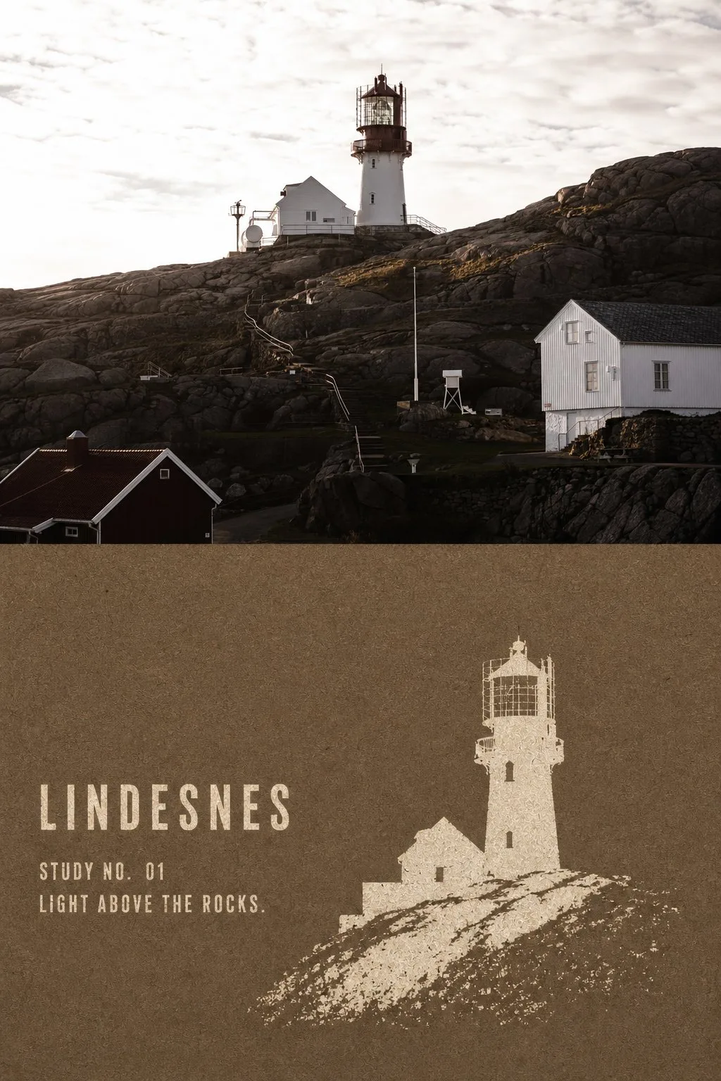
ChatGPT
DesignChatGPT
Kraft negative stencil landmark poster
Creator @Hamburgerai
Prompt
Please turn every travel photo I upload into an individual high-end contrast poster. Do not use multi-image splicing; output each photo separately.

Style Name: KRAFT NEGATIVE-STENCIL LANDMARK | Kraft Paper Negative-Stencil Landmark Printing

## Applicable Objects

Suitable for travel landmarks with clear individual silhouettes, such as:

Lighthouses, towers, churches, temples, gate towers, statues, monuments, windmills, solitary boats, pavilions, bridge towers, or architecture with distinct outlines.

The subject should be clearly separated from the sky, water, square, or relatively simple environment.

Do not process all photos into fixed icons like lighthouses, churches, or the same type of travel icon. Do not add birds, boats, trees, people, railings, or decorative landscapes that do not exist in the original photo.

## Overall Layout

Adopt a 3:4 vertical top-bottom contrast composition:

- The upper part (approximately 45%—52%) preserves the high-fidelity original photo
- The lower part (approximately 48%—55%) undergoes a kraft paper negative-stencil conversion
- Use a straight, clear, and restrained horizontal boundary between the two areas
- No feathering, no mutual penetration, and no thick division lines
- Do not generate picture frames, walls, handheld displays, or Mockups

The finished product must retain a substantial and clearly identifiable original photo contrast area. Do not shrink the original image into a small corner icon, nor make the entire poster a stencil print.

## Upper Original Photo

Faithfully preserve the original photo's:

- Landmark identity
- Number of subjects
- Subject orientation
- Proportions of architecture or objects
- Top, base, and key outlines
- Positions of doors, windows, and major structures
- Observation angle
- Number and position of people
- Relationships between sky, ground, water, and space
- Real materials, light and shadow, and original color atmosphere

Apply only slight color grading suitable for high-end travel magazines, architectural publications, or photography exhibitions, and add a very thin film grain.

Do not illustrate the original photo; do not move the subject, reshape the building, replace the sky, add or remove people, stretch, mirror, or duplicate the landmark.

## Lower Kraft Paper

The lower part is a continuous blank field of coarse fiber paper.

Choose a dark color for the paper base based on the temperament of the original photo:

- Natural kraft brown
- Dark taupe
- Cold brown
- Deep indigo
- Dark green
- A single dark color extracted from the shadows of the original photo

Express real natural paper fibers, tiny scraps of paper, slight creases, local color variations, and a matte rough surface.

The paper can look slightly old, but it should not be heavily charred, tattered, covered in stains, or made into a cheap retro background.

## Negative Stencil Mechanism

Remake the subject in the photo as a handmade negative-stencil, coarse-mesh silk screen, or old template print.

First lay down a complete dark coarse paper base, then use only one light-colored opaque ink to "leak" the subject out as if from the paper surface.

Light-colored inks can use:

- Warm ivory
- Off-white
- Light sand
- An extremely light corresponding color extracted from the photo's subject

The entire conversion is strictly limited to two colors or nearly two colors:

Paper base color + light stencil ink.

Do not add a third accent color, and do not use multicolor overprinting, gradients, translucent colors, realistic shadows, or glowing effects.

## Semantic Extraction

Do not copy the full scene of the photo.

Keep only:

- Complete outer silhouette of the subject
- Subject orientation
- Shape of the top and base
- 2—6 internal holes that determine identity
- Connection of the subject with the ground, shoreline, rocks, or water
- Very few subsidiary structures that actually exist in the original photo and help with identification

Remove:

- Complex window panes
- Brick joints and wall textures
- Decorative carvings
- Dense vegetation
- Cloud details
- Reflections
- Realistic light and shadow
- Repetitive figures
- Irrelevant environment
- Photographic noise

The subject must be recognizable at a glance, but internal information should be compressed to a minimum.

Recognition comes primarily from a single continuous block of light-colored negative space, rather than thin lines, cross-hatching, or photo light and dark.

## Composition Method

Adopt a full-frame impactful secondary composition.

The subject occupies the lower area:

- Height approximately 55%—85%
- Width approximately 28%—68%

The subject can be centered or slightly offset according to the center of gravity of the original photo. Allow the base or partial outlines to slightly bleed out of the frame.

Do not perform a two-color redraw at the same scale and complete framing as the photo above. The lower part should significantly enlarge the subject, remove the background, and change the information density.

Keep a continuous, quiet blank field of coarse paper around the subject.

The environment can retain at most one minimalist, intermittent negative space of ground, shoreline, rock mass, or water surface. Do not create a complete landscape background.

## Stencil Texture

The light-colored subject's outer outline should be solid and clear, while carrying slight paper fiber burrs formed by real template printing.

Inside the ink, the following are allowed:

- Uneven coverage
- Random ink missing
- A small number of pinholes
- Local scraping
- Friction wear
- Kraft paper fibers showing through the bottom
- Slight ink leakage or breaks at the template edges

These marks must appear naturally, randomly, and locally.

Do not use uniform grain filters, regular noise, regular grids, or photo threshold effects.

The upper part of the subject, the top outline, and structures determining identity should be relatively complete.

The closer to the bottom of the subject, the more obviously the ink can break, fall off, and gradually be swallowed by paper fibers, creating a feeling that memory is fading.

The bottom fading must be formed by ink loss, wear, and the paper base showing through.

Do not use:

- Smoke feathering
- Soft focus fading
- Regular halftone gradients
- Pixel dissipation
- Rectangular mosaics
- Digital airbrush effects

The print as a whole remains matte, flat, and almost without thickness.

Do not make it into a paper carving, relief, impasto, resin, or 3D model.

## Text

No text is generated by default to let the negative subject maintain maximum graphic impact.

If text is absolutely necessary, only allow:

- One reliable, extremely short location word
- One simple number

The text must use the same light-colored ink and be placed in the edge blank space as a small-area ink-missing stencil print.

Prohibit long paragraphs, author names, signatures, accounts, brands, logos, URLs, QR codes, watermarks, fake Chinese, or gibberish.

## Overall Mood

The overall feel should be like an old landmark stencil print hand-brushed on coarse kraft paper:

Restrained, coarse, quiet, isolated, flat, modern, while having the imperfections left by real paper and manual plate making.

It is not an ordinary silhouette, nor a photo with a two-color filter applied.

The most important visual mechanisms are:

Large blocks of light-colored negative space
+
Minimal internal structural holes
+
Random ink missing showing the base
+
Bottom gradually breaking and fading

## Mandatory Avoidance

Avoid:

ordinary silhouette, vector icon, travel logo, photo threshold filter, automatic tracing, monochrome photo filter, detailed etching, copperplate hatching, dense woodcut lines, halftone gradient, regular noise texture, pixel dissolve, airbrush fade, transparent watercolor, paper relief, paper sculpture, impasto, realistic shadows, plastic 3D, multicolor overprint, complete background coverage, same-crop same-scale redraw, invented landmark, added birds, added trees, added boats, excessive typography, author name, logo, watermark, QR code, gibberish text.

Both the clear original photo and the kraft paper negative-stencil conversion must appear simultaneously; otherwise, it is not considered complete.
Copy the text, add your own details, and try it in your image model.


