 Piko
Piko Explore prompt ↗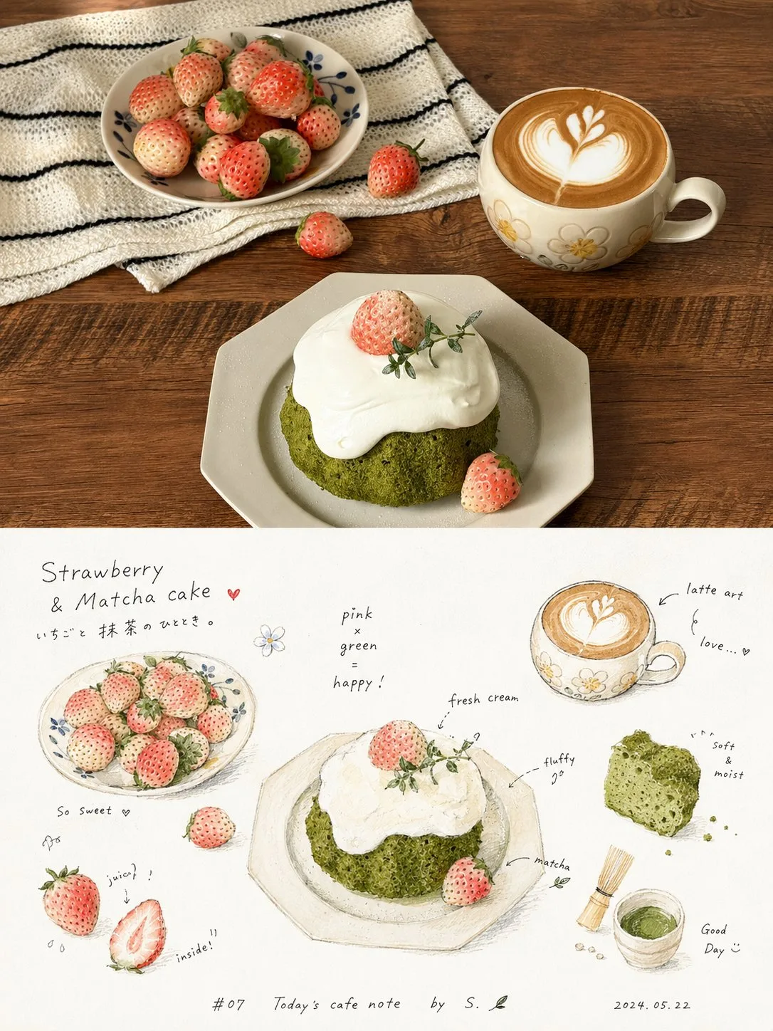
ChatGPT
DesignChatGPT
High end magazine style handwritten observation poster
Creator @xiaoxiaodong01
Prompt
Please turn every photo I upload into an individual high-end design poster, no multi-image stitching, output each photo separately. The overall composition uses a 3:4 vertical layout, with the top and bottom two areas strictly at a 1:1 height, each occupying 50% of the frame.

The upper part preserves the original photo, maintaining the main structure, real texture, natural light and shadow, and original color atmosphere, only performing slight high-end photographic color grading to give it the texture of magazine photography and art publications. To adapt to the frame, the sky, ground, or environmental background can be naturally extended, but the subject must not be stretched, distorted, or changed.

The lower part extracts the most recognizable subject, outline, posture, and narrative relationship from the photo, reconstructing it into a relaxed, intimate, and refreshing handwritten observation map. With a large area of clean white paper as the main space, the theme is broken down into several small block-like physical graphics, partial close-ups, cross-section small images, repeated small items, or detail fragments, loosely distributed in the upper-middle and middle sections of the frame, without a rigid table, but using staggered white space, a rhythm akin to horizontal reading, and handwritten phrases to naturally connect them, forming a casual observation record like taste, touch, sound, action, or memory. Small graphics should retain the material feel, color, and identification characteristics of the subject itself, presenting small scales, rounded outlines, slight perspective, and hand-painted coloring marks, with local parts carrying particles, charred edges, debris, textures, or cross-section details; do not unify them into standard icons, but rather a physical note feeling between picture book illustrations and journal stickers.

Text is the important skeleton of the lower part. Use thin black, slightly childlike or handwritten short words, short sentences, onomatopoeia, and annotations, interspersed around the graphics, some close to the edges of the graphics, some floating in the blank space, with relaxed character spacing and slightly jumping baselines, forming an intimate reading rhythm of 'reading while looking'; a smaller signature-style explanation, number, date, title, or thematic short sentence can be added at the bottom, making the text naturally integrate into the picture rather than a post-pasted layout label.

The overall color scheme is extracted from the upper photo, with white paper white space occupying the largest area, thin black characters carrying information, and the main color being warm, clean, and slightly high in brightness; a small amount of high-saturation warm colors, dark colors, or thematic auxiliary colors are only used for focus, shadows, textures, and rhythmic embellishments. Retain the slight softening, natural compression, uneven edges, and pigment absorption effects of scanned paper, without adding heavy shadows, decorative borders, or a strong sense of modern layout. The overall style references handwritten observation pages, picture book information pages, art publications, and relaxed editorial design, presenting a refreshing, gentle, naive, agile, readable, and life-like visual temperament, avoiding a template feel, cartoonization, cheapness, and over-design.
Copy the text, add your own details, and try it in your image model.


