 Piko
Piko Explore prompt ↗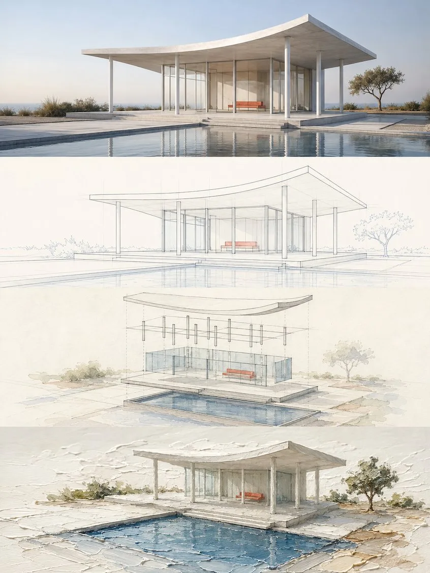
ChatGPT
DesignChatGPT
Four layer narrative style design poster
Creator @zhidawang219555
Prompt
Please turn each photo I upload into an independent premium design poster, no multi-image stitching, each photo output individually.

Overall 3:4 vertical composition. The frame is strictly divided from top to bottom into four equal horizontal areas, each area's height must precisely account for 25% of the overall frame, the ratio of the four layers is strictly 1:1:1:1, no ratio deviations allowed. Seamless transition between areas, no dividing lines, no white gaps. "No white gaps" here only refers to the seams between layers; inside each layer, negative space, paper, or solid color backgrounds can still be kept according to the corresponding style.

All four layers are based solely on the same uploaded photo, presenting the same subject, the same moment, and the same spatial relationship. Strictly maintain the subject's identity, quantity, key structures, proportions, posture, direction of movement, gaze, observation perspective, perspective, occlusion, left-right positions, front-back relationships, and core narrative consistency. The four layers are not four unrelated new compositions, but a continuous style translation of the same image. Since each layer is an extremely flat banner of approximately 3:1, the subject should be organized horizontally, with appropriate breathing space left on the left and right; natural horizontal extension of the background or slight cropping is allowed, but the subject must not be stretched vertically, key parts must not be cropped, character relationships must not be changed, or scenes unrelated to the original image must not be created.

The visual center of gravity, subject proportion, and contour placement of the four layers should be aligned vertically as much as possible, forming a coherent evolution from real photography gradually transitioning to the target style. Each layer must completely fill its own 25% area. Do not add layer numbers, dividing lines, borders, collage gaps, watermarks, or logos. Unless a certain layer's style description explicitly requires a small amount of edited text, receipt markings, or handwritten notes, do not generate extra text; even if text is needed, it must be minimal, restrained, not obscuring the subject, and as much as possible avoid garbled characters.

Layer 1 | Original Photography

Directly retain the real photography state of the uploaded photo as the visual benchmark for the style translation of the following three layers. Maintain the original person or subject's identity, quantity, facial features, hairstyle, clothing, structure, proportions, posture, action, gaze, interactive relationships, observation perspective, perspective, occlusion, environmental direction, natural light and shadow, and core colors, without performing illustration, texture transformation, geometrization, or 3D reconstruction.

To adapt to the extremely flat banner of approximately 3:1, only natural extension of the left and right sides of the background consistent with the logic of the original scene is allowed, or slight cropping that does not damage the subject; the subject's proportions must not be changed, people or buildings must not be stretched, and the head, hands/feet, key objects, or important narrative relationships must not be cropped. The frame remains natural, real, and clear, avoiding excessive skin smoothing, exaggerated color grading, fictional scenery, and decorations unrelated to the original image.

Layer 2 | Real Scene & Regular Line Drawing

In this approximately 3:1 flat banner area, translate the real subject of the first layer into the "Real Scene & Regular Line Drawing" style. Maintain the same subject identity, quantity, key structures, posture, left-right positions, perspective, spatial relationships, and core narrative as the first layer, then fully execute the following visual requirements:

Extract the most recognizable subject, contours, structures, postures, and narrative relationships around the theme, reconstructing them into a minimalist linear graphic expression. Do not mechanically trace details, but re-express with slender and accurate single lines, clear geometric perspective, restrained negative space, orderly detail rhythm, and appropriately abstract generalized modeling, retaining thematic features recognizable at a glance. If the theme leans toward a city or location, extract its most critical architectural skyline, street interface, signage rhythm, transportation facilities, shop window relationships, or crowd status; if the theme is not a city, extract its most core identity characteristics, contour language, structural relationships, and visual memory points, and translate them into a unified, concise, modern, and premium line drawing poster language. A small amount of geometric auxiliary elements, horizontal lines, vertical compositional lines, or rhythmic negative space can be added, making the entire frame look like a refinement and redesign of the theme's realistic scene.

The text system needs to naturally integrate into the overall layout, continuing this restrained, premium, and modern poster logic. Set a striking main title at the top; subtitles can use the original theme text, local language, country or region information, address, coordinates, serial number, year, or a short description. If the image contains street text, signs, or location information, it must be clear, natural, real, and professional, avoiding garbled characters, incorrect text, and random spelling. Text layout should be concise and orderly, together with the image forming a level of completion like collectible travel posters and city brand visuals, rather than explanatory labels randomly pasted on later.

Colors should not mechanically apply a fixed template, but should first understand the climate, light, sense of time, building materials, historical atmosphere, commercial warmth, culinary impressions, natural environment, and emotional texture of the theme itself, and then extract the primary color and background color relationship exclusive to that theme. The overall aesthetic can adopt single-color printing aesthetics or a very small amount of restrained color matching, forming rich changes through line density, brightness levels, local weight, negative space ratio, and detail rhythm, avoiding monotony and flatness. The final product should present a poster effect with clear lines, rich details, unified style, quiet modernity, agile restraint, and high-level aesthetics.

Layer 3 | Isometric Layered Watercolor Structure Study

In this approximately 3:1 flat banner area, translate the real subject of the first layer into the "Isometric Layered Watercolor Structure Study" style. Maintain the same subject identity, quantity, key structures, posture, left-right positions, perspective, spatial relationships, and core narrative as the first layer, then fully execute the following visual requirements:

Extract the most recognizable subject, contours, postures, and narrative relationships from the photo, reconstructing them into a structural deconstruction watercolor study in an axonometric style logic. The uploaded original photo is the sole basis; the subject's identity, geometric form, proportions, observation direction, spatial relationships, main colors, and scale references can only come from the original image. Do not directly paste the photo, do not do before-and-after comparisons, collages, or photographic slices.

When redrawing, first identify the core subject, main axis, original observation direction, foreground-midground-background relationships, 3–7 most important identifying features, 4–6 main colors, and environmental clues that can reflect scale in the original image. Retain the subject's overall contour, overall proportions, original perspective, symmetrical or asymmetrical relationships, key component relationships, identity-determining details, and main material colors, so that people can see at a glance that it is the same object as the original image.

The subject adopts axonometric redrawing logic, reorganized with clear, restrained, and professional axonometric spatial expression, but still faithful to the structural relationships and viewing logic of the original image. According to the subject's real structure, decompose it into 2–5 meaningful complete layers or components: buildings, objects, or composite items can be deconstructed along the roof, floors, shell, frame, base, modules, or connectors; landscapes or spaces can be expanded according to foreground, midground, background, and spatial enclosure levels; people, animals, or plants keep their bodies intact, only expressed through overlapping contours, posture layers, action lines, and surface color blocks, prohibiting dismemberment, dissection, or mechanical part-making. All layers should be restrainedly separated along the real axis or perspective direction, with uniform and moderate interlayer spacing, sharing the same central axis and spatial grid, and retaining one complete, stable, and most detail-rich base or anchor area, allowing the audience to reassemble the subject in their minds.

The overall frame composition remains professional, restrained, and editorial. The subject is centered or slightly offset according to the original image's center of gravity, with sufficient negative space around it, the stable base located at the bottom or center, and separated structural layers expanding upwards, outwards, or toward the depth of field along the real axis. Avoid dramatic fragmentation, excessive explosion diagrams, meaningless decorations, and mechanical deconstruction. The overall effect is like a highly complete research-type editorial poster, rather than an engineering manual.

The painting language adopts the temperament of an "architectural structural deconstruction watercolor study on warm ivory white watercolor paper," which can combine clear line drafts, semi-transparent watercolor blocks, a small amount of structural auxiliary lines, and restrained analytical markings. Retain slight paper texture, detailed brushstrokes, transparent color layering, and rational negative space, making it have both the knowledge sense of a research diagram and the elegance of an art publication. Colors are extracted from the original image and appropriately purified, remaining clear, accurate, restrained, and spirited, avoiding grayness, heaviness, over-rendering, and a cheap computer-rendered feel.

Text, as part of the composition, intervenes naturally in the form of "research diagrams / editorial notes." Extract a short title from the subject's identity, theme, action, state, or symbolic meaning of the photo, and pair it with a very small amount of numbering, structural markings, lateral notes, material words, status words, or miniature descriptions. Text remains slender, restrained, and professional, and can be arranged horizontally, vertically, or staggered along the axis, layering direction, negative space edges, or structural annotation positions, making it look like a combination of architectural research, watercolor observation diagrams, and high-end editorial design, rather than an ordinary poster title.

The whole presents axonometric structural logic, professional deconstruction order, watercolor research texture, editorial negative space, and premium publishing temperament. Whether the subject is a building, person, animal, plant, object, vehicle, street scene, interior, or natural landscape, the entire frame should grow the most appropriate deconstruction method from the original image's own structure, maintaining high adaptability and transferability. Avoid templated explosion diagrams, complex tech user interfaces, a sense of dismemberment, mechanical part sense, cartoonishness, e-commerce feel, and unfounded structural fabrications.

Layer 4 | Isometric 3D Impasto Space

In this approximately 3:1 flat banner area, translate the real subject of the first layer into the "Isometric 3D Impasto Space" style. Maintain the same subject identity, quantity, key structures, posture, left-right positions, perspective, spatial relationships, and core narrative as the first layer, then fully execute the following visual requirements:

Extract the most recognizable subject, contours, postures, and narrative relationships from the photo, reconstructing them into an exquisite impasto micro-landscape with axonometric three-dimensional spatial logic. The subject is not a flat illustration, but a three-dimensional miniature entity with clear volume, structure, front-to-back relationships, and a stable landing point; retain the object's most critical identity features, and appropriately organize the perspective and proportions to make it more complete, clear, and sculptural within a unified axonometric space.

The subject sits on a thematic color field formed by impasto paint. The color block is not an ordinary rectangular background, but should be converted into water, ground, road, grass, light belt, shoreline, shadow, or other spatial slices related to the theme according to the original image content, and naturally extend along the axonometric perspective direction. The subject must have a real spatial relationship with the color block, such as landing, embedding, passing through, extending, reflection, ripple, projection, or partial boundary-crossing, skillfully connecting the two-dimensional impasto strokes with the three-dimensional subject.

The composition is adaptively arranged based on the subject's volume, orientation, and movement direction, establishing a professional spatial order with diagonal axonometry, stable center of gravity, front-to-back depth, and large areas of negative space. The subject is usually located at a key node of the color block rather than mechanically centered, with the color block serving as visual guidance and perspective extension; if necessary, a set of low-weight clouds, sun, plants, ripples, or abstract natural imagery can be added to form front-to-back layers with the subject, but without establishing a second visual center.

The painting language uses a fusion of isometric miniature model x impasto oil painting x real paper surface. The subject's details are exquisite and the volume is clear, while the surrounding environment retains obvious palette knife marks, thick paint accumulation, undulating edges, and handcrafted brushstrokes; clouds, water, ground, and light can have an oil paint thickness similar to bas-relief, creating a tactile illusion of "a real model standing on oil paint that hasn't dried yet."

The color scheme is remixed by extracting the brightest, most vivid colors that best represent the subject's spirit from the uploaded original image, increasing brightness, purity, and vitality, using a large amount of clean warm white as breathing space, paired with a clear primary color and a small amount of sunlight-like warm color highlights. The overall look is bright, healing, vivid, and premium, avoiding grayness, gloom, Morandi-style tones, fluorescence, and cheap candy colors.

Text intervenes sparingly, extracting a short title from the photo's subject, location, emotion, or symbolic meaning, paired with a very small amount of sub-text, numbering, or miniature notes. The layout remains detailed and restrained, and can be arranged according to the axonometric direction, the edges of the impasto color blocks, or negative space areas, forming a clever echo with the spatial perspective, rather than a title independently pasted on the frame.

The whole presents a visual relationship of "axonometric three-dimensional subject x impasto color field x bright healing color scheme x real paper x large negative space." Whether the subject is a building, person, animal, plant, object, vehicle, or natural landscape, the three-dimensional subject should truly "stand, grow, or exist" in the space formed by the impasto color blocks, avoiding flat textures, ordinary illustrations, plastic computer rendering, toy model sense, and templated micro-landscapes.
Copy the text, add your own details, and try it in your image model.


