 Piko
Piko Explore prompt ↗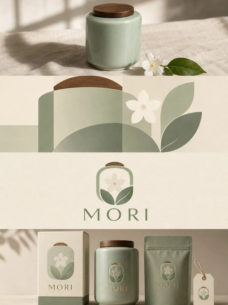
ChatGPT
DesignChatGPT
Four layer advanced narrative design poster prompt
Creator @zhidawang219555
Prompt
Please turn each photo I upload into an independent high-end design poster, rather than a multi-photo collage; each photo should be output individually.

The overall layout uses a 3:4 vertical composition. The frame is strictly divided from top to bottom into four equal horizontal zones. Each zone's height must precisely occupy 25% of the overall frame, and the ratio of the four layers must be strictly 1:1:1:1, with no ratio deviation allowed. The zones transition seamlessly with no dividing lines or blank gaps. Here, "no blank gaps" refers only to the seams between layers, which must not have space; the interior of each layer can still maintain negative space, paper surfaces, or solid color backgrounds according to the corresponding style.

All four layers are based solely on the same uploaded photo, presenting the same subject, the same moment, and the same spatial relationship. Strictly maintain the subject's identity, quantity, key structures, proportions, posture, direction of action, line of sight, observation perspective, perspective, occlusion, left-right positioning, front-back relationship, and core narrative consistency. The four layers are not four unrelated new compositions but a continuous stylistic translation of the same image. Since each layer is a very flat banner of approximately 3:1, the subject should be organized horizontally, and an appropriate amount of breathing space should be reserved on the left and right; natural horizontal extension of the background or slight cropping is allowed, but the subject must not be vertically stretched, key parts must not be cropped, character relationships must not be changed, and scenes unrelated to the original image must not be created.

The visual center of gravity, subject proportion, and contour placement of the four layers should be aligned vertically as much as possible, forming a coherent evolution from real photography transitioning gradually to the target style. Each layer must completely fill its own 25% area. Do not add layer numbers, dividing lines, borders, collage seams, watermarks, or logos. Do not generate extra text unless a layer's style description explicitly requires a small amount of editorial text, receipt marks, or handwritten notes; even if text is needed, it must be small in quantity, restrained, not block the subject, and avoid garbled characters as much as possible.

Layer 1 | Original Photography

Directly preserve the real photographic state of the uploaded photo as the visual baseline for the subsequent three layers of stylistic translation. Maintain the original person or subject's identity, quantity, facial features, hairstyle, clothing, structure, proportions, posture, actions, line of sight, interactive relationships, observation perspective, perspective, occlusion, environmental direction, natural light and shadow, and core colors, without performing illustration, materialization, geometrization, or 3D reconstruction.

To adapt to the approximately 3:1 flat banner, only natural extension of the left and right sides of the background consistent with the logic of the original scene is allowed, or slight cropping that does not damage the subject; the proportion of the subject must not be changed, characters or buildings must not be stretched, and heads, hands, feet, key objects, or important narrative relationships must not be cropped. The image should remain natural, realistic, and clear, avoiding excessive skin smoothing, exaggerated color grading, fictional scenery, and decorations unrelated to the original image.

Layer 2 | Humanistic Geometric Abstraction

In this approximately 3:1 flat banner area, translate the real subject from the first layer into a "Humanistic Geometric Abstraction" style. Maintain the same subject identity, quantity, key structure, posture, left-right position, perspective, spatial relationship, and core narrative as the first layer, then fully execute the following visual requirements:

The entire frame uses a clean ivory background, extracting the most recognizable subject, contours, posture, and narrative relationships from the photo, and converting them into a minimalist abstract visual according to the logic of "deconstruction—screening—refining—reconstruction." Focus on retaining the most unique volume proportions, axes, curves, interweaving, stacking, occlusion, negative space, and asymmetric relationships, reorganizing them with a few geometric forms; do not replicate details completely, but the correspondence with the uploaded original must be immediately felt. The composition emphasizes visual center of gravity, scale difference, primary and secondary hierarchy, positive and negative shapes, and the rhythm of white space, avoiding iconization, average arrangement, and fragmented accumulation.

Color schemes are all extracted from the uploaded original photo and simplified into 1 main color, 1 dark structural color, and 1 light/neutral color, with at most a small amount of key emphasis color added. Prioritize retaining the most recognizable and spirited colors from the original photo, establishing layers through area proportions, depth relationships, and local contrast, maintaining a clean, restrained, yet vital appearance, and avoiding overall graying or average use of color.

Text establishes a complete high-end editorial micro-typography system: extract a 2–5 word poetic English main title from the light, shadow, space, action, material, or emotion of the photo, while pairing it with 2–4 sets of extremely small auxiliary text, which can be freely combined from short sentences, state words, location or object information, numbers, chapter marks, serial numbers, scale-style numbers, direction words, material words, archival labels, or miniature explanations; do not use years. The main title is responsible for emotion, and the small text is responsible for order and detail, making the text like editorial notes in art books, architectural journals, or exhibition catalogs rather than ordinary titles.

Text must be composed together with abstract graphics, and can be arranged along geometric axes, edges, contours, or negative space, or arranged vertically, rotated, in columns, with expanded letter-spacing, against edges, at corners, crossing color blocks, embedded between forms, or forming interweaving and alignment with the subject; allow one set of text to be extremely small and another slightly larger, establishing a reading path through font size contrast, letter-spacing, direction, and position. Overall, use a restrained combination of serif fonts and thin editorial fonts, letting abstract forms be responsible for visual memory and text for structure, rhythm, and a sense of high-end quality.

The overall presentation reflects a visual temperament of original imagery × abstract memory × editorial typography, being modern, quiet, restrained, exquisite, artistic, and collectible, avoiding complex collage, cheap decoration, commercial template feel, and meaningless abstraction.

Layer 3 | Integrated Logo Reconstruction

In this approximately 3:1 flat banner area, translate the real subject from the first layer into an "Integrated Logo Reconstruction" style. Maintain the same subject identity, quantity, key structure, posture, left-right position, perspective, spatial relationship, and core narrative as the first layer, then fully execute the following visual requirements:

Extract the most recognizable subject, contours, posture, and narrative relationships from the photo, and reconstruct them into a concise, professional, brand-identifiable custom wordmark/logo graphic. Do not place the subject graphic alone next to the text; instead, cleverly integrate its most key contours, structures, or features into the letters themselves or the overall logo structure, so that graphics and text become a unified, complete, and recognizable visual symbol. Whether the subject is a person, animal, plant, building, object, vehicle, or natural landscape, its most core visual features should be refined and converted into a concise, geometric, and graphic logo language, maintaining a sense of identity recognizable at a glance within minimal information.

Text is refined into a short English main text from the subject's name, theme attributes, location clues, action status, or symbolic meaning of the photo; if the original image itself has a clear proper noun, it can be directly converted into the main logo name; if there is no clear name, refine a highly summarized, easy-to-recognize English word or phrase suitable as a brand wordmark. It can be paired with a very small amount of auxiliary text, such as category, region, state words, or short slogans, but must be highly restrained, serving only as a supplement to the identification hierarchy. Text and graphics need to together constitute the logo, rather than a conventional collage of "icon + title."

The overall style remains minimalist, modern, geometric, striking, elegant, with sufficient white space and balanced composition. The background uses a light solid color or a very light neutral color to maintain cleanliness and simplicity; the logo is presented in black and white or a very small amount of color, which can be a small translation of the one with the most spiritual temperament extracted from the uploaded original photo, but overall, restraint, professionalism, and branding take priority. The logo maintains a comfortable medium visual size in the entire frame, neither too large nor too small, with the completion level of a mature brand identity, cultural visual system, or high-end design studio work.

The overall emphasis is on the integration of graphics and text, subject recognizability, geometric order, exquisite letter-spacing, professional layout, and high-end white space, presenting a visual temperament that combines modern logo design with art posters. Avoid a travel poster feel, simple icons plus text, cartoonization, decorative stacking, e-commerce feel, cheap graphics, and template feel.

Layer 4 | Brand Packaging System Mockup

In this approximately 3:1 flat banner area, translate the real subject from the first layer into a "Brand Packaging System Mockup" style. Maintain the same subject identity, quantity, key structure, posture, left-right position, perspective, spatial relationship, and core narrative as the first layer, then fully execute the following visual requirements:

Extract the most recognizable subject, contours, posture, and narrative relationships from the photo and convert them into a complete brand packaging and material visual system. Do not simply copy the photo, but refine the subject's characteristics into reusable core graphics, illustration symbols, patterns, color blocks, or identification elements, then apply them respectively to packaging carriers of different sizes and purposes, making all materials belong to the same visual family at a glance.

Automatically select the 5–8 most suitable carriers based on the theme of the original image, such as paper bags, packaging boxes, sets, labels, tags, tickets, cards, stickers, sleeves, cup packaging, key pendants, wrapping paper, or other related materials, without forcing the use of fixed categories. Use 1–2 main packages as the visual focus, with the remaining materials forming modular combinations according to size, horizontal/vertical ratios, and function; use a clear grid, edge alignment, scale contrast, spacing rhythm, and large areas of white space to organize the frame, like a professional brand design studio's packaging visual identity proposal board, rather than a product display or messy mockup presentation collage.

The color palette remains soft, transparent, and slightly desaturated high-end color systems, mainly light pinkish-blue, misty blue, sky blue, and airy cool-toned blue, paired with ivory white, cream white, light beige, soft gray-green, and architectural neutrals, using only a small amount of gray-toned rose pink or low-saturation blush pink as visual focal points. Different packaging can change the color area and combination method, but must maintain the same color system to form a rich yet unified sense of series.

Materials emphasize realistic and exquisite paper and packaging processes, showing matte paper, fine-grained paper, thick cardstock, translucent paper, embossing, die-cutting, folding, stickers, partial printing, and slight layering relationships; light is soft and natural, used only to show paper thickness, creases, and material differences, avoiding plastic feel, strong reflections, exaggerated 3D, and cheap product rendering.

Text is also designed as a unified part of the entire packaging system. Refine a short English main title from the original image's subject name, theme, mood, function, or symbolic meaning, and extend it with a very small amount of sub-titles, short sentences, serial numbers, category names, or miniature explanations. Text can change naturally according to different carriers: arranged vertically on tags, extending along packaging edges, surrounding circular labels, crossing box surfaces, hidden between graphics, or becoming part of the packaging seal structure, making fonts, graphics, and materials together form a complete brand language, rather than repeating the same title on every item.

The overall presentation is a high-end brand packaging system / visual identity proposal board: rich but not crowded, lively but orderly, showing both a complete series and the design logic between graphics, text, materials, and different carriers. Whether the original image is a person, animal, plant, building, object, food, vehicle, or natural landscape, a unique packaging language should be established from the original image itself, avoiding fixed product combinations, repetitive templates, e-commerce display feel, and ordinary brand mockup templates.
Copy the text, add your own details, and try it in your image model.


