 Piko
Piko Explore prompt ↗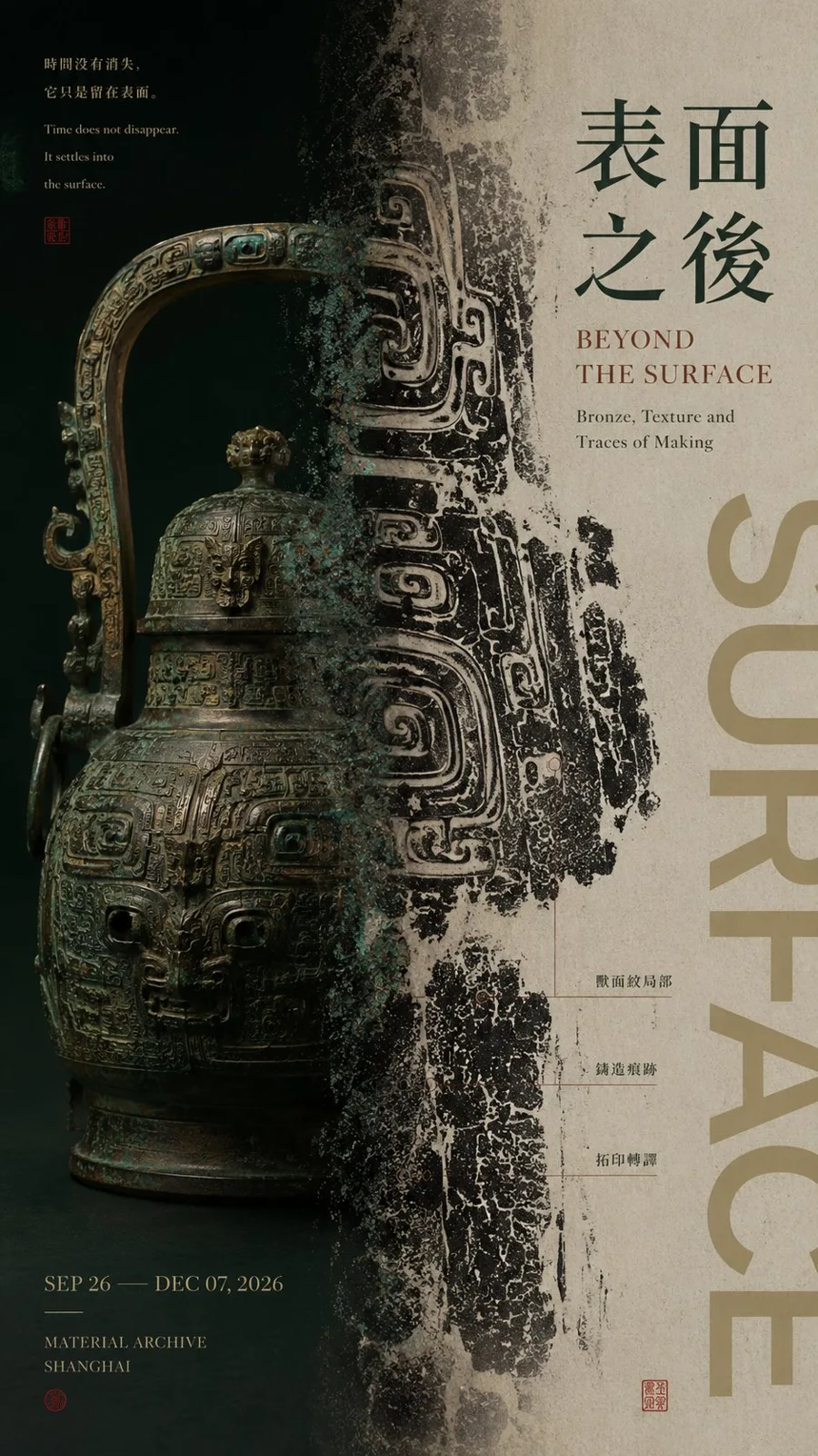
ChatGPT
DesignChatGPT
Editorial graphic design split poster prompt
Creator @MrLarus
Prompt
【Subject / Work Name】: ____
【Left Content】: ____
【Right Content】: ____
【Left-Right Relationship】: Whole and Part / Original and Result / Instant and Extension / Dense and Blank Space / Other
【Cross-region Connection Method】: Subject crossing boundaries / Material translation / Color extension / Cloud and mist transition / Action trajectory / Other
【Chinese Title】: ____
【English Title】: ____
【Main Color】: ____
【Secondary Color】: ____
【Aspect Ratio】: 9:16

Generate an editorial graphic design poster with a left-right composition, featuring mature visual texture for an exhibition.

The core is not to mechanically divide the screen into two equal halves, but to establish two visual areas with different functions and visual weights that have a clear relationship with each other.

Do not fix the left-right ratio at 50:50. Use unequal ratios such as 35:65, 40:60, 45:55, 60:40 according to the content. Complete visual weight balance through subject size, color depth, information density, and white space.

The left and right sides should undertake different visual tasks, for example: one side shows the complete subject, the other side enlarges local textures; one side presents raw materials, the other side shows its transformed visual result; one side freezes a person or object, the other side extends action, trajectory, or energy; one side maintains high-density images, the other side achieves balance with large areas of white space and Typography.

The most important thing is the "middle boundary." Do not use hard vertical lines to divide columns directly; instead, let at least one core element cross the left and right areas to truly connect the two sides:

Subject parts naturally cross the boundary; materials gradually change from solid objects to flat images; colors, ink marks, or textures extend across regions; action trajectories extend from the subject side to the other; clouds, light and shadow, or spatial structures naturally dissipate at the boundary. Let the central axis be "the place where the relationship happens" rather than a simple dividing line.

Typography is organized according to the content of the work. Main titles, short sentences of the work, and auxiliary information must all be related to the subject itself. Do not use templated placeholder text such as "Left-right composition," "Design case," or "Visual research."

Text can participate in left-right weighting: reduce text on the side with heavier images, and increase titles or information on the side with more white space; or let the title cross the boundary and intersperse with the subject.

Control colors within 2–4 main color systems. There can be obvious contrast in cold and warm, light and dark, or material between left and right, but at least one color, texture, or typography system is needed as a visual connection to avoid looking like two pictures forced together.

Maintain sufficient breathing space through: unequal proportions, visual weighting, subject crossing boundaries, material translation, density changes, and Typography interspersion to establish a designed left-right relationship.

The final reading order should be clear: first glance feels the visual contrast between the left and right sides; second glance finds the connections or changes at the central axis; third glance understands the content relationship between the two areas; finally, read the title and work information.

Overall requirements: The left-right relationship is clear but not rigid; the two areas each have a function and belong to the same work; there is visual hierarchy, content logic, and a mature Editorial Poster texture.
Copy the text, add your own details, and try it in your image model.


