Piko
Piko Explore prompt ↗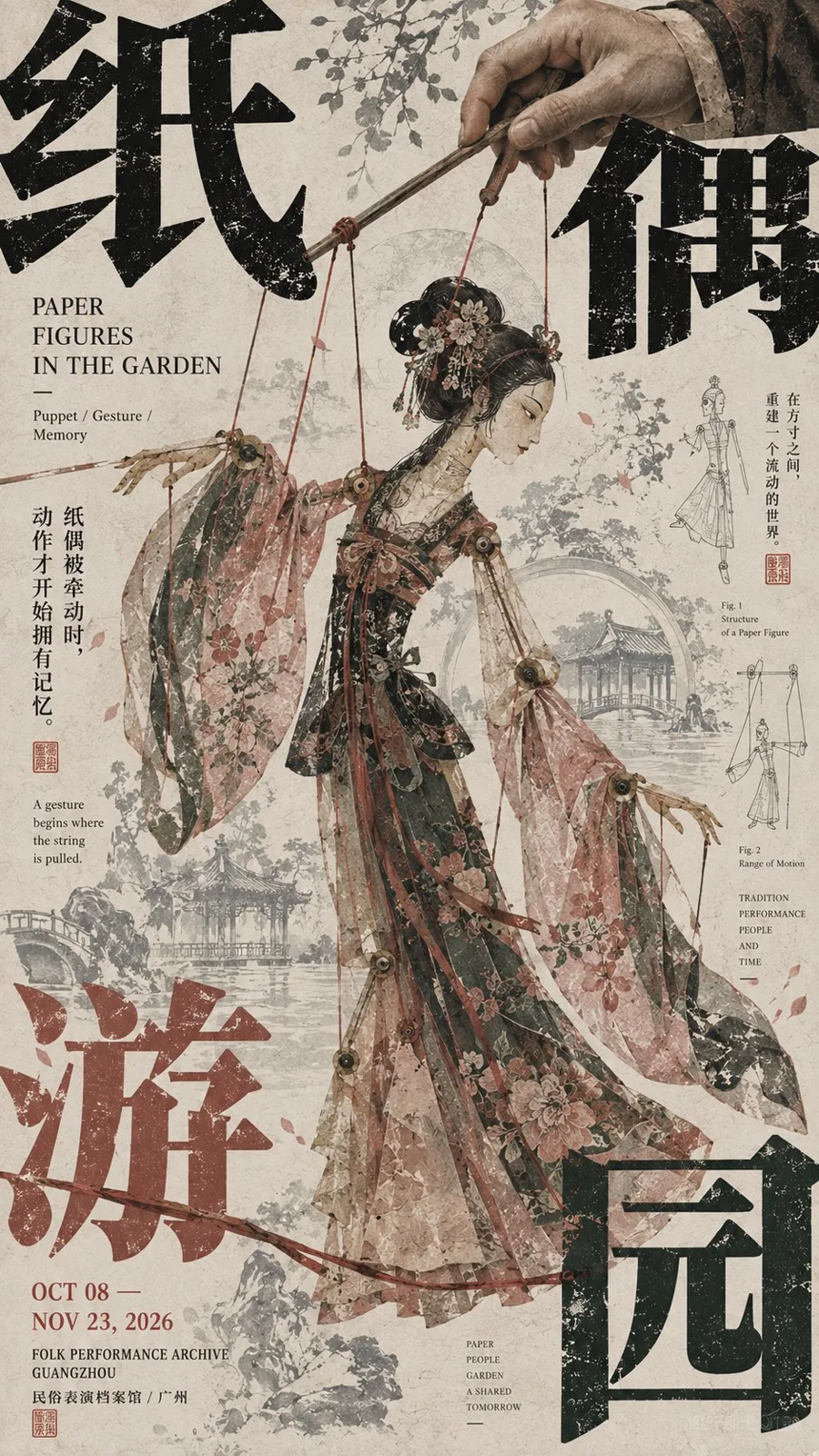
ChatGPT
DesignChatGPT
East asian exhibition poster layout design
Creator @MrLarus
Prompt
[Subject]:
[Four-character Chinese Title]:
[English Title]:
[Core Subject]:
[Subject Action / Pose]:
[Auxiliary Visual Elements]:
[Main Color Palette]:
[Accent Color]:
[Exhibition Date / Institution]:
[Aspect Ratio]: 9:16

Generate a high-aesthetic East Asian cultural exhibition poster, adopting "corner-pressure composition" and a mature Editorial Graphic Design visual language. The overall effect is not a simple subject plus a title, but a layout where a strong visual subject, giant Chinese characters, peripheral information, auxiliary patterns, and negative space truly interlock to form a rich but orderly relationship.

The subject occupies about 45%–60% of the frame, remains complete, clear, with distinct outlines and visual weight, potentially featuring figures, animals, natural landscapes, artifacts, or folk imagery. The subject must possess a sense of craftsmanship and narrativity, without being deliberately distorted, fragmented, or made too small for the sake of the layout.

Split the [Four-character Chinese Title] and distribute the characters across the four edges and corners of the frame, but ensure they are not equal in size, equidistant, or perfectly symmetrical. Select 1–2 characters to serve as the primary corner-pressure elements, significantly enlarged and partially cropped out of the frame, with the remaining characters acting as secondary responses. These large Chinese characters are not merely titles but part of the layout's structure, interacting with the subject through authentic front-and-back interleaving—for example, figures, animals, wings, horns, ropes, branches, sleeves, mountains, or other subject outlines passing through the character shapes, creating a sense that "the characters are behind the subject, and the subject grows out of the characters."

English titles, dates, institutions, and explanatory text should be concentrated in 2–3 peripheral areas, mixing horizontal and vertical alignments, tiny font sizes, and various orientations. Create distinct scale jumps through oversized Chinese characters, medium-sized English text, and minute information; do not arrange all information into a neat modern grid or scatter it evenly across the frame.

Use only one set of auxiliary visual languages directly related to the theme for the entire poster. For example, animals could use horn shapes, footprints, or silhouettes; figures could use ropes, action trajectories, or clothing structures; landscapes could use ridgelines or water ripples; folk themes could use puppet strings, mask patterns, or craft structures. Auxiliary elements can be repeated, enlarged, cropped, or faded, but do not include multiple unrelated decorative sets.

For the background, use art paper with a cultural publication texture, incorporating delicate paper fibers, slight print grain, faint line work, subject silhouettes, small handwritten notes, or an old print texture. The background must be layered without becoming a secondary subject; it should remain clean from a distance, with details revealing themselves only upon closer inspection.

Restrict the color palette to 3–5 core colors to establish a clear color identity. There should be a distinct relationship between the large-area background color, the subject color, and the giant character color, with a minimal amount of accent color used for dates, seals, or key details. Avoid multiple high-saturation colors competing for attention.

The visual reading order must be clear: first, the strong subject and giant corner-pressure characters; second, the occlusion, interleaving, and scale relationships between the subject and characters; third, the English text, dates, and peripheral information; and finally, the paper texture and auxiliary line work.

The overall effect should resemble a mature East Asian museum exhibition poster, art publication, or cultural catalog: a large subject, strong typography, pressure at the edges, and focus at the center—rich in information but not cluttered, possessing a visual tension of "order within chaos." Even if all small text were removed, the image itself should stand as a complete and valid work of art.
Copy the text, add your own details, and try it in your image model.