Piko
Piko Explore prompt ↗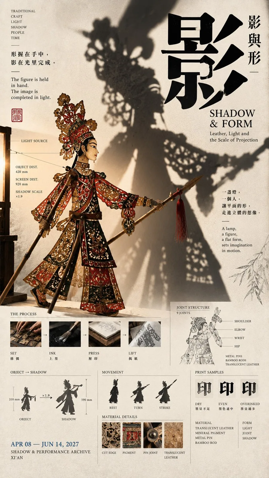
ChatGPT
DesignChatGPT
East asian editorial museum poster prompt
Creator @MrLarus
Prompt
[Theme]:
[Main Visual Object]:
[Chinese Core Character]:
[Chinese Title]:
[English Title]:
[Physical Relationship]: Projection / Reflection / Transfer / Overlap Revelation / Others
[Archive Information]: Structural Diagram / Material / Dimensions / Process / Local Sample / Others
[Theme Color]:
[Aspect Ratio]: 9:16

Generate a vertical poster with a mature East Asian Editorial Design, Museum Poster, and cultural publication texture.

Use an "unbalanced rule-of-thirds composition," letting the three areas in the image respectively bear:

1. Main Visual Object
2. Giant Chinese Title
3. Archive and Auxiliary Information

Do not slice into three equal columns, and do not draw obvious dividing lines.

Most importantly, design at least one real cross-zone interaction based on the [Physical Relationship], creating a causal relationship between the three areas:

For example, the main body generates an enlarged projection, mirror-reflects text, printing paper peels up from the layout, or a rubbing rolls up to reveal the original.

Don't just put elements near each other; let them truly occlude, intersperse, reflect, transfer, or reveal front and back.

The overall use of warm ivory uncoated art paper, paired with ink black Typography and one main theme color. Chinese uses modern high-contrast Songti / Mingti, English titles use Serif, and small archive information uses Grotesk / Monospace.

The main visual must have a clear large shape, recognizable even as a thumbnail. The giant [Chinese Core Character] must participate in spatial relationships; it can be crossed by shadows, reflected by mirrors, appear in printing results, or form a front-and-back hierarchy with real objects.

Add [Archive Information] truly related to the theme, such as materials, dimensions, process steps, structural sections, surface samples, or observation records, making the poster have both visual impact and content depth.

Maintain medium-to-high information density, but keep at least 20%–30% effective white space, forming a rhythm of "high density for main visual, medium density for archives, low density for paper surface."

Final reading order:

First glance sees the strong main visual and giant Chinese; second glance discovers the cross-zone physical relationship; third glance understands the structure, material, or process; fourth glance reads the work title and archive information.

The same series should unify the paper, font system, information hierarchy, and editorial temperament, but each should be redesigned according to different [Physical Relationships], not just template skin-swapping.
Copy the text, add your own details, and try it in your image model.