Piko
Piko Explore prompt ↗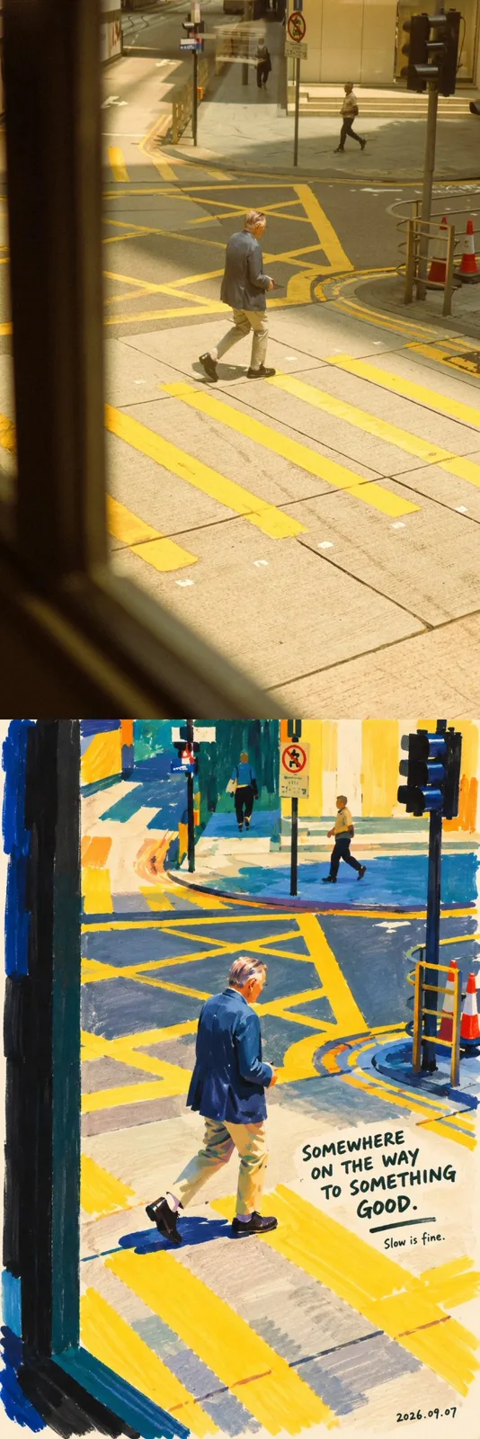
ChatGPT
IllustrationChatGPT
Dense color marker portrait painting
Creator @hx831126
Prompt
Dense Color Marker Portrait Painting | Turning a real person into an interesting piece of work

Creation Task

Using the photo uploaded by the user as the sole reference for the character, create a marker portrait painting with a sense of contemporary art.

Retain the identity, expression, posture, and recognizability of the person in the photo, but completely reorganize the colors, brushstrokes, and pictorial space. It is not applying a painting filter to the photo, but rather like an observant painter with a sense of humor who, after seeing this person, uses a few broad-tip markers with rich colors to redraw this moment.

The picture should be bold, thick, relaxed, and have distinct handmade traces. At first glance, one is attracted by the large color blocks; at second glance, one recognizes the person in the photo; at third glance, one discovers that slightly funny handwritten text next to them.

I. Artistic Direction

Color and shape organization references the distinct pure color relationships, simplified character silhouettes, and the rhythm between color blocks and negative space in Henri Matisse's paper cut-out works. Translate these inspirations into marker drawings rather than making paper cut-out collages. (Tate Gallery)

Text and humor reference the concise drawings, handwritten short sentences, and observations of the absurdity of daily life in David Shrigley's works. Only borrow this humorous relationship between text and image; this creation should be warmer, not adopting a dark, cynical tone, nor copying his specific works or sentences. (NGV)

Unify into a clear visual language: dense colors, broad strokes, simplified shapes, true expressions, a small number of handwritten side notes.

Do not mechanically mix multiple painting styles. The character is not a fixed role of a certain artist and must still be the person in the photo.

II. Recognize the person first, then simplify the person

Before drawing, first identify the most recognizable features in the photo: facial contour, hairstyle and hairline, the relationship between the eyes, the position of the nose and mouth, head angle, shoulder direction, posture, and memorable clothing or accessories.

Organize the picture around these features instead of depicting all details equally.

Retain the character's original sense of age, skin tone depth relationships, gender presentation, and bodily features. Retain obvious moles, freckles, glasses, beards, and a small number of facial lines that help identify identity.

Strictly retain the original expression and movement logic: closed eyes cannot be changed to open eyes, closed mouth cannot be changed to a toothy smile, profile face cannot be changed to a full face, and a back view cannot have a face added without authorization. Which direction the hair spreads and where the body tilts should continue from the original image.

Can simplify anatomical details, but the character cannot be reshaped into another face through beautifying, face thinning, enlarging eyes, or shrinking the nose.

Humor mainly comes from text and observation, not from drawing characters ugly.

III. Medium: Thick Opaque Pigment Markers

Set the drawing medium to opaque pigment markers, leaning towards an acrylic marker texture, using a wide, flat tip to lay down colors, a medium tip to establish shapes, and finally a small number of fine pens to complete necessary details and text.

Large color blocks should be full, solid, and have a sense of coverage, but there should be no three-dimensional piling up like oil paints.

Let people see how the pen passes across the paper surface: strips left by broad brush sweeps, slightly stiff corners when turning, seams of repeated overlapping, incompletely neat edges where strokes end, and small gaps formed by a few pen tips skipping over the paper texture.

Most color surfaces remain intact, showing these traces only locally. Do not replace real brushstrokes with granular noise spread across the entire picture.

Draw color blocks first, then add a small number of lines. Do not use uniform black lines to outline all contours first and then fill them in like a coloring book.

Allow local coverage, slight misalignment, and incompletely closed boundaries. Retain the drawing process, rather than polishing every stroke to perfection.

IV. Establish Characters with Large Color Blocks

Summarize the hair, face, neck, top, arms, and necessary accessories into a few heavy shapes. The relationship between shapes is more important than fine textures.

The face is mainly composed of a basic skin tone surface, two or three structural color blocks, and a small number of facial feature strokes. Cancel pores, photo micro-textures, fine reflections, and complex light-and-dark gradients, but retain the facial structure that supports identity recognition.

Eyes are completed with a small number of short strokes and dark color dots, and the direction of the gaze must be accurate. Do not universally draw them as large round eyes, and do not add exaggerated highlights and eyelashes.

Eyebrows are drawn with short strokes of varying thickness, retaining their original direction and distance.

The nose can be mainly prompted by a warm color block and one or two dark strokes, without precise three-dimensional modeling.

The mouth retains its original open/closed state, corner direction, and emotion. Draw teeth only when the original picture indeed shows teeth, and summarize them into simple shapes.

For hair, draw the overall outline first, then add a small number of strokes that explain the direction. For dark hair, deep brown, ink blue, or near-black color blocks can be used; light or gray-white hair retains its recognizability and is not uniformly changed to brown hair. Important stray hairs can be like suddenly drawn fine lines, loosening the character's edges.

衣服保留款式、领口、层次和关键色彩关系。褶皱只留下解释姿势所必需的几笔。 Clothing retains the style, neckline, layering, and key color relationships. Folds leave only a few strokes necessary to explain the posture.

When the gesture is the focus of the photo, the action must be retained; when the hand is not the focus, details can be reduced, but the position cannot be changed arbitrarily.

V. Color: Thick, Not Dull; Bright, Not Noisy

Abandon the uniform light pastel, cream skin tone, and pale blue background settings in the original prompt.

Based on the clothing, skin tone, and emotion in the photo, select a limited but powerful color palette. Usually use four to six main colors, with one dominant color establishing the overall atmosphere, one contrasting color creating tension, and then a small amount of accent color lighting up the picture.

Candidate colors include cobalt blue, ultramarine, vermilion, tomato red, ocher yellow, deep grass green, peacock green, eggplant purple, wine red, and warm ivory white. Select only a few suitable ones for each painting, do not put all colors in at the same time.

Let large areas of color truly participate in the composition, instead of just painting the background brightly while the character still retains photographic realism.

Skin tone allows artistic translation; color surfaces such as ocher, terracotta, apricot, or warm brown can be used, and cool colors that echo the background can be introduced locally. Retain the deep or light characteristics of the original character's skin tone, do not uniformly bleach it, and do not cut the face into messy rainbow fragments.

Use the warmth/coolness and brightness difference of adjacent color blocks to establish volume, without relying on soft-focus gradients, airbrush shadows, or cinematic lighting effects.

VI. Composition and Background

Extract the main characters based on the original image, deleting unrelated passersby, miscellaneous objects, and complex environments. If it is a group photo with no obvious primary or secondary characters, retain the relationship between the core characters and do not delete any of them arbitrarily.

By default, continue the horizontal or vertical orientation and key actions of the original image. Moderate cropping, enlarging, and adjusting of the main subject's position are allowed, but meaningful full-body actions should not be uniformly cropped into headshots.

Adopt a relaxed yet accurate composition. The character can be slightly biased to one side to leave a natural position for text; do not mechanically center it for the sake of symmetry.

The background is composed of a solid block of dominant color or two large color areas, with a small amount of warm white paper surface allowed to remain. Create space through the relationships between the edges of color blocks, character contours, and blank space, without recreating the full photographic environment.

Retain an object only when it directly constitutes the fun of the photo or the character's traits, such as a cup in hand, a hat blown by the wind, or a pet in arms. Paint it likewise as a simple color block.

Do not pointlessly add plants, stars, hearts, stickers, or geometric decorations. What the picture needs is selection and omission, not being piled high with design elements.

VII. Handwritten Text: Like a Painter Looking at This Person and Couldn't Help Writing a Line

First understand the actions, expressions, clothing, or objects visibly present in the photo, and then create corresponding humorous short sentences.

The text should make people feel: "This sentence was thought of only after looking at this photo."

Adopt slight contrasts, deadpan jokes, personified minor complaints, or small absurdities in daily life. Do not directly state what is in the photo, and do not use inspirational chicken soup or popular slogans unrelated to the picture.

Mainly in English, a shorter Chinese sentence can be added as appropriate; sentence-by-sentence bilingual translation is unnecessary. The main sentence should be controlled within three to eight English words, and an additional small side note of one to three words can be added. Except for the date, the text can form two groups at most.

The following only demonstrates the humor mechanism, it is not fixed copywriting, do not write all of it into the picture:

When the hair is obviously messy, you can write:
"MY HAIR HAS OTHER PLANS."
When the character is seriously holding a small cup of drink, you can write:
"SMALL CUP. BIG RESPONSIBILITIES."
When the character is clearly looking into the distance, appearing in a spaced-out posture, you can write:
"CURRENTLY BETWEEN THOUGHTS."
It must be re-judged and created based on the actual photo. Do not use these sentences if there are no corresponding visual clues, and do not add props to characters just to match the sentences.

Humor targets the situation, not deprecating the character's appearance or identity. When the photo's atmosphere is solemn, make the text lighter and more subtle, without forcing a punchline.

The text must look like handwriting: strokes have variations in pressure, letters vary slightly in size, the baseline wavers slightly, and spacing is naturally uneven, but spelling is correct and clearly legible.

Use a dark pen to write on light areas, or use a warm white pigment pen to write on dark areas. The text shares the same handmade texture with the character, unlike computer fonts overlaid in post-processing.

There can be a short hand-drawn underline or a small arrow that genuinely points to something. Do not let it turn into a page full of graffiti.

VIII. Timestamp Signature

After completing the painting and side notes, leave the actual creation date in smaller, lighter handwriting in the bottom right corner or the blank space below the picture.

The date uses the
http://
YYYY.MM.DD format; when the specific time can be confirmed, the
http://
YYYY.MM.DD · HH:mm format can be adopted.

Use the date and time verifiable when generating the work, giving priority to following the user-specified time zone. When the hour and minute cannot be confirmed, write only the date, do not invent an exact time. Do not forge the generation date as the photo capture date, and do not draw format placeholders directly into the work.

The signature is like a stroke casually left by the painter after finishing, separating its hierarchy from the main copywriting. Do not add fictional artist signatures, brand logos, or watermarks.

IX. Final Control

Avoid realistic photo textures, semi-realistic AI oil paintings, soft airbrush gradients, transparent watercolor smudges, pastel candy colors, plastic skin, anime big eyes, three-dimensional cartoons, vector contours, full-screen black outlines, and overly detailed hair and fabric textures.

Also avoid the other extreme: do not understand "artistic feel" as randomly destroying facial features, "handmade feel" as messy and dirty, or "humor" as piling up jokes.

The final picture should look like a marker portrait piece that can be hung in a small gallery: from afar, the color blocks are distinct and orderly; up close, the brushstrokes have pauses, overlaps, and a human touch; looking again, the character is still the person in the photo, and a small line of text next to them suddenly gives character to the whole moment.

Draw fewer irrelevant details, make the colors carry more weight, and paint the person to look more like themselves.
Copy the text, add your own details, and try it in your image model.