 Piko
Piko Explore prompt ↗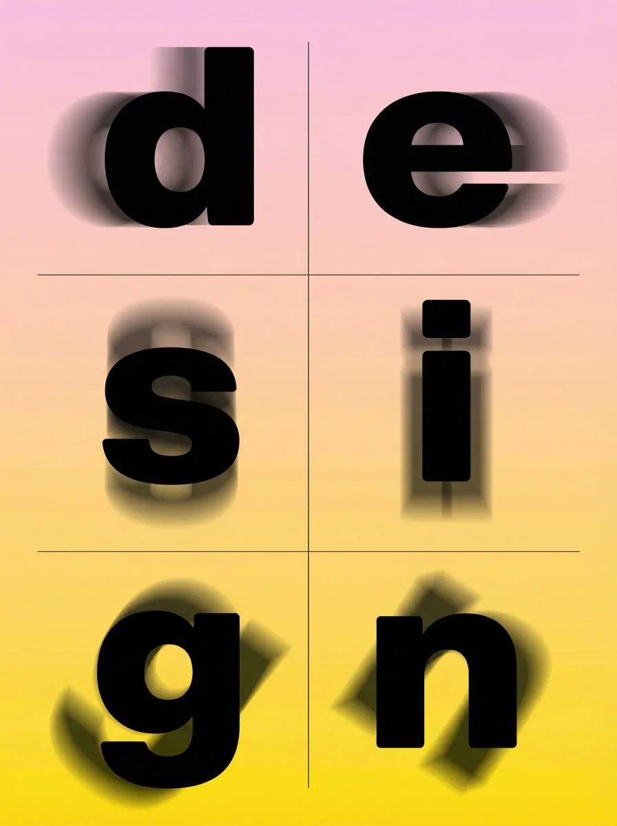
Nano banana pro
DesignNano banana pro
Brutalist motion blur typography
Creator @carolletta
Prompt
A bold experimental typographic poster in brutalist style, featuring the lowercase word ‘design’ with the letters arranged in a strict 3-row by 2-column grid layout, each individual letter perfectly centered and isolated in its own square cell with equal spacing and thin invisible grid lines for structure. The main letters are ultra-heavy geometric sans-serif with thick slab-like strokes, perfectly rounded edges, solid black fill, high contrast. Beneath each main sharp letter, multiple duplicated ghostly versions of the same letter appear with strong directional motion blur — each cell has blur going in a unique direction: horizontal left, horizontal right, vertical up, vertical down, diagonal top-left to bottom-right, diagonal top-right to bottom-left — creating chaotic overlapping energy and depth illusion. Soft linear gradient background from baby-pink at the top to vibrant yellow at the bottom. Clean minimalist composition, perfectly symmetrical grid, no additional elements, high-resolution vector aesthetic, contemporary graphic design poster with hypnotic blur dynamics.
Copy the text, add your own details, and try it in your image model.


