 Piko
Piko Explore prompt ↗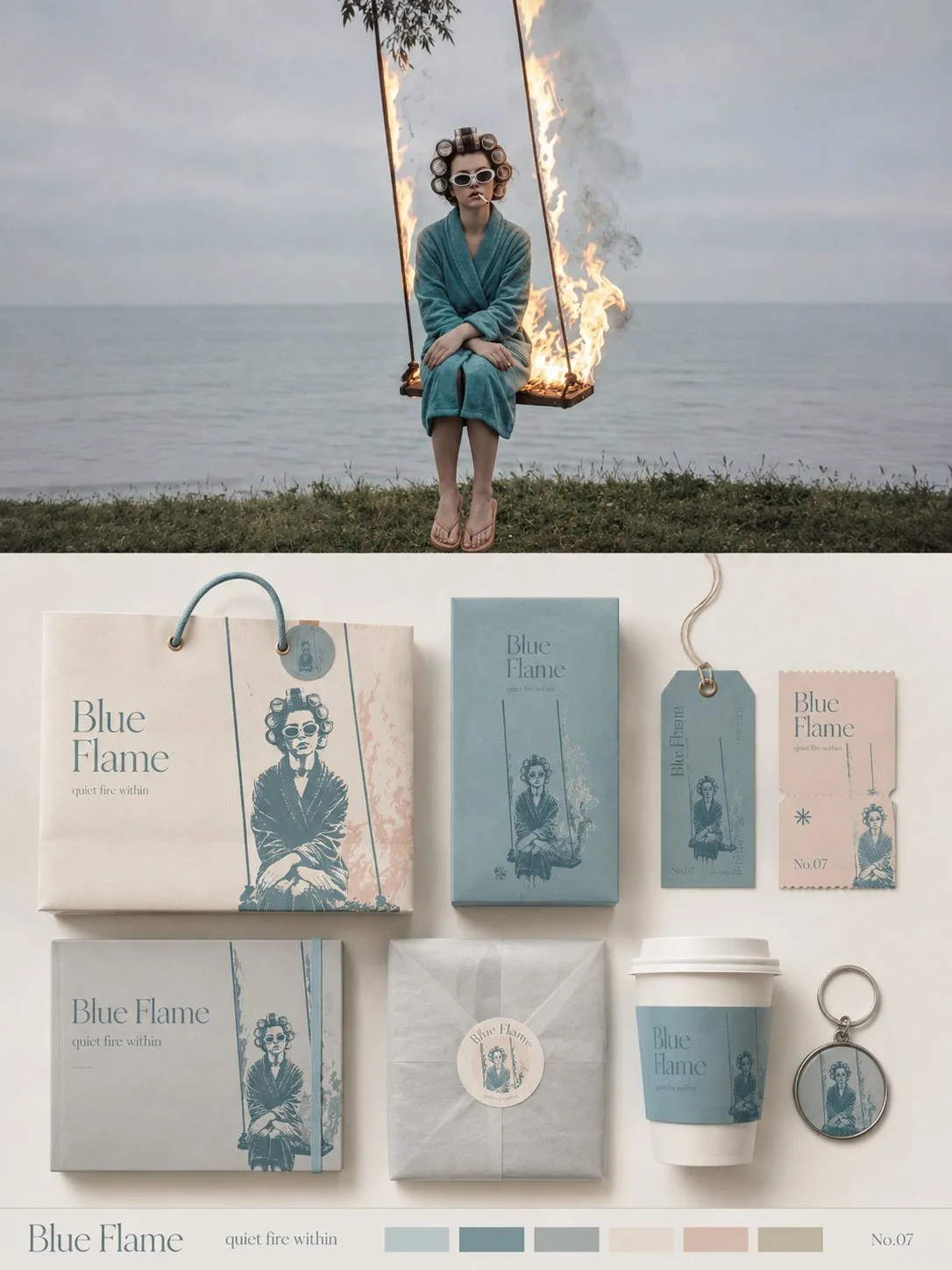
ChatGPT
DesignChatGPT
Brand visual identity presentation board
Creator @xiaoxiaodong01
Prompt
Please turn each photo I upload into an independent high-end design poster, no multi-photo stitching, each photo output individually. The overall composition uses a 3:4 vertical layout, with the upper and lower areas strictly 1:1 in height, each occupying 50% of the frame. The upper half preserves the original photo, maintaining the subject identity, structure, posture, realistic texture, natural lighting, and original color atmosphere, with only slight high-end photographic color grading to give it the texture of art magazines, independent publications, and exhibition photography. To adapt to the frame, the sky, ground, or environmental background can be naturally extended, but the subject must not be stretched, distorted, or changed. The lower half extracts the most recognizable subject, outline, posture, and narrative relationship from the photo, transforming it into a complete brand packaging and material visual system. Do not simply copy the photo; instead, refine the subject's characteristics into reusable core graphics, illustration symbols, patterns, color blocks, or identification elements, and then apply them to packaging carriers of different sizes and purposes, making all materials instantly belong to the same visual family. Automatically select the most suitable 5–8 carriers based on the original image's theme, such as paper bags, packaging boxes, gift sets, labels, tags, tickets, cards, stickers, sleeves, cup packaging, key pendants, wrapping paper, or other related materials, without forcing the use of fixed categories. Use 1–2 main packages as the visual focus, with the remaining materials forming modular combinations based on size, horizontal/vertical ratios, and function; use a clear grid, edge alignment, scale contrast, spacing rhythm, and large areas of white space to organize the frame, like a professional brand design studio's packaging identity presentation board, rather than product displays or messy mockup collages. The color palette remains soft, transparent, and slightly desaturated in high-end tones, mainly light pink-blue, mist blue, sky blue, and airy cool-toned blue, paired with ivory white, cream white, light beige, soft gray-green, and architectural neutral colors, using only a small amount of dusty rose or muted blush as visual accents. Different packaging can change the color area and combination method, but must maintain the same color system to form a rich yet unified sense of series. The material emphasizes realistic and exquisite paper and packaging craftsmanship, showing matte paper, fine-grained paper, thick cardstock, translucent paper, embossing, die-cutting, folding, stickers, partial printing, and slight layering relationships; lighting is soft and natural, only used to express paper thickness, creases, and material differences, avoiding plastic feel, strong reflections, exaggerated 3D, and cheap product rendering. Text is also designed uniformly as part of the entire packaging system. Extract a short English main title from the subject's name, theme, mood, function, or symbolic meaning of the original image, and extend a very small amount of sub-titles, short sentences, numbers, category names, or micro-descriptions. Text can change naturally according to different carriers: vertically arranged on tags, extending along packaging edges, surrounding circular labels, crossing box surfaces, hidden between graphics, or becoming part of the packaging closure structure, so that fonts, graphics, and materials together form a complete brand language, rather than repeating the same title on every item. The overall presentation is a high-end brand packaging system / visual identity proposal board: rich but not crowded, lively but orderly, showing both the complete series and the design logic between graphics, text, materials, and different carriers. Whether the original image is a person, animal, plant, architecture, object, food, vehicle, or natural landscape, a unique packaging language should be established from the original image itself, avoiding fixed product combinations, repetitive templates, e-commerce display feel, and ordinary brand mockup templates.
Copy the text, add your own details, and try it in your image model.


